以下是 CSS3实现游乐场摩天轮旋转动画特效代码 的示例演示效果:
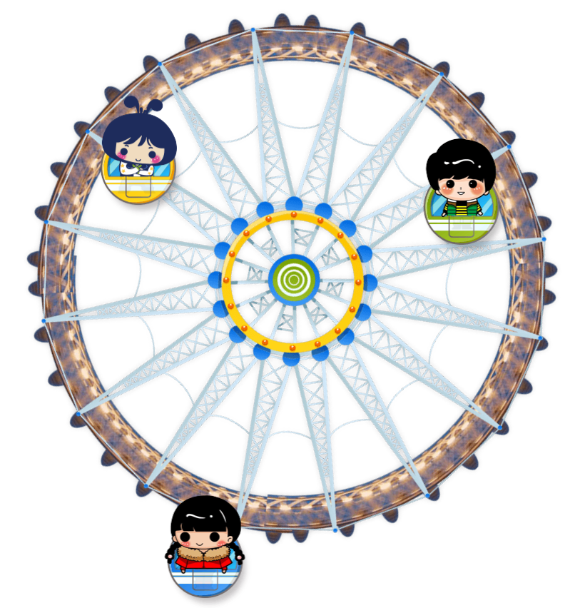
部分效果截图:
HTML代码(index.html):
<!doctype html>
<html>
<head>
    <meta charset="utf-8">
    <title>CSS3实现游乐场摩天轮旋转动画特效</title>
    <style>
        div.lanren {
            margin: 100px auto;
            width: 800px;
            animation: a 1000s;
            position: relative;
        }

        img:nth-child(2) {
            position: absolute;
            top: 80px;
            left: 400px;
            animation: b 1000s;
            transform-origin: top center;
        }

        img:nth-child(3) {
            position: absolute;
            top: 700px;
            left: 400px;
            animation: b 1000s;
            transform-origin: top center;
        }

        img:nth-child(4) {
            position: absolute;
            top: 300px;
            left: 0px;
            animation: b 1000s;
            transform-origin: top center;
        }

        @keyframes a {
            form {
                transform: rotate(0deg);
            }

            to {
                transform: rotate(36000deg);
            }
        }

        @keyframes b {
            form {
                transform: rotate(0deg);
            }

            to {
                transform: rotate(-36000deg);
            }
        }
    </style>

</head>
<body>
    <div class="lanren">
        <img src="images/fsw.png">
        <img src="images/boy.png">
        <img src="images/girl.png">
        <img src="images/shamegirl.png">
    </div>
</body>
</html>


 分享到QQ
分享到QQ 分享到微博
分享到微博 微信扫一扫
微信扫一扫