以下是 进度加载条css3动画效果代码 的示例演示效果:
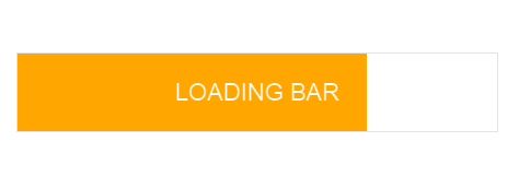
部分效果截图:
HTML代码(index.html):
<!DOCTYPE html>
<html class=''>
<head>
    <title>进度加载条css3动画效果</title>
    <style class="cp-pen-styles">
body {
  font-family: "HelveticaNeue-Light", "Helvetica Neue Light", "Helvetica Neue", Helvetica, Arial, "Lucida Grande", sans-serif;
}

.wrapper {
  position: relative;
  overflow: hidden;
  width: 500px;
  margin: 0 auto;
}

.bar {
  border: solid 1px #e3e3e3;
  margin: 40px 30px;
  padding: 8px 0;
  height: 55px;
}

.text {
  font-size: 22px;
  margin: 15px 0;
  text-align: center;
  text-transform: uppercase;
}

.text-gradient {
  width: 100%;
  font-size: 22px;
  font-weight: bold;
  text-align: center;
  color: #ffa600;
  background: -webkit-linear-gradient(left, #000, #ffa600);
  -webkit-background-clip: text;
  -webkit-text-fill-color: transparent;
}

.bar {
  background: #ffa600;
  background: -webkit-linear-gradient(left, #ffa600 0%, #ffa600 50%, #fff 50%, #fff 100%);
  background: -moz-linear-gradient(left, #ffa600 0%, #ffa600 50%, #fff 50%, #fff 100%);
  background: -o-linear-gradient(left, #ffa600 0%, #ffa600 50%, #fff 50%, #fff 100%);
  background: -ms-linear-gradient(left, #ffa600 0%, #ffa600 50%, #fff 50%, #fff 100%);
  background: linear-gradient(left, #ffa600 0%, #ffa600 50%, #fff 50%, #fff 100%);
  background-size: 200% 200%;
  -webkit-animation: AnimationName 10s ease infinite;
}
@-webkit-keyframes AnimationName {
  0% {
    background-position: 100% 0%;
  }
  100% {
    background-position: 0% 0%;
  }
}
.bar .text {
  background: #ffa600;
  background: -webkit-linear-gradient(left, #fff 0%, #fff 50%, #000 50%, #000 100%);
  background: -moz-linear-gradient(left, #fff 0%, #fff 50%, #000 50%, #000 100%);
  background: -o-linear-gradient(left, #fff 0%, #fff 50%, #000 50%, #000 100%);
  background: -ms-linear-gradient(left, #fff 0%, #fff 50%, #000 50%, #000 100%);
  background: linear-gradient(left, #fff 0%, #fff 50%, #000 50%, #000 100%);
  background-size: 200% 200%;
  -webkit-animation: AnimationName 10s ease infinite;
  -webkit-background-clip: text;
  -webkit-text-fill-color: transparent;
}
@-webkit-keyframes AnimationName {
  0% {
    background-position: 100% 0%;
  }
  100% {
    background-position: 0% 0%;
  }
}
</style>
</head>
<body>
    <div class="wrapper">
        <div class="bar">
            <p class="text">
                Loading bar</p>
        </div>
    </div>
</body>
</html>


 分享到QQ
分享到QQ 分享到微博
分享到微博 微信扫一扫
微信扫一扫