以下是 纯CSS3鼠标滑过彩色动画按钮代码 的示例演示效果:
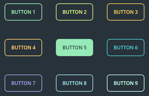
部分效果截图:
HTML代码(index.html):
<!doctype html>
<html lang="zh">
<head>
<meta charset="UTF-8">
<meta http-equiv="X-UA-Compatible" content="IE=edge,chrome=1">
<meta name="viewport" content="width=device-width, initial-scale=1.0">
<title>纯CSS3鼠标滑过彩色动画按钮</title>
<link rel="stylesheet" href="css/style.css">
</head>
<body>
<div class="zzsc-container">
	<button class="btn-1">Button 1</button>
	<button class="btn-2">Button 2</button>
	<button class="btn-3">Button 3</button><br>
	<button class="btn-4">Button 4</button>
	<button class="btn-5">Button 5</button>
	<button class="btn-6">Button 6</button><br>
	<button class="btn-7">Button 7</button>
	<button class="btn-8">Button 8</button>
	<button class="btn-9">Button 9</button>
</div>
</body>
</html>
CSS代码(style.css):
@import url(https://fonts.googleapis.com/css?family=Open+Sans:600);/***************/
/**************/
*{margin:0;padding:0;}
body{box-sizing:border-box;background-color:#27323A;text-align:center;}
button{margin:30px 20px;padding:15px 20px;border-radius:10px;border:2px solid;font:16px 'Open Sans',sans-serif;text-transform:uppercase;background:none;outline:none;cursor:pointer;-webkit-transition:all .5s;transition:all .5s;}
/* btn-1 */
.btn-1{color:#A3F7BF;border-color:#A3F7BF;background:-webkit-linear-gradient(left,#a3f7bf,#a3f7bf) no-repeat;background:linear-gradient(to right,#a3f7bf,#a3f7bf) no-repeat;background-size:0% 100%;}
.btn-1:hover{background-size:100% 100%;color:#27323A;}
/* btn-2 */
.btn-2{color:#E4F68F;border-color:#E4F68F;background:-webkit-linear-gradient(left,#e4f68f,#e4f68f) no-repeat;background:linear-gradient(to right,#e4f68f,#e4f68f) no-repeat;background-size:100% 0%;}
.btn-2:hover{background-size:100% 100%;color:#27323A;}
/* btn-3 */
.btn-3{color:#FFD460;border-color:#FFD460;position:relative;overflow:hidden;}
.btn-3:before{content:"";position:absolute;top:0;right:-5px;width:0;height:100%;background-color:#FFD460;z-index:-1;-webkit-transition:all .5s;transition:all .5s;}
.btn-3:hover{color:#27323A;}
.btn-3:hover:hover:before{width:110%;}
/* btn-4 */
.btn-4{color:#FFD478;border-color:#FFD478;position:relative;overflow:hidden;}
.btn-4:before{content:"";background-color:#FFD478;-webkit-transform:skew(45deg,0);transform:skew(45deg,0);width:0;height:100%;position:absolute;top:0px;left:-30px;z-index:-1;-webkit-transition:all .5s;transition:all .5s;}
.btn-4:hover{color:#27323A;}
.btn-4:hover:before{width:150%;}
/* btn-5 */
.btn-5{color:#96EAB7;border-color:#96EAB7;position:relative;overflow:hidden;}
.btn-5:before{content:"";position:absolute;bottom:0;left:-5px;width:110%;height:0;background-color:#96EAB7;z-index:-1;-webkit-transition:all .5s;transition:all .5s;}
.btn-5:hover{color:#27323A;}
.btn-5:hover:before{height:100%;}
/* btn-6 */
.btn-6{color:#53CDD8;border-color:#53CDD8;position:relative;overflow:hidden;}
.btn-6:before{content:"";background-color:#53CDD8;position:absolute;z-index:-1;top:0;right:-30px;height:100%;width:0;-webkit-transform:skew(45deg,0);transform:skew(45deg,0);-webkit-transition:all .5s;transition:all .5s;}
.btn-6:hover{color:#27323A;}
.btn-6:hover:before{width:150%;}
/* btn-7 */
.btn-7{color:#A6ACEC;border-color:#A6ACEC;overflow:hidden;position:relative;}
.btn-7:before,.btn-7:after{content:"";height:100%;width:0;position:absolute;z-index:-1;background-color:#A6ACEC;top:0;-webkit-transition:all 0.25s;transition:all 0.25s;}
.btn-7:before{left:0;}
.btn-7:after{right:0;}
.btn-7:hover{color:#27323A;}
.btn-7:hover:before,.btn-7:hover:after{width:50%;}
/* btn-8 */
.btn-8{color:#ACE7EF;border-color:#ACE7EF;overflow:hidden;position:relative;}
.btn-8:before,.btn-8:after{content:"";position:absolute;z-index:-1;height:100%;width:0;top:0;background-color:#ACE7EF;-webkit-transition:all .4s;transition:all .4s;}
.btn-8:before{left:-30px;-webkit-transform:skew(-45deg,0);transform:skew(-45deg,0);}
.btn-8:after{right:-30px;-webkit-transform:skew(-45deg,0);transform:skew(-45deg,0);}
.btn-8:hover{color:#27323A;}
.btn-8:hover:before,.btn-8:hover:after{width:80%;}
/* btn-9 */
.btn-9{color:#CEFFF1;border-color:#CEFFF1;overflow:hidden;position:relative;}
.btn-9:before,.btn-9:after{content:"";position:absolute;z-index:-1;background-color:#CEFFF1;width:100%;height:0;left:0;-webkit-transition:all .25s;transition:all .25s;}
.btn-9:before{bottom:50%;}
.btn-9:after{top:50%;}
.btn-9:hover{color:#27323A;}
.btn-9:hover:before,.btn-9:hover:after{height:50%;}


 分享到QQ
分享到QQ 分享到微博
分享到微博 微信扫一扫
微信扫一扫