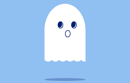
以下是 纯CSS3幽灵上下浮动动画特效代码 的示例演示效果:
部分效果截图:
HTML代码(index.html):
<!doctype html>
<html lang="en">
 <head>
  <meta charset="gb2312">
  <title>纯CSS3幽灵上下浮动动画特效</title>
  <style>
  *{padding:0;margin:0;}
	body{
		position:relative;
   	    background:#90C0F1;
	    overflow:hidden;
	}
	.ghost{
		width:160px;
		margin:100px auto;
		position:relative;
		animation:ghostUpdown 1s infinite alternate;
		-webkit-animation:ghostUpdown 1s infinite alternate;
	}
	.ghostBody{
		width:140px;
		height:180px;
		background:#fff;
		border-radius:100% 100% 0 0;
		position:relative;
	}
	.ghostEye{
		width:15px;
		height:20px;
		border-radius:100%;
		border:2px solid #061E74;
		background:#061E74;
		box-shadow:inset -2px -2px #fff;
		position:absolute;
		top:60px;
	}
	.left{left:45px}
	.right{right:50px;}
	.ghostMouth{
		width:15px;
		height:20px;
		border-radius:100%;
		border:2px solid #061E74;
		position:absolute;
		top:90px;
		left:70px;
	}
	.ghostWave{
		position:absolute;
		width: 140px;
		height: 20px;
		background-size:25px 20px;
		background-image:radial-gradient(circle at 50% 0%,#fff,71%,transparent 71%);
	}
	.shadow{
		width:140px;
		height:10px;
		border-radius:100%;
		background:#061E74;
		opacity:0.3;
		margin-top:70px;
		animation:shadow 1s infinite alternate;
		-webkit-animation:shadow 1s infinite alternate;
	}
	@keyframes ghostUpdown{
		from{margin-top:100px;}
		to{margin-top:70px;}
	}
	@-webkit-keyframes ghostUpdown{
		from{margin-top:100px;}
		to{margin-top:70px;}
	}
	@keyframes shadow{
		from{margin-top:70px;opacity:0.3;}
		to{margin-top:100px;opacity:0.1;}
	}
	@-webkit-keyframes shadow{
		from{margin-top:70px;opacity:0.3;}
		to{margin-top:100px;opacity:0.1;}
	}
  </style>
 </head>
 <body>
	<div class="ghost">
		<div class="ghostBody"></div>
		<div class="ghostEye left"></div>
		<div class="ghostEye right"></div>
		<div class="ghostMouth"></div>
		<div class="ghostWave"></div>
		<div class="shadow"></div>
	</div>
</body>
</html>


 分享到QQ
分享到QQ 分享到微博
分享到微博 微信扫一扫
微信扫一扫