以下是 纯CSS3带过渡动画效果分页条代码 的示例演示效果:
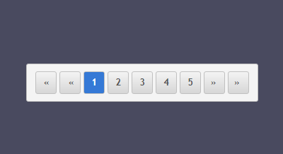
部分效果截图:
HTML代码(index.html):
<!doctype html>
<html lang="zh">
<head>
    <meta charset="UTF-8">
    <meta http-equiv="X-UA-Compatible" content="IE=edge,chrome=1">
    <meta name="viewport" content="width=device-width, initial-scale=1.0">
    <title>纯CSS3带过渡动画效果分页条代码</title>
    <link rel="stylesheet" type="text/css" href="css/htmleaf-demo.css">
    <link rel="stylesheet" href="css/style.css">
</head>
<body>
    <div class="wrapper">
        <section class="archive-pages">
            <ul>
                <li class="first"><a href="#" title="first page">first page</a></li>
                <li class="previous"><a href="#" title="previous page">previous page</a></li>
                <li class="selected">1</li>
                <li><a href="#" title="Pagina 2">2</a></li>
                <li><a href="#" title="Pagina 3">3</a></li>
                <li><a href="#" title="Pagina 4">4</a></li>
                <li><a href="#" title="Pagina 5">5</a></li>
                <li class="next"><a href="#" title="next page">next page</a></li>
                <li class="last"><a href="#" title="last page">last page</a></li>
            </ul>
        </section>
        <!--End-->
    </div>
</body>
</html>
CSS代码(style.css):
body{background:#494A5F;color:#D5D6E2;font-family:"Microsoft YaHei","瀹嬩綋","Segoe UI","Lucida Grande",Helvetica,Arial,sans-serif,FreeSans,Arimo;}
.wrapper{width:400px;min-height:400px;margin:100px auto;}
.archive-pages li a:hover{color:#000;}
.archive-pages li.selected{color:white;}
.archive-pages a,.archive-pages a:visited{color:#555;}
.archive-pages li.selected{color:white;padding:5px;width:18px;line-height:20px;background:rgb(53,121,214);background:-moz-radial-gradient(center,ellipse cover,rgba(53,121,214,1) 0%,rgba(53,121,214,1) 91%,rgba(27,85,157,1) 100%);background:-webkit-gradient(radial,center center,0px,center center,100%,color-stop(0%,rgba(53,121,214,1)),color-stop(91%,rgba(53,121,214,1)),color-stop(100%,rgba(27,85,157,1)));background:-webkit-radial-gradient(center,ellipse cover,rgba(53,121,214,1) 0%,rgba(53,121,214,1) 91%,rgba(27,85,157,1) 100%);background:-o-radial-gradient(center,ellipse cover,rgba(53,121,214,1) 0%,rgba(53,121,214,1) 91%,rgba(27,85,157,1) 100%);background:-ms-radial-gradient(center,ellipse cover,rgba(53,121,214,1) 0%,rgba(53,121,214,1) 91%,rgba(27,85,157,1) 100%);background:radial-gradient(ellipse at center,rgba(53,121,214,1) 0%,rgba(53,121,214,1) 91%,rgba(27,85,157,1) 100%);filter:progid:DXImageTransform.Microsoft.gradient( startColorstr='#3579d6',endColorstr='#1b559d',GradientType=1 );}
.archive-pages li.selected:hover{cursor:default;background:rgb(53,121,214);background:-moz-radial-gradient(center,ellipse cover,rgba(53,121,214,1) 0%,rgba(53,121,214,1) 91%,rgba(27,85,157,1) 100%);background:-webkit-gradient(radial,center center,0px,center center,100%,color-stop(0%,rgba(53,121,214,1)),color-stop(91%,rgba(53,121,214,1)),color-stop(100%,rgba(27,85,157,1)));background:-webkit-radial-gradient(center,ellipse cover,rgba(53,121,214,1) 0%,rgba(53,121,214,1) 91%,rgba(27,85,157,1) 100%);background:-o-radial-gradient(center,ellipse cover,rgba(53,121,214,1) 0%,rgba(53,121,214,1) 91%,rgba(27,85,157,1) 100%);background:-ms-radial-gradient(center,ellipse cover,rgba(53,121,214,1) 0%,rgba(53,121,214,1) 91%,rgba(27,85,157,1) 100%);background:radial-gradient(ellipse at center,rgba(53,121,214,1) 0%,rgba(53,121,214,1) 91%,rgba(27,85,157,1) 100%);filter:progid:DXImageTransform.Microsoft.gradient( startColorstr='#3579d6',endColorstr='#1b559d',GradientType=1 );}
.archive-pages li:hover{background:-moz-linear-gradient(top,rgba(255,255,255,0) 0%,rgba(196,196,196,1) 100%);background:-webkit-gradient(linear,left top,left bottom,color-stop(0%,rgba(255,255,255,0)),color-stop(100%,rgba(196,196,196,1)));background:-webkit-linear-gradient(top,rgba(255,255,255,0) 0%,rgba(196,196,196,1) 100%);background:-o-linear-gradient(top,rgba(255,255,255,0) 0%,rgba(196,196,196,1) 100%);background:-ms-linear-gradient(top,rgba(255,255,255,0) 0%,rgba(196,196,196,1) 100%);background:linear-gradient(to bottom,rgba(255,255,255,0) 0%,rgba(196,196,196,1) 100%);filter:progid:DXImageTransform.Microsoft.gradient( startColorstr='#00ffffff',endColorstr='#c4c4c4',GradientType=0 );}
.archive-pages li a{cursor:pointer;line-height:20px;display:block;padding:5px;float:left;width:18px;text-aling:center;}
.archive-pages{diaply:block;background-color:#f4f4f4;float:left;padding:0px;margin:0px;font-size:.8em;font-family:"Trebuchet MS",Arial,Helvetica,sans-serif;border:1px solid silver;border-radius:3px;-moz-border-radius:3px;-webkit-border-radius:3px;}
.archive-pages ul{float:left;margin:0px;padding:10px;list-style:none;}
.archive-pages li{border:1px solid silver;float:left;font-weight:700;margin:0 2px;text-align:center;border-radius:3px;-moz-border-radius:3px;-webkit-border-radius:3px;background:-moz-linear-gradient(top,rgba(255,255,255,0) 0%,rgba(214,214,214,1) 100%);background:-webkit-gradient(linear,left top,left bottom,color-stop(0%,rgba(255,255,255,0)),color-stop(100%,rgba(214,214,214,1)));background:-webkit-linear-gradient(top,rgba(255,255,255,0) 0%,rgba(214,214,214,1) 100%);background:-o-linear-gradient(top,rgba(255,255,255,0) 0%,rgba(214,214,214,1) 100%);background:-ms-linear-gradient(top,rgba(255,255,255,0) 0%,rgba(214,214,214,1) 100%);background:linear-gradient(to bottom,rgba(255,255,255,0) 0%,rgba(214,214,214,1) 100%);filter:progid:DXImageTransform.Microsoft.gradient( startColorstr='#00ffffff',endColorstr='#d6d6d6',GradientType=0 );}
.archive-pages .first a,.archive-pages .previous a,.archive-pages .next a,.archive-pages .last a{overflow:hidden;white-space:nowrap;-webkit-transition-duration:300ms;-webkit-transition-property:width,text-indent,letter-spacing;-webkit-transition-timing-function:ease;-moz-transition-duration:300ms;-moz-transition-property:width,text-indent,letter-spacing;-moz-transition-timing-function:ease;-o-transition-duration:300ms;-o-transition-property:width,text-indent,letter-spacing;-o-transition-timing-function:ease;transition-duration:300ms;transition-property:width,text-indent,letter-spacing;transition-timing-function:ease;}
.archive-pages a{text-decoration:none;}
.archive-pages .next a:after,.archive-pages .last a:after{content:" 禄";}
.archive-pages .first a:before,.archive-pages .previous a:before{content:'芦 '}
.archive-pages .first a:hover,.archive-pages .previous a:hover,.archive-pages .next a:hover,.archive-pages .last a:hover{width:100px;text-indent:0;letter-spacing:0px;}
.archive-pages .first a{text-indent:+6px;letter-spacing:10px;}
.archive-pages .previous a{text-indent:+7px;letter-spacing:10px;}
.archive-pages .next a{text-indent:-159px;letter-spacing:10px;}
.archive-pages .last a{text-indent:-154px;letter-spacing:10px;}


 分享到QQ
分享到QQ 分享到微博
分享到微博 微信扫一扫
微信扫一扫