以下是 纯CSS3夜晚天空月亮动画特效代码 的示例演示效果:
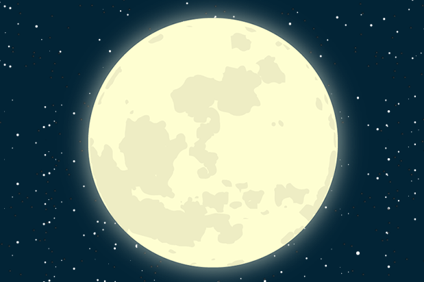
部分效果截图:
HTML代码(index.html):
<!doctype html>
<html>
<head>
<meta charset="gb2312">
<meta name="viewport" content="width=device-width, initial-scale=1.0">
<title>纯CSS3夜晚天空月亮动画特效</title>
<link type="text/css" href="css/main.css" rel="stylesheet">
<link type="text/css" href="css/0001245c2.css" rel="stylesheet">
</head>
<body>
<div id="e_background">
	<div id="e_smallstars"></div>
	<div id="e_moon"></div>
</div>
</body>
</html>
CSS代码(0001245c2.css):
body{position:relative}
#e_background{background:#022436 url(../img/e_stars.png) repeat 20% 20%;position:fixed;top:0;left:0;right:0;bottom:0;z-index:-100;-webkit-animation:stars-anim 600s infinite linear;-moz-animation:stars-anim 600s infinite linear;-o-animation:stars-anim 600s infinite linear;animation:stars-anim 600s infinite linear}
#e_smallstars{background:url(../img/smallstars.png) repeat 20% 20%;position:absolute;top:0;left:0;right:0;bottom:0;opacity:1;z-index:-50;-webkit-animation:light 4s infinite alternate;-moz-animation:light 4s infinite alternate;-o-animation:light 4s infinite alternate;animation:light 4s infinite alternate}
#e_moon{background:url(../img/e_moon2.png) no-repeat 35% 35%;position:absolute;top:0;left:0;right:0;bottom:0;opacity:1;z-index:-25;-webkit-animation:moon-anim 100s infinite linear;-moz-animation:moon-anim 100s infinite linear;-o-animation:moon-anim 100s infinite linear;animation:moon-anim 100s infinite linear}
@media only screen and (max-width:480px){#e_moon{background:url(../img/e_moon2_sm.png) no-repeat 35% 35%}
}
@media only screen and (min-width:481px) and (max-width:767px){#e_moon{background:url(../img/e_moon2_md.png) no-repeat 35% 35%}
}
@-webkit-keyframes moon-anim{from{background-position:0 2%}
to{background-position:110% 2%}
}
@-moz-keyframes moon-anim{from{background-position:0 2%}
to{background-position:110% 2%}
}
@-o-keyframes moon-anim{from{background-position:0 2%}
to{background-position:110% 2%}
}
@keyframes moon-anim{from{background-position:0 2%}
to{background-position:110% 2%}
}
@-webkit-keyframes stars-anim{from{background-position:5% 600%}
to{background-position:1300% 5%}
}
@-moz-keyframes stars-anim{from{background-position:5% 600%}
to{background-position:1300% 5%}
}
@-o-keyframes stars-anim{from{background-position:5% 600%}
to{background-position:1300% 5%}
}
@keyframes stars-anim{from{background-position:5% 600%}
to{background-position:1300% 5%}
}
@-webkit-keyframes light{0%{opacity:.1}
25%{opacity:.35}
50%{opacity:.95}
100%{opacity:.2}
}
@-moz-keyframes light{0%{opacity:.1}
25%{opacity:.35}
50%{opacity:.95}
100%{opacity:.2}
}
@-o-keyframes light{0%{opacity:.1}
25%{opacity:.35}
50%{opacity:.95}
100%{opacity:.2}
}
@keyframes light{0%{opacity:.1}
25%{opacity:.35}
50%{opacity:.95}
100%{opacity:.2}
}
CSS代码(main.css):
@charset "utf-8";@import url(http://fonts.useso.com/css?family=Play);/* Live Preview style */
/* you donot need this style for your background */
html,body,div,section,article,aside,header,hgroup,footer,nav,h1,h2,h3,h4,h5,h6,p,blockquote,address,time,span,em,strong,img,ol,ul,li,figure,canvas,video,th,td,tr{margin:0;padding:0;border:0;font:inherit;}
body{width:60%;margin:5% auto;font-family:'Play',sans-serif;}
#content{background-color:rgba(255,255,255,.5);width:70%;height:100%;padding:5%;border-radius:25px;margin:5% auto;}
#content > p{width:90%;padding:10px 5px;margin:0 auto;text-align:center;}
#content h1{color:#cc0;font-size:1.4em;font-weight:bold;width:90%;padding:5px 2.5%;margin:5px auto;text-align:center;}
#content p{color:black;padding:5px;margin:5px;}
/* -------------------- Mobile Style -------------------- */
@media only screen and (max-width:480px){body{width:90%;}
#content{width:90%;}
}
/* -------------------- Tablet Style -------------------- */
@media only screen and (min-width:481px) and (max-width:767px){body{width:80%;}
#content{width:85%;}
}
.btn{color:#ccf;display:inline-block;padding:6px 12px;margin-bottom:0;font-size:20px;font-weight:normal;line-height:1.42857143;text-align:center;white-space:nowrap;vertical-align:middle;-ms-touch-action:manipulation;touch-action:manipulation;cursor:pointer;-webkit-user-select:none;-moz-user-select:none;-ms-user-select:none;user-select:none;background-image:none;border:1px solid transparent;border-radius:4px;text-decoration:none;}
.btn:focus,.btn:active:focus,.btn.active:focus,.btn.focus,.btn:active.focus,.btn.active.focus{outline:thin dotted;outline:5px auto -webkit-focus-ring-color;outline-offset:-2px;color:firebrick;}
.btn:hover,.btn:focus,.btn.focus{color:#333;text-decoration:none;}
.btn:active,.btn.active{background-image:none;outline:0;-webkit-box-shadow:inset 0 3px 5px rgba(0,0,0,.125);box-shadow:inset 0 3px 5px rgba(0,0,0,.125);}


 分享到QQ
分享到QQ 分享到微博
分享到微博 微信扫一扫
微信扫一扫