以下是 纯CSS3创意Loading加载动画代码 的示例演示效果:
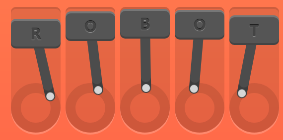
部分效果截图:
HTML代码(index.html):
<!DOCTYPE html>
<html>

<head>
    <meta charset="UTF-8">
    <title>纯CSS3创意Loading加载动画</title>
    <link rel="stylesheet" href="css/style.css" media="screen" type="text/css" />
</head>

<body>
    <div id="robot">
        <div class="piston">
            <div class="rotator"></div>
            <div class="block">
                R
                <div class="arm"></div>
            </div>
        </div>
        <div class="piston">
            <div class="rotator"></div>
            <div class="block">
                O
                <div class="arm"></div>
            </div>
        </div>
        <div class="piston">
            <div class="rotator"></div>
            <div class="block">
                B
                <div class="arm"></div>
            </div>
        </div>
        <div class="piston">
            <div class="rotator"></div>
            <div class="block">
                O
                <div class="arm"></div>
            </div>
        </div>
        <div class="piston">
            <div class="rotator"></div>
            <div class="block">
                T
                <div class="arm"></div>
            </div>
        </div>
    </div>
</body>
</html>
CSS代码(style.css):
@-webkit-keyframes piston{0%{margin-top:0;}
50%{margin-top:80px;}
100%{margin-top:0;}
}
@keyframes piston{0%{margin-top:0;}
50%{margin-top:80px;}
100%{margin-top:0;}
}
@-webkit-keyframes arm{0%{-webkit-transform:rotate(0);}
25%{-webkit-transform:rotate(-18deg);}
50%{-webkit-transform:rotate(0);}
75%{-webkit-transform:rotate(18deg);}
100%{-webkit-transform:rotate(0);}
}
@keyframes arm{0%{transform:rotate(0);}
25%{transform:rotate(-18deg);}
50%{transform:rotate(0);}
75%{transform:rotate(18deg);}
100%{transform:rotate(0);}
}
html{height:100%;}
body{margin:60px 0 0;text-align:center;background:linear-gradient(to bottom,coral,tomato);}
#robot{position:absolute;top:50%;left:50%;width:540px;height:250px;margin-top:-125px;margin-left:-270px;font-family:'Oswald',sans-serif;font-size:30px;font-weight:700;color:#444;text-shadow:0px -1px 1px rgba(0,0,0,.7),0px 1px 1px rgba(255,255,255,.4);}
.piston{float:left;margin-right:10px;position:relative;width:100px;height:250px;background:rgba(0,0,0,.1);border-radius:10px 10px 50px 50px;box-shadow:0 -4px 0 rgba(0,0,0,.2),0 4px 0 rgba(255,255,255,.2);}
.piston:last-child{margin:0;}
.piston .block{position:relative;width:100px;height:60px;line-height:60px;background:#555;border-radius:10px;-webkit-animation:piston 1.2s cubic-bezier(.5,0,.5,1) infinite;animation:piston 1.2s cubic-bezier(.5,0,.5,1) infinite;box-shadow:inset 0 -4px 0 rgba(0,0,0,.2),inset 0 4px 0 rgba(255,255,255,.2);}
.piston:nth-child(1) .block{-webkit-animation-delay:0s;animation-delay:0s;}
.piston:nth-child(2) .block{-webkit-animation-delay:.1s;animation-delay:.1s;}
.piston:nth-child(3) .block{-webkit-animation-delay:.2s;animation-delay:.2s;}
.piston:nth-child(4) .block{-webkit-animation-delay:.3s;animation-delay:.3s;}
.piston:nth-child(5) .block{-webkit-animation-delay:.4s;animation-delay:.4s;}
.piston .arm{position:absolute;top:50%;left:50%;margin:-10px 0 0 -10px;width:20px;height:150px;background:#555;border-radius:10px;box-shadow:inset 0 -22px 0 rgba(0,0,0,.2);z-index:-1;-webkit-transform-origin:center 10px;-webkit-animation:arm 1.2s linear infinite;-webkit-animation-delay:inherit;transform-origin:center 10px;animation:arm 1.2s linear infinite;animation-delay:inherit;}
.piston .arm:before,.piston .arm:after{content:'';position:absolute;right:0;left:0;height:16px;background:#eee;border-radius:50%;margin:2px;}
.piston .arm:before{top:0;}
.piston .arm:after{bottom:0;}
.piston .rotator{position:absolute;bottom:0;width:100px;height:100px;border-radius:10px;border-radius:50%;border:20px solid rgba(0,0,0,.1);box-sizing:border-box;z-index:-1;}


 分享到QQ
分享到QQ 分享到微博
分享到微博 微信扫一扫
微信扫一扫