以下是 纯CSS3实现按钮动画效果代码 的示例演示效果:
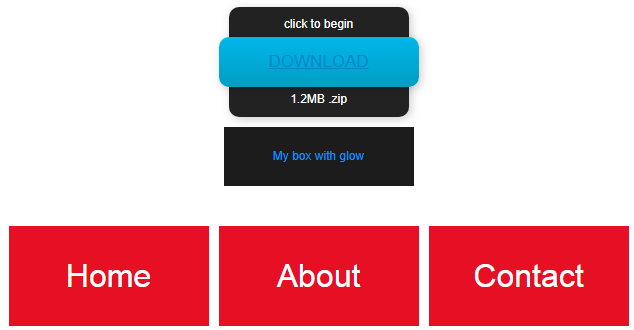
部分效果截图:
HTML代码(index.html):
<!DOCTYPE html PUBLIC "-//W3C//DTD XHTML 1.0 Transitional//EN" "http://www.w3.org/TR/xhtml1/DTD/xhtml1-transitional.dtd">
<html xmlns="http://www.w3.org/1999/xhtml">
<head>
<meta http-equiv="Content-Type" content="text/html; charset=utf-8" />
<title>纯CSS3实现按钮动画效果代码</title>
<style type="text/css">
* {
	padding: 0;
	margin: 0;
}
a{
	transition-duration:0.4s, 0.5s;
	transition-property:background-color, color;
	transition-timing-function:ease, ease;
}
body{font-family:Arial;}

/*********************************button 01********************************/
.button01 {
  width: 200px;
  margin: 150px auto 20px auto;
}

.button01 a {
  display: block;
  height: 50px;
  width: 200px;

  /*TYPE*/
  color: white;
  font: 17px/50px Helvetica, Verdana, sans-serif;
  text-decoration: none;
  text-align: center;
  text-transform: uppercase;

  /*GRADIENT*/
  background: #00b7ea; /* Old browsers */
  background: -moz-linear-gradient(top, #00b7ea 0%, #009ec3 100%); /* FF3.6+ */
  background: -webkit-gradient(linear, left top, left bottom, color-stop(0%,#00b7ea), color-stop(100%,#009ec3)); /* Chrome,Safari4+ */
  background: -webkit-linear-gradient(top, #00b7ea 0%,#009ec3 100%); /* Chrome10+,Safari5.1+ */
  background: -o-linear-gradient(top, #00b7ea 0%,#009ec3 100%); /* Opera 11.10+ */
  background: -ms-linear-gradient(top, #00b7ea 0%,#009ec3 100%); /* IE10+ */
  background: linear-gradient(top, #00b7ea 0%,#009ec3 100%); /* W3C */
  filter: progid:DXImageTransform.Microsoft.gradient( startColorstr='#00b7ea', endColorstr='#009ec3',GradientType=0 ); /* IE6-9 */
}

.button01 a, p {
    -webkit-border-radius: 10px;
     -moz-border-radius: 10px;
          border-radius: 10px;

  -webkit-box-shadow: 2px 2px 8px rgba(0,0,0,0.2);
     -moz-box-shadow: 2px 2px 8px rgba(0,0,0,0.2);
          box-shadow: 2px 2px 8px rgba(0,0,0,0.2);
}

p {
  background: #222;
  display: block;
  height: 40px;
  width: 180px;
  margin: -50px 0 0 10px;

  /*TYPE*/
  text-align: center;
  font: 12px/45px Helvetica, Verdana, sans-serif;
  color: #fff;

  /*POSITION*/
  position: absolute;
  z-index: -1;

  /*TRANSITION*/
  -webkit-transition: margin 0.5s ease;
     -moz-transition: margin 0.5s ease;
       -o-transition: margin 0.5s ease;
      -ms-transition: margin 0.5s ease;
          transition: margin 0.5s ease;
}

/*HOVER*/
.button01:hover .bottom {
  margin: -10px 0 0 10px;
}

.button01:hover .top {
  margin: -80px 0 0 10px;
  line-height: 35px;
}

/*ACTIVE*/
.button01 a:active {
	  background: #00b7ea; /* Old browsers */
	  background: -moz-linear-gradient(top,  #00b7ea 36%, #009ec3 100%); /* FF3.6+ */
	  background: -webkit-gradient(linear, left top, left bottom, color-stop(36%,#00b7ea), color-stop(100%,#009ec3)); /* Chrome,Safari4+ */
	  background: -webkit-linear-gradient(top,  #00b7ea 36%,#009ec3 100%); /* Chrome10+,Safari5.1+ */
	  background: -o-linear-gradient(top,  #00b7ea 36%,#009ec3 100%); /* Opera 11.10+ */
	  background: -ms-linear-gradient(top,  #00b7ea 36%,#009ec3 100%); /* IE10+ */
	  background: linear-gradient(top,  #00b7ea 36%,#009ec3 100%); /* W3C */
	  filter: progid:DXImageTransform.Microsoft.gradient( startColorstr='#00b7ea', endColorstr='#009ec3',GradientType=0 ); /* IE6-9 */

}

.button01:active .bottom {
  margin: -20px 0 0 10px;
}

.button01:active .top {
  margin: -70px 0 0 10px;
}
/*****************************button 01**********************************/
/*****************************button 02*****************************/
div.button02{

	color: #333;
	font-size: 12px;
	line-height: 1.64;
	margin:0 auto ;
}
.box {
	background: #1c1c1c;
	color: #0099ff;
	cursor: pointer;
	display: block;
	margin: 40px auto;
	padding: 20px;
	text-align: center;
	width: 150px;
	transition:all 1s ease-out;
	-webkit-transition: -webkit-box-shadow 0.5s ease-out;
	-moz-transition: -moz-box-shadow 0.5s ease-out;
	-o-transition: box-shadow 0.5s ease-out;
}
.box:hover {
	-moz-box-shadow: 0px 0px 15px #0099ff;
	-webkit-box-shadow: 0px 0px 15px #0099ff;
	 box-shadow: 0px 0px 15px #0099ff;
}
a:hover {
	color: #0088CC;
	text-decoration: underline;
}
/*********************************end  button02***********************/

/*********************************button03***********************************/

#menu {
	height: 100px; width: 630px;
    overflow: hidden;
    margin: 40px auto;
    text-align: center;
}

#menu ul li {
	float: left;
	margin: 0 5px;
	list-style-type: none;
}

/* Menu Link Styles */
#menu ul a {
	display: block;
	background: #e70f23; color: #fff;
	height: 100px; width: 200px;
	font: lighter 2em/100px "Helvetica Neue", Arial, Helvetica, Geneva, sans-serif;
	text-decoration: none;

	-webkit-transition: margin .4s ease-in-out;
	-moz-transition: margin .4s ease-in-out;
	-o-transition: margin .4s ease-in-out;
	-ms-transition: margin .4s ease-in-out;
	transition: margin .4s ease-in-out;
}

/* Secondary Link Styles */
#menu ul a:nth-of-type(even) {
	background: #000;
	color: white;
}

/* Hover Slide */
#menu ul li:hover :first-child {
	margin-top: -100px;
}
/***********************************end button03***********************************/

/***********************************button04***********************************/
#navigationMenu li{
	list-style:none;
	height:39px;
	padding:2px;
	width:40px;
}

#navigationMenu span{
	/* Container properties */
	width:0;
	left:38px;
	padding:0;
	position:absolute;
	overflow:hidden;

	/* Text properties */
	font-family:'Myriad Pro',Arial, Helvetica, sans-serif;
	font-size:18px;
	font-weight:bold;
	letter-spacing:0.6px;
	white-space:nowrap;
	line-height:39px;

	/* CSS3 Transition: */
	-webkit-transition: 0.25s;
	/*-o-transition: 0.25s;*/

	/* Future proofing (these do not work yet): */
	-moz-transition: 0.25s;
	transition: 0.25s;
}

#navigationMenu a{
	background:#C30;

	height:39px;
	width:38px;
	display:block;
	position:relative;
}

/* General hover styles */

#navigationMenu a:hover span{ width:auto; padding:0 20px;overflow:visible; }
#navigationMenu a:hover{
	text-decoration:none;

	/* CSS outer glow with the box-shadow property */
	-moz-box-shadow:0 0 5px #9ddff5;
	-webkit-box-shadow:0 0 5px #9ddff5;
	box-shadow:0 0 5px #9ddff5;
}

/* Green Button */

#navigationMenu .home {}
#navigationMenu .home:hover {	background-position:0 -39px;}
#navigationMenu .home span{
	background-color:#7da315;
	color:#3d4f0c;
	text-shadow:1px 1px 0 #99bf31;
}

/* Blue Button */

#navigationMenu .about { }
#navigationMenu .about:hover { background-position:-38px -39px;}
#navigationMenu .about span{
	background-color:#1e8bb4;
	color:#223a44;
	text-shadow:1px 1px 0 #44a8d0;
}

/* Orange Button */

#navigationMenu .services { }
#navigationMenu .services:hover { background-position:-76px -39px;}
#navigationMenu .services span{
	background-color:#c86c1f;
	color:#5a3517;
	text-shadow:1px 1px 0 #d28344;
}

/* Yellow Button */

#navigationMenu .portfolio {}
#navigationMenu .portfolio:hover{ background-position:-114px -39px;}
#navigationMenu .portfolio span{
	background-color:#d0a525;
	color:#604e18;
	text-shadow:1px 1px 0 #d8b54b;
}

/* Purple Button */

#navigationMenu .contact { }
#navigationMenu .contact:hover { background-position:-152px -39px;}
#navigationMenu .contact span{
	background-color:#af1e83;
	color:#460f35;
	text-shadow:1px 1px 0 #d244a6;
}

/* The styles below are only needed for the demo page */

#main{
	margin:40px auto;
	position:relative;
	width:40px;
}

/***********************end button04***************************/

/***********************button05*****************************/
#container {
	width: 450px;
	height: 200px;
	margin:40px auto;
}

.button05 {
	position: relative;
	display: inline-block;

	min-width: 150px;
	padding: 10px 15px;
	margin: 0px 10px;

	background-color: #3E9ED6;
	background-image: -webkit-gradient(
		linear,
		left top,
		left bottom,
		color-stop(0, rgb(112,181,242)),
		color-stop(0.49, rgb(84,164,238)),
		color-stop(0.5, rgb(54,144,240)),
		color-stop(1, rgb(26,97,219))
	);
	background-image: -moz-linear-gradient(
		center top,
		rgb(112,181,242) 0%,
		rgb(84,164,238) 49%,
		rgb(54,144,240) 50%,
		rgb(26,97,219) 100%
	);


	color: #fff;
	font-weight: bold;
	font-size: 24px;
	text-decoration: none;
	text-align: center;
	line-height: 1;
	text-shadow: 0px -1px 0px rgba(0,0,0,0.5);

	border: 1px solid;
	border-color: #2f71a3 #265a82 #1e4766 #265a82;
	border-radius: 8px;
	-moz-border-radius: 8px;
	-webkit-border-radius: 8px;

	box-shadow: 		inset 0px -4px 5px rgba(255,255,255,0.2),
						inset 0px 1px 5px rgba(255,255,255,0.2),
						/**/
						0px 2px 0px #1e4766,
						0px 4px 0px #1e4766,
						0px 6px 0px #1e4766,
						/**/
						0px 8px 5px rgba(0,0,0,0.5);

	-moz-box-shadow: 	inset 0px -4px 5px rgba(255,255,255,0.2),
						inset 0px 1px 5px rgba(255,255,255,0.2),
						/**/
						0px 2px 0px #1e4766,
						0px 4px 0px #1e4766,
						0px 6px 0px #1e4766,
						/**/
						0px 8px 5px rgba(0,0,0,0.5);

	-webkit-box-shadow: inset 0px -4px 5px rgba(255,255,255,0.2),
						inset 0px 1px 5px rgba(255,255,255,0.2),
						/**/
						0px 2px 0px #1e4766,
						0px 4px 0px #1e4766,
						0px 6px 0px #1e4766,
						/**/
						0px 8px 5px rgba(0,0,0,0.5);
}

.button05:hover {
	background-color: #8AC5FD;

	background-image: -webkit-gradient(
		linear,
		left top,
		left bottom,
		color-stop(0, rgb(134,193,253)),
		color-stop(0.49, rgb(153,213,255)),
		color-stop(0.5, rgb(130,194,253)),
		color-stop(1, rgb(108,170,229))
	);
	background-image: -moz-linear-gradient(
		center top,
		rgb(134,193,253) 0%,
		rgb(153,213,255) 49%,
		rgb(130,194,253) 50%,
		rgb(108,170,229) 100%
	);
}

.button05:active {
	top: 4px;
	box-shadow: 		inset 0px 4px 5px rgba(255,255,255,0.4),
						inset 0px -1px 5px rgba(255,255,255,0.2),
						/**/
						0px 2px 0px #1e4766,
						/**/
						0px 4px 5px rgba(0,0,0,0.5);

	-moz-box-shadow: 	inset 0px 4px 5px rgba(255,255,255,0.4),
						inset 0px -1px 5px rgba(255,255,255,0.2),
						/**/
						0px 2px 0px #1e4766,
						/**/
						0px 4px 5px rgba(0,0,0,0.5);

	-webkit-box-shadow: inset 0px 4px 5px rgba(255,255,255,0.4),
						inset 0px -1px 5px rgba(255,255,255,0.2),
						/**/
						0px 2px 0px #1e4766,
						/**/
						0px 4px 5px rgba(0,0,0,0.5);
}

/***********************end button05*****************************/
</style>
</head>

<body>
<!--button01-->
<div class="button01">
      <a href="#">Download</a>
      <p class="top">click to begin</p>
      <p class="bottom">1.2MB .zip</p>
    </div>
<!--button01-->

<!--button--02-->
<div class="button02"><a class="box">My box with glow</a></div>
<!--end button02-->

<!--button03-->
<div id="menu">
    <ul>
        <li><a href="#">Home</a><a href="#">See Us</a></li>
        <li><a href="#">About</a><a href="#">Meet Us</a></li>
        <li><a href="#">Contact</a><a href="#">Email Us</a></li>
    </ul>
</div>
<!--end button03-->

<!--button04-->
<div id="main">

<ul id="navigationMenu">
    <li>
	    <a class="home" href="#">
            <span>Home</span>
        </a>
    </li>

    <li>
    	<a class="about" href="#">
            <span>About</span>
        </a>
    </li>

    <li>
	     <a class="services" href="#">
            <span>Services</span>
         </a>
    </li>

    <li>
    	<a class="portfolio" href="#">
            <span>Portfolio</span>
        </a>
    </li>

    <li>
    	<a class="contact" href="#">
            <span>Contact us</span>
        </a>
    </li>
</ul>

</div>
<!---end button04-->

<!---button05-->
<div id="container">
	<a href="#nogo" class="button05">Login ►</a>
	<a href="#nogo" class="button05">Register ♥</a>
</div>
<!---end button05-->
</body>
</html>


 分享到QQ
分享到QQ 分享到微博
分享到微博 微信扫一扫
微信扫一扫