以下是 css3图文切换菜单特效代码 的示例演示效果:
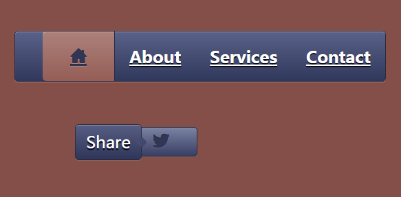
部分效果截图:
HTML代码(index.html):
<!DOCTYPE HTML>
<html lang="en-US">
<head>
<meta http-equiv="Content-Type" content="text/html; charset=UTF-8">
<title>css3图文切换菜单</title>
<link rel="stylesheet" type="text/css" href="css/base.css" media="all" />
<style>
body{
background:#844f48;
}
.demo{
width:600px;
margin:40px auto 0;
}
.uiTabs{
display:table;
font-weight:bold;
text-shadow:0 2px 0 rgba(0,0,0,.8);
border:1px solid #272b43;
border-radius:5px;
box-shadow:0 1px 0 #ad847f,0 1px 0 rgba(255,255,255,.5) inset;
background:-webkit-linear-gradient(top,#5b6289,#30385c);
background:-moz-linear-gradient(top,#5b6289,#30385c);
background:-ms-linear-gradient(top,#5b6289,#30385c);
background:-o-linear-gradient(top,#5b6289,#30385c);
background:linear-gradient(top,#5b6289,#30385c);
}
.uiTabs li{
display:inline-block;
font-size:24px;
}
.uiTabs a{
display:block;
color:#fff;
padding:0 15px;
margin:0 5px;
height:70px;
line-height:70px;
border-left:1px solid transparent;
border-right:1px solid transparent;
}
.uiTabs a:hover{
color:#fff;
text-decoration:none;
margin:10 0px;
height:52px;
line-height:52px;
border-radius:5px;
border:1px solid #262a42;
box-shadow:0 1px 0 #4d5373,0 1px 3px #151724 inset;
background: -webkit-linear-gradient(top,#313654,#2f3451);
background: -moz-linear-gradient(top,#313654,#2f3451);
background: -ms-linear-gradient(top,#313654,#2f3451);
background: -o-linear-gradient(top,#313654,#2f3451);
background: linear-gradient(top,#313654,#2f3451);
}
.uiTabs li a.active,.uiTabs li a.active:hover{
font-family: 'icomoon';
speak: none;
font-weight: normal;
-webkit-font-smoothing: antialiased;
color:#313654;
text-shadow:0 -1px 0 #312c3a,0 1px 0 #af8580;
margin:0;
height:72px;
line-height:72px;
padding: 0 40px;
border:none;
border-radius:0;
border-left:1px solid #292d46;
border-right:1px solid #292d46;
box-shadow:0 1px 0 rgba(255,255,255,.5) inset;
background:-webkit-linear-gradient(top,#ac827b,#955e57);
background:-moz-linear-gradient(top,#ac827b,#955e57);
background:-ms-linear-gradient(top,#ac827b,#955e57);
background:-o-linear-gradient(top,#ac827b,#955e57);
background:linear-gradient(top,#ac827b,#955e57);
}
.uiTabs li:first-child a.active{
border-radius:5px 0 0 5px;
border-left:none;
}
.uiTabs li:last-child a.active{
border-radius:0 5px 5px 0;
border-right:none;
}
.uiButton li{
margin:50px 0 0 30px;
letter-spacing:0;
word-spacing:0;
font-size:24px;
position: relative;
display:inline-block;
font-size:24px;
line-height:40px;
margin-left:120px;
border-radius:5px;
border:1px solid #272b43;
box-shadow:0 1px 0 #878ca7 inset,0 1px 0 #8c6a65;
background:-webkit-linear-gradient(top,#575e83,#2f3659);
background:-moz-linear-gradient(top,#575e83,#2f3659);
background:-ms-linear-gradient(top,#575e83,#2f3659);
background:-o-linear-gradient(top,#575e83,#2f3659);
background:linear-gradient(top,#575e83,#2f3659);
}
.uiButton li:after{
display:inline-block;
font-family: 'icomoon';
speak: none;
font-weight: normal;
-webkit-font-smoothing: antialiased;
content:"\22";
color:#313654;
text-shadow:0 -1px 0 #1f2335,0 1px 0 #5d6384;
padding:0 40px;
}
.uiButton li:hover{
background:-webkit-linear-gradient(top,#7c84a4,#383f64);
background:-moz-linear-gradient(top,#7c84a4,#383f64);
background:-ms-linear-gradient(top,#7c84a4,#383f64);
background:-o-linear-gradient(top,#7c84a4,#383f64);
background:linear-gradient(top,#7c84a4,#383f64);
}
.uiButton li:active{
border:1px solid #1b1d2b;
box-shadow:0 1px 3px #1c1f31 inset;
background:-webkit-linear-gradient(top,#2d314c,#303553);
background:-moz-linear-gradient(top,#2d314c,#303553);
background:-ms-linear-gradient(top,#2d314c,#303553);
background:-o-linear-gradient(top,#2d314c,#303553);
background:linear-gradient(top,#2d314c,#303553);
}
.uiButton li:active:after{
color:#464f79;
text-shadow:0 -1px 0 #767c98,0 3px 5px #24293e;
}
.uiButton li span{
display: none;
position: absolute;
top:-5px;
left:-70%;
padding: 0 15px;
line-height: 50px;
color: #fff;
text-shadow:0 3px 0 rgba(0,0,0,.8);
border-radius:5px;
border:1px solid #272b43;
box-shadow:0 1px 0 #878ca7 inset,0 1px 0 #8c6a65;
background:-webkit-linear-gradient(top,#575e83,#2f3659);
background:-moz-linear-gradient(top,#575e83,#2f3659);
background:-ms-linear-gradient(top,#575e83,#2f3659);
background:-o-linear-gradient(top,#575e83,#2f3659);
background:linear-gradient(top,#575e83,#2f3659);
}
.uiButton li:hover span{
display: block;
}
.uiButton li span:after{
display: block;
content:'';
position: absolute;
top:50%;
margin-top: -5px;
right:-5px;
width: 10px;
height: 10px;
box-shadow: 0 1px 0 #272b43,1px 0 0 #272b43;
background:-webkit-linear-gradient(top left,#484f74,#3e4568);
background:-moz-linear-gradient(top left,#484f74,#3e4568);
background:-ms-linear-gradient(top left,#484f74,#3e4568);
background:-o-linear-gradient(top left,#484f74,#3e4568);
background:linear-gradient(top left,#484f74,#3e4568);
-webkit-transform:rotate(-45deg);
-moz-transform:rotate(-45deg);
-ms-transform:rotate(-45deg);
-o-transform:rotate(-45deg);
transform:rotate(-45deg);
}
@font-face {
font-family: 'icomoon';
src:url('fonts/icomoon.eot');
src:url('fonts/icomoon.eot?#iefix') format('embedded-opentype'),
url('fonts/icomoon.svg#icomoon') format('svg'),
url('fonts/icomoon.woff') format('woff'),
url('fonts/icomoon.ttf') format('truetype');
font-weight: normal;
font-style: normal;
}
</style>
<script>
window.onload=function(){
var oUlTabs=document.getElementById('uiTabs');
var aA=oUlTabs.getElementsByTagName('a');
var aConent_icon=new Array('!',''','&','(');
var aConent_letter=new Array('Home','About','Services','Contact');
for(var i=0;i<aA.length;i++){
var content = window.getComputedStyle(aA[i], ":after").getPropertyValue("content");
aA[i].innerHTML='';
aA[0].innerHTML=(content=aConent_icon[0]);
content=aConent_letter[i];
aA[i].innerHTML=content;
aA[i].index=i;
aA[i].onclick=function(){
for(var i=0;i<aA.length;i++){
aA[i].className='';
content=aConent_letter[i];
aA[i].innerHTML=content;
}
this.className='active';
aA[this.index].innerHTML=(content=aConent_icon[this.index]);
}
}
}
</script>
</head>
<body>
<div class="page">
<header id="header">
<hgrounp class="white">
<h1></h1>
<h2><h2>
</hgrounp>
</header>
<section class="demo">
<ul class="uiTabs" id="uiTabs">
<li><a href="#" class="active">Home</a></li>
<li><a href="#">About</a></li>
<li><a href="#">Services</a></li>
<li><a href="#">Contact</a></li>
</ul>
<ul class="uiButton">
<li><a href="#"><span>Share</span></a></li>
</ul>
</section>
</div>
</body>
</html>
CSS代码(base.css):
@charset "utf-8";@import url("http://www.w3cplus.com/download/reset.css");/* ------------------------------------------------- * common * -------------------------------------------------*/
.page{text-align:left;padding-top:40px;}
.wrap_top_nav{background-color:#333;box-shadow:0 1px 3px rgba(0,0,0,0.25),0 -1px 0 rgba(0,0,0,0.1) inset;height:40px;}
#top_nav{width:1000px;margin:0 auto;position:relative;}
#top_nav a{font-size:16px;line-height:40px;float:left;margin-right:20px;color:#999;text-decoration:none;}
#top_nav a:hover{color:#fff;}
#top_nav li:nth-child(1) a{background-image:url(http://www.w3cplus.com/sites/all/themes/marvin/logo.png);background-position:0 -12px;background-repeat:no-repeat;background-size:68px 60px;padding-left:74px;color:#fff;width:74px;overflow:hidden;}
#read{position:absolute;right:0;top:0;font-family:'����';}
#header{text-align:center;}
#header .white{color:#fff;}
#header .blank{color:#444;}
#header h1{font-size:24px;}
#header h2{font-weight:normal;}
#ad_w3cplus{width:750px;margin:100px auto;text-align:center;}
#ad_w3cplus .grid-ad{float:left;}


 分享到QQ
分享到QQ 分享到微博
分享到微博 微信扫一扫
微信扫一扫