以下是 jQuery自适应窗口大小图片排列代码 的示例演示效果:
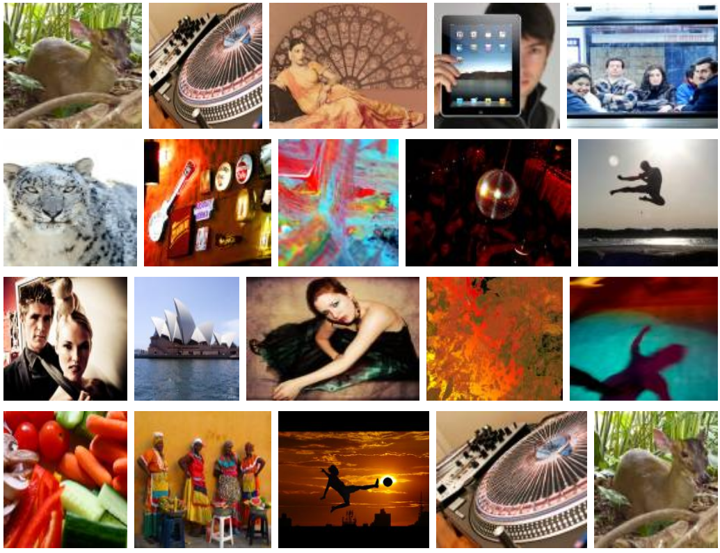
部分效果截图:
HTML代码(index.html):
<!doctype html>
<html lang="en">
<head>
<meta charset="gb2312">
<title>jQuery自适应窗口大小图片排列代码</title>

<style>
.container:before,
.container:after {
	content: "";
	display: table;
}
.container:after {
	clear: both;
}
.item {
  float: left;
  margin-bottom: 15px;
}
.item img {
  max-width: 100%;
  max-height: 100%;
  vertical-align: bottom;
}
.first-item {
  clear: both;
}
.last-row, .last-row ~ .item {
  margin-bottom: 0;
}
</style>

<script src="js/jquery.min.js"></script>
<script src="js/jquery.row-grid.js"></script>
<script>
$(document).ready(function(){
  $(".container").rowGrid({itemSelector: ".item", minMargin: 10, maxMargin: 25, firstItemClass: "first-item"});
});
</script>

</head>
<body>

<div class="container">
	<div class="item">
	<img src="images/2.jpg" width="220" height="200" />
	</div>
	<div class="item">
	<img src="images/1.jpg" width="180" height="200" />
	</div>
	<div class="item">
	<img src="images/3.jpg" width="250" height="200" />
	</div>
	<div class="item">
	<img src="images/4.jpg" width="200" height="200" />
	</div>
	<div class="item">
	<img src="images/5.jpg" width="240" height="200" />
	</div>
	<div class="item">
	<img src="images/6.jpg" width="210" height="200" />
	</div>
	<div class="item">
	<img src="images/7.jpg" width="200" height="200" />
	</div>
	<div class="item">
	<img src="images/8.jpg" width="190" height="200" />
	</div>
	<div class="item">
	<img src="images/9.jpg" width="260" height="200" />
	</div>
	<div class="item">
	<img src="images/10.jpg" width="220" height="200" />
	</div>
	<div class="item">
	<img src="images/11.jpg" width="200" height="200" />
	</div>
	<div class="item">
	<img src="images/12.jpg" width="170" height="200" />
	</div>
	<div class="item">
	<img src="images/13.jpg" width="280" height="200" />
	</div>
	<div class="item">
	<img src="images/14.jpg" width="220" height="200" />
	</div>
	<div class="item">
	<img src="images/15.jpg" width="240" height="200" />
	</div>
	<div class="item">
	<img src="images/16.jpg" width="180" height="200" />
	</div>
	<div class="item">
	<img src="images/17.jpg" width="200" height="200" />
	</div>
	<div class="item">
	<img src="images/22.jpg" width="220" height="200" />
	</div>
	<div class="item">
	<img src="images/1.jpg" width="220" height="200" />
	</div>
	<div class="item">
	<img src="images/2.jpg" width="180" height="200" />
	</div>
	<div class="item">
	<img src="images/3.jpg" width="250" height="200" />
	</div>
	<div class="item">
	<img src="images/4.jpg" width="200" height="200" />
	</div>
	<div class="item">
	<img src="images/5.jpg" width="240" height="200" />
	</div>
	<div class="item">
	<img src="images/6.jpg" width="210" height="200" />
	</div>
	<div class="item">
	<img src="images/7.jpg" width="200" height="200" />
	</div>
	<div class="item">
	<img src="images/8.jpg" width="190" height="200" />
	</div>
	<div class="item">
	<img src="images/9.jpg" width="260" height="200" />
	</div>
	<div class="item">
	<img src="images/10.jpg" width="220" height="200" />
	</div>
	<div class="item">
	<img src="images/11.jpg" width="200" height="200" />
	</div>
	<div class="item">
	<img src="images/12.jpg" width="170" height="200" />
	</div>
	<div class="item">
	<img src="images/13.jpg" width="280" height="200" />
	</div>
	<div class="item">
	<img src="images/14.jpg" width="220" height="200" />
	</div>
	<div class="item">
	<img src="images/15.jpg" width="240" height="200" />
	</div>
	<div class="item">
	<img src="images/16.jpg" width="180" height="200" />
	</div>
	<div class="item">
	<img src="images/17.jpg" width="200" height="200" />
	</div>
	<div class="item">
	<img src="images/22.jpg" width="220" height="200" />
	</div>
</div>
</body>
</html>
JS代码(jquery.row-grid.min.js):
(function(k){
	function t(d,b,f){
	var l=0,e=[];
	f=jQuery.makeArray(f||d.querySelectorAll(b.itemSelector));
	var p=f.length;
	d=d.clientWidth-parseFloat(k(d).css("padding-left"))-parseFloat(k(d).css("padding-right"));
	for(var m=[],c,g,n,a=0;
	a<p;
	++a)(c=f[a].getElementsByTagName("img")[0])?((g=parseInt(c.getAttribute("width")))||c.setAttribute("width",g=c.offsetWidth),(n=parseInt(c.getAttribute("height")))||c.setAttribute("height",n=c.offsetHeight),m[a]={
	width:g,height:n}
):(f.splice(a,1),--a,--p);
	p=f.length;
	for(c=0;
	c<p;
	++c){
	f[c].classList?(f[c].classList.remove(b.firstItemClass),f[c].classList.remove(b.lastRowClass)):f[c].className=f[c].className.replace(new RegExp("(^|\\b)"+b.firstItemClass+"|"+b.lastRowClass+"(\\b|$)","gi")," ");
	l+=m[c].width;
	e.push(f[c]);
	if(c===p-1)for(a=0;
	a<e.length;
	a++)0===a&&(e[a].className+=" "+b.lastRowClass),e[a].style.cssText="width:"+m[c+parseInt(a)-e.length+1].width+"px;
	height:"+m[c+parseInt(a)-e.length+1].height+"px;
	margin-right:"+(a<e.length-1?b.minMargin+"px":0);
	if(l+b.maxMargin*(e.length-1)>d){
	g=l+b.maxMargin*(e.length-1)-d;
	a=e.length;
	(b.maxMargin-b.minMargin)*(a-1)<g?(n=b.minMargin,g-=(b.maxMargin-b.minMargin)*(a-1)):(n=b.maxMargin-g/(a-1),g=0);
	for(var s,q=0,a=0;
	a<e.length;
	a++){
	s=e[a];
	var r=m[c+parseInt(a)-e.length+1].width,h=r-r/l*g,r=Math.round(m[c+parseInt(a)-e.length+1].height*(h/r));
	.5<=q+1-h%1?(q-=h%1,h=Math.floor(h)):(q+=1-h%1,h=Math.ceil(h));
	s.style.cssText="width:"+h+"px;
	height:"+r+"px;
	margin-right:"+(a<e.length-1?n:0)+"px";
	0===a&&(s.className+=" "+b.firstItemClass)}
e=[];
	l=0}
}
}
k.fn.rowGrid=function(d){
	return this.each(function(){
	$this=k(this);
	if("appended"===d){
	d=$this.data("grid-options");
	var b=$this.children("."+d.lastRowClass),b=b.nextAll(d.itemSelector).add(b);
	t(this,d,b)}
else if(d=k.extend({
}
,k.fn.rowGrid.defaults,d),$this.data("grid-options",d),t(this,d),d.resize)k(window).on("resize.rowGrid",{
	container:this}
,function(b){
	t(b.data.container,d)}
)}
)}
;
	k.fn.rowGrid.defaults={
	minMargin:null,maxMargin:null,resize:!0,lastRowClass:"last-row",firstItemClass:null}
}
)(jQuery);


 分享到QQ
分享到QQ 分享到微博
分享到微博 微信扫一扫
微信扫一扫