以下是 jQuery网格布局瀑布流插件Freewall代码 的示例演示效果:
部分效果截图:
HTML代码(index.html):
<!DOCTYPE html>
<html>
<head>
<title>jQuery网格布局瀑布流插件Freewall</title>
<meta content="text/html; charset=utf-8" http-equiv="content-type">
<link rel="stylesheet" type="text/css" href="example/css/style.css" />
<script type="text/javascript" src="example/js/jquery-1.10.2.min.js"></script>
<script type="text/javascript" src="freewall.js"></script>
<script type="text/javascript" src="example/js/index.js"></script>
<script type="text/javascript">
$(function() {
app.setup({
share: 1,
color: 1,
logo: 1,
layout: 1,
events: 1,
methods: 1,
options: 1,
preload: 1
});
});
</script>
<style type="text/css">
.free-wall {
margin: 15px;
}
</style>
</head>
<body>
<div class='header'>
<div class="clearfix">
<div class="float-left">
<h1>Free Wall</h1>
<div class='target'>Creating dynamic grid layouts.</div>
</div>
<ul class="float-right reponsive-block">
<li><a class="desktop active" data-width="auto"></a></li>
<li><a class="tablet-landscape" data-width="1024"></a></li>
<li><a class="tablet-portrait" data-width="768"></a></li>
<li><a class="iphone-landscape" data-width="960"></a></li>
<li><a class="iphone-portrait" data-width="640"></a></li>
</ul>
</div>
</div>
<div id="freewall-logo" class="free-wall-logo"></div>
<div id="freewall" class="free-wall">
<div class="brick size33" data-fixSize=0 >
<div class='cover'>
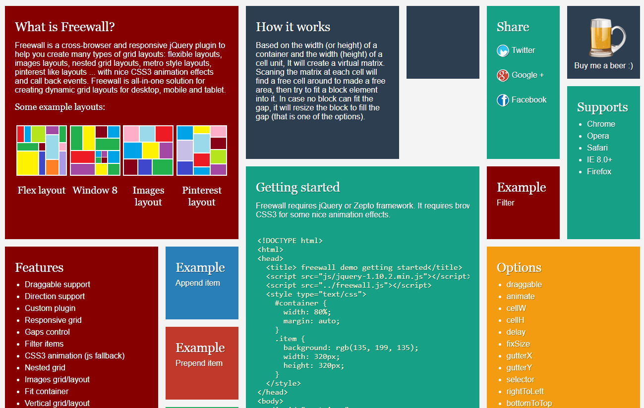
<h2>What is Freewall?</h2>
<p>
Freewall is a cross-browser and responsive jQuery plugin to help you create many types of grid layouts: flexible layouts, images layouts, nested grid layouts, metro style layouts, pinterest like layouts ... with nice CSS3 animation effects and call back events. Freewall is all-in-one solution for creating dynamic grid layouts for desktop, mobile and tablet.
</p>
<h4>Some example layouts:</h4>
<br/>
<ul class="img-demo">
<li>
<a href="example/flex-grid.html" target="_blank">
<img src="i/flex.png" width=98 height=98 />
<h3>Flex layout</h3>
</a>
</li>
<li>
<a href="example/metro-style.html" target="_blank">
<img src="i/metro.png" width=98 height=98 />
<h3>Window 8</h3>
</a>
</li>
<li>
<a href="example/image-layout.html" target="_blank">
<img src="i/image.png" width=98 height=98 />
<h3>Images layout</h3>
</a>
</li>
<li>
<a href="example/pinterest-layout.html" target="_blank">
<img src="i/pinterest.png" width=98 height=98 />
<h3>Pinterest layout</h3>
</a>
</li>
</ul>
</div>
</div>
<div class="brick size22" data-fixSize=0>
<div class='cover'>
<h2> How it works </h2>
<p>
Based on the width (or height) of a container and the width (height) of a cell unit, It will create a virtual matrix. Scaning the matrix at each cell will find a free cell around to made a free area, then try to fit a block element into it. In case no block can fit the gap, it will resize the block to fill the gap (that is one of the options).
</p>
</div>
</div>
<div class="size22" data-nested=".brick" data-fixSize=0>
<div class="brick size11">
</div>
<div class="brick size12" data-fixSize=0>
<div class='cover'>
<h2>Share</h2>
<div class="twitter-share">Twitter</div>
<div class="google-share">Google +</div>
<div class="facebook-share">Facebook</div>
</div>
</div>
</div>
<div class="donate size11">
<form action="#" method="post">
<input type="hidden" name="cmd" value="_s-xclick">
<input type="hidden" name="hosted_button_id" value="SZSGB3GJ3T4VU">
<input class="paypal" type="image" src="example/i/donate.png" border="0" name="submit" alt="">
<div align="center">Buy me a beer :)</div>
</form>
</div>
<div class="brick size36" data-fixSize=0 >
<div class='cover'>
<a class='float-left' href="example/getting-started.html" target="_blank">
<h2>Getting started</h2>
<div>
<p> Freewall requires jQuery or Zepto framework. It requires browsers which support CSS3 for some nice animation effects.</p>
<pre>
<code>
<!DOCTYPE html>
<html>
<head>
<title> freewall demo getting started</title>
<script src="js/jquery-1.10.2.min.js"></script>
<script src="../freewall.js"></script>
<style type="text/css">
#container {
width: 80%;
margin: auto;
}
.item {
background: rgb(135, 199, 135);
width: 320px;
height: 320px;
}
</style>
</head>
<body>
<div id="container">
<div class="item"></div>
<div class="item"></div>
<div class="item"></div>
<div class="item"></div>
<div class="item"></div>
<div class="item"></div>
<div class="item"></div>
</div>
<script>
$(function() {
var wall = new freewall("#container");
wall.fitWidth();
});
</script>
</body>
</html>
</code>
</pre>
</div>
<div class="read-more">View detail ...</div>
</a>
</div>
</div>
<div class="brick size23">
<div class='cover'>
<h2>Features</h2>
<ul>
<li> Draggable support </li>
<li> Direction support </li>
<li> Custom plugin</li>
<li> Responsive grid </li>
<li> Gaps control </li>
<li> Filter items </li>
<li> CSS3 animation (js fallback) </li>
<li> Nested grid </li>
<li> Images grid/layout </li>
<li> Fit container </li>
<li> Vertical grid/layout </li>
<li> Horizontal grid/layout </li>
<li> Window 8 metro style </li>
<li> Pinterest like grid/layout </li>
</ul>
</div>
</div>
<div class="brick size23 options">
<div class='cover' id="options">
<div class='float-left'>
<h2>Options</h2>
<ul>
<li> draggable </li>
<li> animate </li>
<li> cellW </li>
<li> cellH </li>
<li> delay </li>
<li> fixSize </li>
<li> gutterX </li>
<li> gutterY </li>
<li> selector </li>
<li> rightToLeft </li>
<li> bottomToTop </li>
</ul>
<div class="read-more">View detail ...</div>
</div>
<div class='desc'>
<h2>
<span>Options</span>
</h2>
<h3>All options are parameters of <i>Reset</i> method</h3>
<ul>
<li>
<h3> draggable : boolean </h3>
<div>
Default: false <br/>
True: to make block can be drag & drop</div>
</li>
<li>
<h3> animate : boolean </h3>
<div> True: to make block move with animation</div>
</li>
<li>
<h3> cellW: mix </h3>
<div>
Default: 100 <br/>
The width of unit, base on it will build grid container.
It can be a function and return value.
</div>
<h3> Example </h3>
<pre>
<code>
var wall = new freewall('.free-wall');
wall.reset({
selector: '.brick',
cellW: function(width) {
var cellWidth = width / 3;
return cellWidth - 20;
},
cellH: 160
});
</code>
</pre>
</li>
<li>
<h3> cellH: mix </h3>
<div>
Default: 100 <br/>
The height of unit, base on it will build grid container.
It can be a function and return value.
</div>
</li>
<li>
<h3> delay : number </h3>
<div>
Default: 0 <br/>
The time delay for show block. It will increase by each block.
</div>
</li>
<li>
<h3> fixSize : boolean </h3>
<div>
Default: null <br/>
value is null or not set let blocks can adjust and resize to fill gap<br/>
value is 0 or false let blocks can adjust size but can't resize to fill gap.<br/>
value is 1 or true let blocks keep the size as init, can't resize to fill gap.<br/>
Can override the fixSize option by set data-fixSize attribute in the block.
<h3> Example </h3>
<pre>
<code>
<div class="brick size22" data-fixSize=true>
<div class='cover'>
<div class="item size12"></div>
<div class="item size12"></div>
</div>
</div>
</code>
</pre>
</div>
</li>
<li>
<h3> gutterX : mixed </h3>
<div>
Default: 10 <br/>
The horizon spacing between the column. Default is number, but can set it with 'auto' value.
</div>
</li>
<li>
<h3> gutterY : mixed </h3>
<div>
Default: 10 <br/>
The vertical spacing between the row. Default is number, but can set it with 'auto' value.
</div>
</li>
<li>
<h3> selector : string </h3>
<div> Get all blocks to made layout</div>
</li>
<li>
<h3> Example </h3>
<pre>
<code>
var wall = new freewall('.free-wall');
wall.reset({
selector: '.brick',
animate: true,
cellW: 150,
cellH: 150,
gutterY: 10,
gutterX: 'auto'
});
</code>
</pre>
</li>
<li>
<h3> rightToLeft : boolean </h3>
<div> Default: false <br/>
True: let layout start render from right to left</div>
</li>
<li>
<h3> bottomToTop : boolean </h3>
<div> Default: false <br/>
True: let layout start render from bottom up to top</div>
</li>
</ul>
</div>
</div>
</div>
<div class="brick size22 events">
<div class='cover' id="events">
<div class='float-left'>
<h2>Events</h2>
<div class='float-left'>
<ul>
<li> onGapFound </li>
<li> onComplete </li>
<li> onResize </li>
<li> onBlockReady </li>
<li> onBlockActive </li>
<li> onBlockFinish </li>
</ul>
</div>
<div class="read-more">View detail ...</div>
</div>
<div class='desc'>
<h2>
<span>Events</span>
</h2>
<ul>
<li>
<h3> onGapFound </h3>
<div> Registry callback when a gap found.</div>
</li>
<li>
<h3> onComplete </h3>
<div> Registry callback when all block arrange.</div>
</li>
<li>
<h3> onResize </h3>
<div> Registry callback when browser resize.</div>
</li>
<li>
<h3> Example </h3>
<pre>
<code>
var wall = new freewall('.free-wall');
wall.reset({
selector: '.brick',
onResize: function() {
this.fitWidth();
}
});
</code>
</pre>
</li>
<li>
<h3> onBlockReady </h3>
<div> Fire when block adjusted.</div>
</li>
<li>
<h3> onBlockActive </h3>
<div> Fire before block show or hide in the layout.</div>
</li>
<li>
<h3> onBlockFinish </h3>
<div> Fire when block finish show or hide in the layout.</div>
</li>
</ul>
</div>
</div>
</div>
<div class="brick size23 methods">
<div class='cover' id="methods">
<div class='float-left'>
<h2>Methods</h2>
<ul>
<li> addCustomEvent </li>
<li> appendBlock </li>
<li> appendHoles </li>
<li> fillHoles </li>
<li> filter </li>
<li> fireEvent </li>
<li> fitHeight </li>
<li> fitWidth </li>
<li> fitZone </li>
<li> fixPos </li>
<li> fixSize </li>
<li> prepend </li>
<li> refresh </li>
<li> reset </li>
<li> setHoles </li>
<li> unFilter </li>
</ul>
<div class="read-more">View detail ...</div>
</div>
<div class='desc'>
<h2>
<span>Methods</span>
</h2>
<ul>
<li>
<h3> addCustomEvent(name, handler) </h3>
<div> Support create custom event when arrange layout</div>
</li>
<li>
<h3> appendBlock(items) </h3>
<div> Append one or more items into layout</div>
</li>
<li>
<h3> appendHoles(holes) </h3>
<div> Add one or more blank area into layout</div>
</li>
<li>
<h3> fillHoles() </h3>
<div> Let layout without gaps</div>
</li>
<li>
<h3> filter(selector) </h3>
<div> Fillter blocks to show</div>
</li>
<li>
<h3> fireEvent() </h3>
<div> Fire custom event</div>
</li>
<li>
<h3> fitHeight(height) </h3>
<div> Made the layout fit with limit height</div>
</li>
<li>
<h3> fitWidth(width) </h3>
<div> Made the layout fit with limit width</div>
</li>
<li>
<h3> fitZone(width, height) </h3>
<div> Made the layout fit with limit width and height</div>
</li>
<li>
<h3> fixPos(object) </h3>
<div> Set a block at fixed position, top/left is multiple of cell with/height</div>
</li>
<li>
<h3> fixSize(object) </h3>
<div> Set a block with special width or height</div>
<h5> Example </h5>
<pre>
<code>
var wall = new freewall('.free-wall');
var dna = $(".free-wall .flex-layout");
wall.unsetFilter();
wall.fixSize({
block: dna,
width: 150,
height: 150
});
wall.fitWidth();
</code>
</pre>
</li>
<li>
<h3> prepend(items) </h3>
<div> Prepend one or more items into layout</div>
</li>
<li>
<h3> refresh() </h3>
<div> rearrange layout</div>
</li>
<li>
<h3> reset(options) </h3>
<div> Config options for render layout.</div>
<h5> Example </h5>
<pre>
<code>
var ewall = new freewall(demo);
var demo = $(".example");
ewall.reset({
selector: '.cell',
animate: true,
delay: 20,
cellW: 15.5,
cellH: 15,
gutterX: 2,
gutterY: 2
});
ewall.fitWidth(cwidth);
</code>
</pre>
</li>
<li>
<h3> setHoles(hole) </h3>
<div> Set the holes on layout</div>
</li>
<li>
<h3> unFilter() </h3>
<div> Made all block to show</div>
</li>
</ul>
</div>
</div>
</div>
<div class="brick size12">
<div class='cover'>
<h2> Supports</h2>
<ul>
<li>Chrome</li>
<li>Opera</li>
<li>Safari</li>
<li>IE 8.0+</li>
<li>Firefox</li>
</ul>
</div>
</div>
<div class="brick size11">
<div class='cover'>
<a class="float-left" href="example/demo-filter.html" target="_blank">
<h2> Example </h2>
<div> Filter </div>
<div class="read-more">View detail ...</div>
</a>
</div>
</div>
<div class="brick size11">
<div class='cover'>
<a class="float-left" href="example/append-more.html" target="_blank">
<h2>Example</h2>
<div> Append item </div>
<div class="read-more">View detail ...</div>
</a>
</div>
</div>
<div class="brick size11">
<div class='cover'>
<a class="float-left" href="example/prepend-example.html" target="_blank">
<h2>Example</h2>
<div> Prepend item </div>
<div class="read-more">View detail ...</div>
</a>
</div>
</div>
<div class="brick size11">
<div class='cover'>
<a class="float-left" href="example/css-animate.html" target="_blank">
<h2>Example</h2>
<div> CSS3 animation </div>
<div class="read-more">View detail ...</div>
</a>
</div>
</div>
<div class="brick size11 example-draggable" data-draggable=1>
<div class='cover'>
<div class="float-left">
<h2>Example</h2>
<div> Draggable </div>
<a class="read-more" href="example/draggable.html" target="_blank">View detail ...</a>
</div>
</div>
</div>
<div class="brick size11">
<div class='cover'>
<a class="float-left" href="example/for-zepto.html" target="_blank">
<h2>Example</h2>
<div>For Zeptojs</div>
<div class="read-more">View detail ...</div>
</a>
</div>
</div>
<div class="brick size12">
<div class='cover'>
<a class="float-left" href="example/fit-height.html" target="_blank">
<h2>Example</h2>
<div> Fit height </div>
<div class="read-more">View detail ...</div>
</a>
</div>
</div>
<div class="brick size12">
<div class='cover'>
<a class="float-left" href="example/fit-zone.html" target="_blank">
<h2>Example</h2>
<div>Fit zone</div>
<div class="read-more">View detail ...</div>
</a>
</div>
</div>
<div class="brick size21">
<div class='cover'>
<a class="float-left" href="example/metro-style.html" target="_blank">
<h2>Example </h2>
<div>Window 8 metro style</div>
<div class="read-more">View detail ...</div>
</a>
</div>
</div>
<div class="brick size11">
<div class='cover'>
<a class="float-left" href="example/image-layout.html" target="_blank">
<h2>Example</h2>
<div>Images layout</div>
<div class="read-more">View detail ...</div>
</a>
</div>
</div>
<div class="brick size11">
<div class='cover'>
<a class="float-left" href="example/pinterest-layout.html" target="_blank">
<h2>Example </h2>
<div>Pinterest like layout</div>
<div class="read-more">View detail ...</div>
</a>
</div>
</div>
<div class="brick size21">
<div class='cover'>
<a class="float-left" href="example/flex-grid.html" target="_blank">
<h2>Example</h2>
<div>Flexible grid</div>
<div class="read-more">View detail ...</div>
</a>
</div>
</div>
<div class="brick size21">
<div class='cover'>
<a class="float-left" href="example/grid-layout.html" target="_blank">
<h2>Example</h2>
<div>Grid layout</div>
<div class="read-more">View detail ...</div>
</a>
</div>
</div>
<div class="brick size21">
<div class='cover'>
<a class="float-left" href="example/nested-grid.html" target="_blank">
<h2>Example</h2>
<div>Nested grid</div>
<div class="read-more">View detail ...</div>
</a>
</div>
</div>
</div>
<div class="back-button">
<a href="javascript:void(0)" class="back-icon"></a>
</div>
</body>
</html>
JS代码(index.js):
// demo for freewall layout;
	// created by Minh Nguyen;
	(function($){
	var setting ={
}
,wall;
	var colour = ["#16A085","#27AE60","#2980B9","#8E44AD","#2C3E50","#F39C12","#D35400","#C0392B","#870000"];
	var func ={
	preload:function(){
	var images = []for (var i = 1;
	i < 50;
	++i){
	images[i] = new Image();
	images[i].src = "example/i/photo/" + i + ".jpg";
	images[i].onload = function(){
	//window["console"] && console.log(this.src);
}
}
}
,color:function(value){
	$(".free-wall .brick").each(function(){
	var backgroundColor = colour[colour.length * Math.random() << 0];
	var bricks = $(this).find(".nested");
	!bricks.length && (bricks = $(this));
	bricks.css({
	backgroundColor:backgroundColor}
);
	bricks.attr("data-bgcolor",backgroundColor);
}
);
}
,layout:function(){
	var lwidth = $(window).width();
	wall = new freewall('.free-wall');
	wall.reset({
	selector:'> div',animate:true,cellW:160,cellH:160,onResize:function(){
	var cwidth = wall.container.width();
	wall.container.find('.full-width').each(function(index,item){
	wall.fixSize({
	block:item,width:cwidth}
);
}
);
	wall.fitWidth();
}
,onComplete:function(lastItem,lastBlock,setting){
	wall.container.find(".example-draggable").removeAttr("data-position");
}
}
);
	wall.fitWidth();
	$(window).trigger("resize");
	wall.container.find(".brick").each(function(){
	var $item = $(this);
	$item.attr({
	"data-class":$item.attr("class"),"data-style":$item.attr("style")}
);
}
);
	window["console"] && console.log(wall);
	// for responsive demo;
	$(".reponsive-block li>a").click(function(){
	var viewWidth = $(window).width();
	var preWidth = $(this).data("width");
	if (preWidth != "auto" && (preWidth - viewWidth) > 0){
	alert('The screen\'s width not enought to test this size');
	return;
}
$(".reponsive-block li>a").removeClass("active");
	var preWidth = $(this).data("width");
	var margin = "10px auto";
	preWidth == "auto" && (margin = "10px");
	wall.container.css({
	margin:margin,width:preWidth}
);
	$(this).addClass("active");
	var cwidth = wall.container.width();
	wall.container.find('.full-width').each(function(index,item){
	wall.fixSize({
	block:item,width:cwidth * 0.88}
);
}
);
	wall.fitWidth();
}
);
	if ("onhashchange" in window){
	window.onhashchange = function (){
	hashChanged(window.location.hash);
}
}
else{
	var storedHash = window.location.hash;
	setInterval(function (){
	if (window.location.hash != storedHash){
	storedHash = window.location.hash;
	hashChanged(storedHash);
}
}
,100);
}
function hashChanged(hash){
	if (!hash || hash == "#"){
	wall.container.find(".brick").each(function(){
	var $item = $(this).removeAttr("style");
	$item.removeAttr("data-width");
	$item.removeAttr("data-height");
	$item.attr({
	"class":$item.attr("data-class")}
);
	$item.css({
	backgroundColor:$item.attr("data-bgcolor")}
);
}
);
	wall.unFilter();
	$(".back-button").hide();
	$(".free-wall-logo").show();
}
else{
	$(hash).trigger("click");
	$(".back-button").show();
	$(".free-wall-logo").hide();
}
$(".header")[0].scrollIntoView(true);
}
// for back-button;
	$(".back-button .back-icon").click(function(){
	window.location.hash = "";
}
);
}
,logo:function(){
	var wall = new freewall('.free-wall-logo');
	var temp = "<div class='cell' style='width:{
	width}
px;
	height:{
	height}
px;
	background-color:{
	color}
'><div class='cover'></div></div>";
	var colour = ["#DAA520","#CD950C","#EEB422","#CD9B1D"];
	var w = 1,h = 1,html = '',color = '',limitItem = 820;
	for (var i = 0;
	i < limitItem;
	++i){
	h = 1;
	w = 2 + 4 * Math.random() << 0;
	color = colour[colour.length * Math.random() << 0];
	html += temp.replace(/\{
	height\}
/g,h*20).replace(/\{
	width\}
/g,w*15).replace("{
	color}
",color);
}
wall.container.html(html);
	wall.reset({
	selector:'.cell',animate:true,cellW:15,cellH:20,gutterX:2,gutterY:2,delay:20,onResize:function(){
	this.refresh();
	var totalCol = this.container.attr('data-total-col');
	var offsetLeft = Math.round(totalCol/2 - 31);
	this.setHoles(getPosition(offsetLeft));
	this.refresh();
}
,onBlockActive:function(block,setting){
	// check for showing brick;
	if (block != null){
	$(this).css({
	top:- 10000,left:block.left}
);
}
else{
	$(this).css({
	opacity:0}
)}
}
,onComplete:function(){
	wall.reset({
	delay:0,animate:false,onBlockActive:function(){
}
}
)}
}
);
	function getPosition(offsetLeft){
	return [// F{
	top:3,left:offsetLeft,width:9,height:3}
,{
	top:5,left:offsetLeft,width:3,height:14}
,{
	top:9,left:offsetLeft,width:7,height:3}
,// r{
	top:9,left:offsetLeft + 11,width:2,height:10}
,{
	top:11,left:offsetLeft + 13,width:1,height:2}
,{
	top:10,left:offsetLeft + 14,width:1,height:2}
,{
	top:9,left:offsetLeft + 15,width:2,height:2}
,// e{
	top:9,left:offsetLeft + 19,width:2,height:10}
,{
	top:9,left:offsetLeft + 19,width:4,height:2}
,{
	top:9,left:offsetLeft + 23,width:2,height:6}
,{
	top:13,left:offsetLeft + 19,width:4,height:2}
,{
	top:17,left:offsetLeft + 19,width:5,height:2}
,// e{
	top:9,left:offsetLeft + 27,width:2,height:10}
,{
	top:9,left:offsetLeft + 27,width:4,height:2}
,{
	top:9,left:offsetLeft + 31,width:2,height:6}
,{
	top:13,left:offsetLeft + 27,width:4,height:2}
,{
	top:17,left:offsetLeft + 27,width:5,height:2}
,// W{
	top:6,left:offsetLeft + 37,width:2,height:12}
,{
	top:17,left:offsetLeft + 39,width:6,height:2}
,{
	top:12,left:offsetLeft + 41,width:2,height:5}
,{
	top:6,left:offsetLeft + 45,width:2,height:12}
,//a{
	top:9,left:offsetLeft + 50,width:3,height:2}
,{
	top:9,left:offsetLeft + 53,width:2,height:10}
,{
	top:13,left:offsetLeft + 49,width:4,height:2}
,{
	top:15,left:offsetLeft + 49,width:2,height:2}
,{
	top:17,left:offsetLeft + 49,width:4,height:2}
,//l{
	top:6,left:offsetLeft + 57,width:2,height:13}
,//l{
	top:6,left:offsetLeft + 61,width:2,height:13}
,];
}
wall.fitZone();
	var totalCol = wall.container.attr('data-total-col');
	var offsetLeft = Math.round(totalCol/2 - 31);
	wall.setHoles(getPosition(offsetLeft));
	wall.refresh();
}
,options:function(){
	$('.free-wall .options').click(function(){
	var cwidth = wall.container.width() - 10;
	var dna = $(this);
	if (!dna.hasClass('full-width')){
	dna.addClass('full-width');
	wall.fixSize({
	block:dna,width:cwidth,height:2000}
);
	wall.filter('.options');
	window.location.hash = "options";
}
}
);
}
,events:function(){
	$('.free-wall .events').click(function(){
	var cwidth = wall.container.width() - 10;
	var dna = $(this);
	if (!dna.hasClass('full-width')){
	dna.addClass('full-width');
	wall.fixSize({
	block:dna,width:cwidth,height:720}
);
	wall.filter('.events');
	window.location.hash = "events";
}
}
);
}
,methods:function(){
	$('.free-wall .methods').click(function(){
	var cwidth = wall.container.width() - 10;
	var dna = $(this);
	if (!dna.hasClass('full-width')){
	dna.addClass('full-width');
	wall.fixSize({
	block:dna,width:cwidth,height:2100}
);
	wall.filter('.methods');
	window.location.hash = "methods";
}
}
);
}
,share:function(){
	var leftPosition,topPosition,width = 500,height = 300;
	leftPosition = (window.screen.width / 2) - ((width / 2) + 10);
	topPosition = (window.screen.height / 2) - ((height / 2) + 50);
	var windowFeatures = "status=no,height=" + height + ",width=" + width + ",resizable=yes,left=" + leftPosition + ",top=" + topPosition + ",screenX=" + leftPosition + ",screenY=" + topPosition + ",toolbar=no,menubar=no,scrollbars=no,location=no,directories=no";
	$(".free-wall .facebook-share").click(function(){
	window.open('http://www.facebook.com/sharer.php?u=' + encodeURIComponent(location.href),'sharer',windowFeatures);
}
);
	$(".free-wall .google-share").click(function(){
	window.open('https://plus.google.com/share?url=' + encodeURIComponent(location.href),'sharer',windowFeatures);
}
);
	$(".free-wall .twitter-share").click(function(){
	window.open("https://twitter.com/intent/tweet?original_referer=''&url=''&text=" + encodeURIComponent(location.href),'_blank',windowFeatures);
}
);
}
,finish:function(){
	if (window.location.hash && $(window.location.hash).length){
	$(window.location.hash).trigger("click");
	$('.back-button').show();
	$(".free-wall-logo").hide();
}
}
}
;
	window.app ={
	config:function(key,data){
	setting[key] = data;
}
,setup:function(options){
	for (var i in options){
	if (options.hasOwnProperty(i)){
	func[i](options[i]);
}
}
func['finish']();
}
}
;
}
)(window.Zepto || window.jQuery);
CSS代码(style.css):
/* http://meyerweb.com/eric/tools/css/reset/ v2.0 | 20110126 License:none (public domain)*/
@font-face{font-family:'Lato';font-style:normal;font-weight:400;src:local('Lato Regular'),local('Lato-Regular'),url(9k-RPmcnxYEPm8CNFsH2gg.woff) format('woff');}
/*@import url(http://fonts.googleapis.com/css?family=Happy+Monkey);*/
html,body,div,span,applet,object,blockquote,pre,a,abbr,acronym,address,big,cite,code,del,dfn,em,img,ins,kbd,q,s,samp,small,strike,strong,sub,sup,tt,var,b,u,i,center,dl,dt,dd,ol,ul,li,fieldset,form,label,legend,table,caption,tbody,tfoot,thead,tr,th,td,article,aside,canvas,details,embed,figure,figcaption,footer,header,hgroup,menu,nav,output,ruby,section,summary,time,mark,audio,video{margin:0;padding:0;border:0;font-size:1em;vertical-align:baseline;}
/* HTML5 display-role reset for older browsers */
article,aside,details,figcaption,figure,footer,header,hgroup,menu,nav,section{display:block;}
body{background:rgba(231,231,231,0.43);line-height:1.125em;color:white;max-width:1920px;margin:0 auto;position:relative;font-family:'Lato',Helvetica,Arial,Tahoma;text-shadow:1px 1px 0 rgba(0,0,0,0.3);}
ol,ul{padding:0 10px;margin:0 10px;line-height:1.5em;}
h1,h2,h3,h4,h5,h6{text-shadow:1px 1px 0 rgba(0,0,0,0.5);font-family:'Lato',Georgia,Helvetica,Tahoma;margin:10px 0;font-weight:normal;}
h1{font-size:1.875em;}
h2{font-size:1.6em;line-height:1em;}
h3{font-size:1.25em;}
h4{font-size:1.125em;}
h5{font-size:1em;}
h6{font-size:0.875em;}
a{text-decoration:none;color:white;}
a:hover{color:white;opacity:0.9;}
a:visited{color:white;}
h2{cursor:pointer;}
code,pre{font-family:Monaco,Menlo,Consolas;font-size:1em;color:#FFFFDE;padding:0 3px 2px;}
table{border-collapse:collapse;border-spacing:0;}
.header{padding:14px 0;background-color:rgb(19,17,17);background-color:#006a3f;background-image:radial-gradient(rgba(0,0,0,0.1) 15%,transparent 16%),radial-gradient(rgba(0,0,0,0.1) 15%,transparent 16%),radial-gradient(rgba(255,255,255,0.1) 15%,transparent 20%),radial-gradient(rgba(255,255,255,0.1) 15%,transparent 20%);background-image:-webkit-radial-gradient(rgba(0,0,0,0.1) 15%,transparent 16%),-webkit-radial-gradient(rgba(0,0,0,0.1) 15%,transparent 16%),-webkit-radial-gradient(rgba(255,255,255,0.1) 15%,transparent 20%),-webkit-radial-gradient(rgba(255,255,255,0.1) 15%,transparent 20%);background-position:0 0px,4px 4px,0 1px,4px 5px;background-size:8px 8px;border-bottom:1px solid rgb(41,41,41);}
.header div.float-left{padding-left:2%;}
.header a{font-size:35px;color:white;display:block;}
.header a:first-letter{font-size:60px;line-height:40px;font-weight:bold;}
.header .target{margin-left:5px;margin-bottom:20px;}
.header .reponsive-block{list-style:none;margin:0px;padding:50px 2% 0 0;}
.header .reponsive-block li{display:inline-block;float:left;}
.header .reponsive-block a{display:inline-block;margin:0 5px;cursor:pointer;background:url(../i/reponsive.png) no-repeat;}
.header .reponsive-block a.desktop{background-position:3px 0;width:34px;height:26px;}
.header .reponsive-block a.tablet-landscape{background-position:-49px 0;width:22px;height:22px;}
.header .reponsive-block a.tablet-portrait{background-position:-90px 0;width:18px;height:24px;}
.header .reponsive-block a.iphone-landscape{background-position:-129px 0;width:20px;height:20px;}
.header .reponsive-block a.iphone-portrait{background-position:-166px 0;width:16px;height:26px;}
.header .reponsive-block a.desktop:hover,.header .reponsive-block a.desktop.active{background-position:3px -34px;}
.header .reponsive-block a.tablet-landscape:hover,.header .reponsive-block a.tablet-landscape.active{background-position:-49px -34px;}
.header .reponsive-block a.tablet-portrait:hover,.header .reponsive-block a.tablet-portrait.active{background-position:-91px -33px;}
.header .reponsive-block a.iphone-landscape:hover,.header .reponsive-block a.iphone-landscape.active{background-position:-128px -33px;}
.header .reponsive-block a.iphone-portrait:hover,.header .reponsive-block a.iphone-portrait.active{background-position:-166px -33px;}
.free-wall{margin:auto;}
.free-wall-logo{margin:auto;height:420px;}
.size2-2{width:80px;height:80px;}
.size11{height:160px;width:160px;}
.size12{width:160px;height:320px;}
.size21{width:320px;height:160px;}
.size22{height:320px;width:320px;}
.size13{width:160px;height:480px;}
.size31{width:480px;height:160px;}
.size23{width:320px;height:480px;}
.size24{width:320px;height:640px;}
.size32{width:480px;height:320px;}
.size33{width:480px;height:480px;}
.size34{width:480px;height:640px;}
.size43{width:640px;height:480px;}
.size35{width:480px;height:800px;}
.size53{width:800px;height:480px;}
.size36{width:480px;height:960px;}
.donate form{height:100%;width:100%;background:rgb(44,62,80);}
.donate form .paypal{display:block;margin:auto;padding:20px 0px 0px 0px;outline:0;}
.img-demo{vertical-align:bottom;list-style:none;margin:0;padding:0;}
.img-demo li{float:left;width:25%;text-align:center;}
.img-demo li img{border:2px solid white;width:98px;height:98px;}
.float-left{float:left;}
.float-right{float:right;}
.clearfix:before,.clearfix:after{content:"";display:table;}
.clearfix:after{clear:both;}
.clearfix{zoom:1;/* For IE 6/7 (trigger hasLayout) */
}
.rest-left{margin-left:244px;}
.desc h1,.desc h2,.desc h3,.desc h4,.desc h5,.desc h6{font-weight:bold;}
.desc h2{border-bottom:1px solid rgba(0,0,0,0.1);margin-top:0px;margin-bottom:0px;padding-bottom:50px;}
.desc h2 span{float:left;display:block;line-height:50px;}
.brick{background-color:white;float:left;cursor:default;overflow:hidden;background-repeat:no-repeat;background-size:cover;background-position:center;}
.brick .cover{overflow:hidden;margin:20px;}
.brick .read-more{position:absolute;display:none;bottom:0px;left:0px;right:0px;padding:12px;background:rgb(0,0,0);background:rgba(0,0,0,0.45);}
.brick:hover .read-more{display:block;cursor:pointer;}
.brick .desc{display:none;}
.full-width .float-left{display:none;}
.full-width .desc{display:block;}
.full-width.brick{box-shadow:none;overflow:visible;border:none !important;background:none !important;}
.full-width.brick .cover{margin:0px 20px;color:#333;}
.full-width.brick .cover *{text-shadow:none;}
.full-width.brick .cover code{color:#666;}
.open .float-left{display:none;}
.open .desc{display:block;}
.example{width:0px;height:0px;overflow:visible !important;/* for ie7 */
}
.example-draggable{cursor:move;}
.example-draggable *{cursor:move;}
.example-draggable a{cursor:pointer;}
.cell{background-position:center center;background-repeat:no-repeat;background-size:cover;position:absolute;background-color:#222;}
[class*="-share"]{cursor:pointer;margin:20px 0;line-height:30px;padding-left:30px;}
.facebook-share{background:url(../i/fb.png) no-repeat left center;}
.twitter-share{background:url(../i/tw.png) no-repeat left center;}
.google-share{background:url(../i/gp.png) no-repeat left center;}
.download-icon{background:url(../i/download.png) no-repeat left center;display:block;margin:0 0 10px 0;line-height:30px;padding-left:30px;}
.js-icon{background:url(../i/js.png) no-repeat left center;display:block;line-height:30px;padding-left:30px;}
.fork{float:right;width:100%;height:100%;display:block;background:url(../i/forkme.png) no-repeat top right;}
.back-button{position:fixed;z-index:9999;padding:1%;bottom:2%;right:2%;display:none;background:black;}
.back-button .back-icon{background:url(../i/back.png) no-repeat top center;width:45px;height:27px;display:block;}
.back-button .back-icon:hover{background:url(../i/back.png) no-repeat bottom center;}


 分享到QQ
分享到QQ 分享到微博
分享到微博 微信扫一扫
微信扫一扫