以下是 庆祝抗战胜利70周年CSS3特效代码 的示例演示效果:
部分效果截图1:

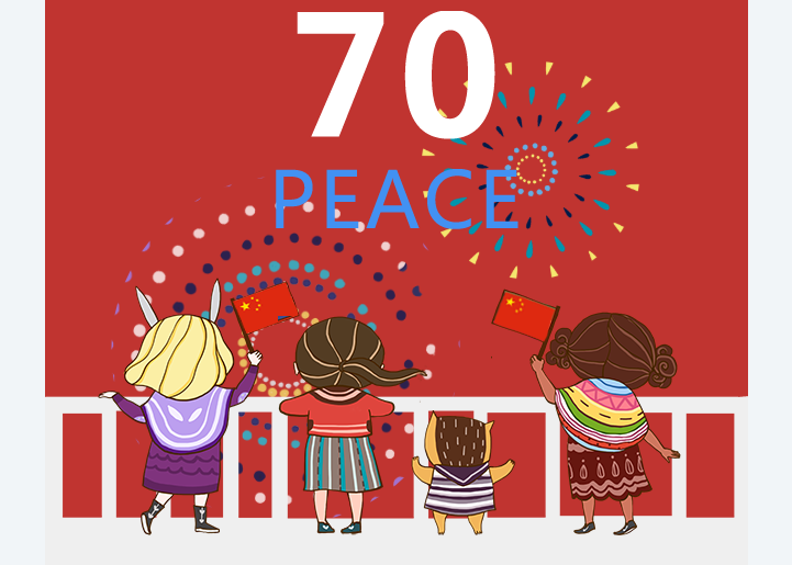
部分效果截图2:
HTML代码(index.html):
<!DOCTYPE html>
<html lang="en">
<head>
<meta charset="UTF-8">
<meta name="format-detection" content="telephone=no" />
<meta name="viewport" content="initial-scale=1.0,maximum-scale=1.0,minimum-scale=1.0,width=device-width" />
<title>庆祝抗战胜利70周年CSS3特效</title>
<link id="common_css" rel="stylesheet" href="css/style.css">
<script src="js/viewport.js"></script>
<style>
* {
	margin: 0;
	padding: 0;
}
html, body {
	height: 100%;
}
body {
	font-family: "microsoft yahei";
}
img {
	display: block;
}
.wrap {
	height: 100%;
	width: 640px;
	margin: 0 auto;
	background: #c03430;
	position: relative;
	animation:opc 3s ease-in 1s backwards;
	-webkit-animation:opc 3s ease-in 1s backwards;
	overflow:hidden
}
.yanhua1 {
	border-radius:50%;
	position: absolute;
	width: 250px;
	height: 250px;
	background: linear-gradient(rgba(115,197,251,1), rgba(115,197,251,1)), url(images/hua1.png) no-repeat center center;
	background: -webkit-linear-gradient(rgba(115,197,251,1),rgba(115,197,251,1)), url(images/hua1.png) no-repeat center center;
	background-size: 100% 100%,100% 100%;
	top: 50px;
	left: 45px;
	z-index: 1;
	animation: yanhua 3s ease-out infinite 8s backwards,yanse1 3s ease-out  infinite 8s backwards,touming 3s ease-out infinite 8s backwards;
	-webkit-animation: yanhua 3s ease-out infinite 8s backwards,yanse1 3s ease-out infinite 8s backwards,touming 3s ease-out infinite 8s backwards;
	box-shadow:0 0 20px rgba(115,197,251,1);
}
.yanhua2 {
	border-radius:50%;
	position: absolute;
	width: 330px;
	height: 330px;
	background: linear-gradient(rgba(245,231,210,1),rgba(245,231,210,1)), url(images/hua2.png) no-repeat center center;
	background: -webkit-linear-gradient(rgba(245,231,210,1),rgba(245,231,210,1)), url(images/hua2.png) no-repeat center center;
	background-size: 100% 100%,100% 100%;
	top: 230px;
	left: 277px;
	z-index: 2;
	animation: yanhua 3s ease-out infinite 9s backwards,yanse2 3s ease-out infinite backwards 9s,touming 3s ease-out infinite 9s backwards;
	-webkit-animation: yanhua 3s ease-out infinite 9s backwards,yanse2 3s ease-out infinite backwards 9s,touming 3s ease-out infinite 9s backwards;
	box-shadow:0 0 20px rgba(245,231,210,1);
}
.yanhua3 {
	border-radius:50%;
	position: absolute;
	width: 350px;
	height: 350px;
	background: linear-gradient(rgba(154,134,255,1),rgba(154,134,255,1)), url(images/hua3.png) no-repeat center center;
	background: -webkit-linear-gradient(rgba(154,134,255,1), rgba(154,134,255,1)), url(images/hua3.png) no-repeat center center;
	background-size: 100% 100%,100% 100%;
	top: 384px;
	left: 44px;
	z-index: 3;
	animation: yanhua 3s ease-out infinite 8.5s backwards,yanse3 3s ease-out infinite backwards 8.5s,touming 3s ease-out infinite 8.5s backwards;
	-webkit-animation: yanhua 3s ease-out infinite 8.5s backwards,yanse3 3s ease-out infinite backwards 8.5s,touming 3s ease-out infinite 8.5s backwards;
}
.land {
	position: absolute;
	bottom: 0;
	left: 0;
	width: 640px;
	z-index: 9
}
.land img {
	width: 100%
}
.ren1 {
	width: 184px;
	height: 235px;
	left: 48px;
	bottom: 140px;
	position: absolute;
	z-index: 20;
	animation:opc 3s linear 4s backwards;
	-webkit-animation:opc 3s linear 4s backwards;
}
.ren1 img {
	width: 100%;
	height: 100%
}
.ren2 {
	width: 136px;
	height: 200px;
	left: 212px;
	bottom: 140px;
	position: absolute;
	z-index: 20;
	animation:opc 3s linear 7.5s backwards;
	-webkit-animation:opc 3s linear 7.5s backwards;
}
.ren2 img {
	width: 100%;
	height: 100%
}
.ren3 {
	width: 97px;
	height: 114px;
	left: 332px;
	bottom: 140px;
	position: absolute;
	z-index: 20;
	animation:opc 3s linear 6s backwards;
	-webkit-animation:opc 3s linear 6s backwards;
}
.ren3 img {
	width: 100%;
	height: 100%
}
.ren4 {
	width: 173px;
	height: 225px;
	left: 406px;
	bottom: 140px;
	position: absolute;
	z-index: 20;animation:opc 3s linear 5s backwards;
	-webkit-animation:opc 3s linear 5s backwards;
}
.ren4 img {
	width: 100%;
	height: 100%
}
.zhounian {
	position: absolute;
	width: 221px;
	height: 199px;
	margin: auto;
	left: 0;
	right: 0;
	top: 250px;
	z-index: 99;
	animation:topopc 1.5s linear 12s backwards;
	-webkit-animation:topopc 1.5s linear 12s backwards;
}
.zhounian2 {
	position: absolute;
	width: 406px;
	height: 44px;
	margin: auto;
	left: 0;
	right: 0;
	bottom: 40px;
	z-index: 99;
	animation:opc 1.5s ease-in 9.5s backwards;
	-webkit-animation:opc 1.5s ease-in 9.5s backwards;
}
 @keyframes yanhua {
 0% {
transform:translateY(300%) scale(0.05)
}
 50% {
transform:translateY(0%) scale(0.05)
}
 100% {
transform:translateY(0%) scale(1)
}
}
@-webkit-keyframes yanhua {
 0% {
-webkit-transform: translateY(300%) scale(0.05)
}
 50% {
-webkit-transform:translateY(0%) scale(0.05)
}
 100% {
-webkit-transform:translateY(0%) scale(1)
}
}
 @keyframes yanse1 {
 0% {
	 background: linear-gradient(rgba(115,197,251,1), rgba(115,197,251,1)), url(images/hua1.png) no-repeat center center;
	 box-shadow:0 0 20px rgba(115,197,251,1);
}
49% {
 background: linear-gradient(rgba(115,197,251,1), rgba(115,197,251,1)), url(images/hua1.png) no-repeat center center;
  box-shadow:0 0 20px rgba(115,197,251,1);
}
 50% {
 background: linear-gradient(rgba(115,197,251,0), rgba(115,197,251,0)), url(images/hua1.png) no-repeat center center;
 box-shadow:0 0 20px rgba(115,197,251,0);
}
 100% {
 background: linear-gradient(rgba(115,197,251,0), rgba(115,197,251,0)), url(images/hua1.png) no-repeat center center;
 box-shadow:0 0 20px rgba(115,197,251,0);
}
}
 @-webkit-keyframes yanse1 {
  0% {
	 background:-webkit-linear-gradient(rgba(115,197,251,1), rgba(115,197,251,1)), url(images/hua1.png) no-repeat center center;
	 box-shadow:0 0 20px rgba(115,197,251,1);
}
49% {
 background:-webkit-linear-gradient(rgba(115,197,251,1), rgba(115,197,251,1)), url(images/hua1.png) no-repeat center center;
 box-shadow:0 0 20px rgba(115,197,251,1);
}
 50% {
 background:-webkit-linear-gradient(rgba(115,197,251,0), rgba(115,197,251,0)), url(images/hua1.png) no-repeat center center;
 box-shadow:0 0 20px rgba(115,197,251,0);
}
 100% {
 background: -webkit-linear-gradient(rgba(115,197,251,0), rgba(115,197,251,0)), url(images/hua1.png) no-repeat center center;
 box-shadow:0 0 20px rgba(115,197,251,0);
}
}
 @keyframes yanse2 {
 0% {
	 background: linear-gradient(rgba(245,231,210,1), rgba(245,231,210,1)), url(images/hua2.png) no-repeat center center;
	 box-shadow:0 0 20px rgba(245,231,210,1);
}
49% {
 background: linear-gradient(rgba(245,231,210,1), rgba(245,231,210,1)), url(images/hua2.png) no-repeat center center;
 box-shadow:0 0 20px rgba(245,231,210,1);
}
 50% {
 background: linear-gradient(rgba(245,231,210,0), rgba(245,231,210,0)), url(images/hua2.png) no-repeat center center;
 box-shadow:0 0 20px rgba(245,231,210,0);
}
 100% {
 background: linear-gradient(rgba(245,231,210,0), rgba(245,231,210,0)), url(images/hua2.png) no-repeat center center;
 box-shadow:0 0 20px rgba(245,231,210,0);
}
}
 @-webkit-keyframes yanse2 {
  0% {
	 background:-webkit-linear-gradient(rgba(245,231,210,1), rgba(245,231,210,1)), url(images/hua2.png) no-repeat center center;
	 box-shadow:0 0 20px rgba(115,197,251,1);
}
49% {
 background:-webkit-linear-gradient(rgba(245,231,210,1), rgba(245,231,210,1)), url(images/hua2.png) no-repeat center center;
 box-shadow:0 0 20px rgba(245,231,210,1);
}
 50% {
 background:-webkit-linear-gradient(rgba(245,231,210,0), rgba(245,231,210,0)), url(images/hua2.png) no-repeat center center;
 box-shadow:0 0 20px rgba(245,231,210,0);
}
 100% {
 background: -webkit-linear-gradient(rgba(245,231,210,0), rgba(245,231,210,0)), url(images/hua2.png) no-repeat center center;
 box-shadow:0 0 20px rgba(245,231,210,0);
}
}
 @keyframes yanse3 {
 0% {
	 background: linear-gradient(rgba(154,134,255,1), rgba(154,134,255,1)), url(images/hua3.png) no-repeat center center;
	 box-shadow:0 0 20px rgba(154,134,255,1);
}
49% {
 background: linear-gradient(rgba(154,134,255,1), rgba(154,134,255,1)), url(images/hua3.png) no-repeat center center;
  box-shadow:0 0 20px rgba(154,134,255,1);
}
 50% {
 background: linear-gradient(rgba(154,134,255,0), rgba(154,134,255,0)), url(images/hua3.png) no-repeat center center;
 box-shadow:0 0 20px rgba(154,134,255,0);
}
 100% {
 background: linear-gradient(rgba(154,134,255,0), rgba(154,134,255,0)), url(images/hua3.png) no-repeat center center;
 box-shadow:0 0 20px rgba(154,134,255,0);
}
}
 @-webkit-keyframes yanse3 {
  0% {
	 background:-webkit-linear-gradient(rgba(154,134,255,1), rgba(154,134,255,1)), url(images/hua3.png) no-repeat center center;
	 box-shadow:0 0 20px rgba(154,134,255,1);
}
49% {
 background:-webkit-linear-gradient(rgba(154,134,255,1), rgba(154,134,255,1)), url(images/hua3.png) no-repeat center center;
 box-shadow:0 0 20px rgba(154,134,255,1);
}
 50% {
 background:-webkit-linear-gradient(rgba(154,134,255,0), rgba(154,134,255,0)), url(images/hua3.png) no-repeat center center;
 box-shadow:0 0 20px rgba(154,134,255,0);
}
 100% {
 background: -webkit-linear-gradient(rgba(154,134,255,0), rgba(154,134,255,0)), url(images/hua3.png) no-repeat center center;
 box-shadow:0 0 20px rgba(154,134,255,0);
}
}
@keyframes touming{
	0%{ opacity:1}
	85%{ opacity:1}
	100%{ opacity:0}

	}
@-webkit-keyframes touming{
	0%{ opacity:1}
	85%{ opacity:1}
	100%{ opacity:0}

	}
@keyframes opc{
	from{ opacity:0}
	to{ opacity:1}
	}
	@-webkit-keyframes opc{
	from{ opacity:0}
	to{ opacity:1}
	}
@keyframes topopc{
	from{ opacity:0; transform:translateY(30%)}
	to{ opacity:1;transform:translateY(0)}
	}
	@-webkit-keyframes topopc{
	from{ opacity:0;-webkit-transform:translateY(30%)}
	to{ opacity:1;-webkit-transform:translateY(0)}
	}
</style>
</head>
<body>
<div class="wrap">
  <div class="yanhua1"> </div>
  <div class="yanhua2"> </div>
  <div class="yanhua3"> </div>
  <div class="land"> <img src="images/land.png"> </div>
  <div class="ren1"> <img src="images/ren2.png"> </div>
  <div class="ren2"> <img src="images/ren1.png"> </div>
  <div class="ren3"> <img src="images/ren3.png"> </div>
  <div class="ren4"> <img src="images/ren4.png"> </div>
  <div class="zhounian"> <img src="images/peace.png"> </div>
  <div class="zhounian2"> <img src="images/70.png"> </div>
</div>
</body>
</html>
JS代码(viewport.js):
var getBrowserInfo = function (){
	var info ={
}
;
	if (/(iPhone|iPad|iPod|iOS)/i.test(navigator.userAgent)){
	info.os = "ios";
}
else if (/(Android)/i.test(navigator.userAgent)){
	info.os = "android";
}
else if (/(Windows)/i.test(navigator.userAgent)){
	info.os = "windows";
}
else{
	info.os = "unknown";
}
var ua = navigator.userAgent.toLowerCase();
	//alert(ua) if(ua.indexOf('msie') > -1)info.browser = 'ie';
	else if(ua.indexOf('firefox') > -1) info.browser = 'firefox';
	else if(ua.indexOf('safari') > -1) info.browser = 'safari';
	else if(ua.indexOf('chrome') > -1) info.browser = 'chrome';
	else if(ua.indexOf('opera') > -1) info.browser = 'opera';
	return info;
}
var browserInfo = getBrowserInfo();
	var defaultWidth=640;
	var viewPixel=devicePixelRatio || 1;
	var densitydpi = defaultWidth / screen.width * viewPixel * 160;
	var metaHtml='';
	if(browserInfo.browser == 'firefox'){
	var scripts = document.getElementsByTagName('script');
	var script = scripts[scripts.length-1];
	var isPersentage = script.getAttribute('isPersentage') == 'true';
	metaHtml = '<meta name="viewport" content="width='+(isPersentage ? defaultWidth:'device-width')+',target-densitydpi=320,initial-scale=0.5,user-scalable=no" />';
}
else if (/(iPhone|iPad|iPod|iOS)/i.test(navigator.userAgent)){
	metaHtml='<meta name="viewport" content="width='+defaultWidth+',user-scalable=no">';
}
else{
	metaHtml='<meta name="viewport" content="width='+defaultWidth+',target-densitydpi='+densitydpi+',user-scalable=no">';
}
metaHtml=unescape(escape(metaHtml));
	document.write(metaHtml);
CSS代码(style.css):
@charset "utf-8";body,div,dl,dt,dd,ul,ol,li,h1,h2,h3,h4,h5,h6,pre,form,fieldset,input,p,blockquote,th,td{margin:0;padding:0;}
a:link,a:visited{text-decoration:none;}
a img{border:0;}
ul li{list-style:none;}
input:focus{outline:none;}
/*鍏煎鎬цВ鍐?瀹夊崜鍘熺敓娴忚鍣ㄥ湪鍔犱簡bg鍚庢墠娓叉煋涓篵lock*/
/* 娓呯悊娴姩 */
.f-clear:after{visibility:hidden;display:block;font-size:0;content:" ";clear:both;height:0;}
.f-clear{zoom:1;}
/* for IE6 IE7 */
body{margin:0;padding:0;font-family:"寰蒋闆呴粦";background:#F1F5F8;}
.wrapper{width:640px;background:#F1F5F8;margin:0 auto;}
.clear{clear:both}
@keyframes shandong{0%{opacity:0}
20%{opacity:1}
40%{opacity:0}
60%{opacity:1}
100%{opacity:1}
}
@-webkit-keyframes shandong{0%{opacity:0}
20%{opacity:1}
40%{opacity:0}
60%{opacity:1}
100%{opacity:1}
}


 分享到QQ
分享到QQ 分享到微博
分享到微博 微信扫一扫
微信扫一扫