以下是 jQuery天空流星雨动画特效代码 的示例演示效果:
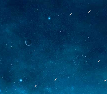
部分效果截图:
HTML代码(index.html):
<!DOCTYPE html PUBLIC "-//W3C//DTD XHTML 1.0 Transitional//EN" "http://www.w3.org/TR/xhtml1/DTD/xhtml1-transitional.dtd">
<html xmlns="http://www.w3.org/1999/xhtml">
<head>
    <meta http-equiv="Content-Type" content="text/html; charset=utf-8" />
    <meta http-equiv="X-UA-Compatible" content="IE=8" />
    <title>jQuery天空流星雨动画特效 </title>
    <link href="css/css.css" rel="stylesheet" type="text/css" />
    <script type="text/javascript" src="js/jquery-1.4.2.min.js"></script>
    <script type="text/javascript" src="js/js.js"></script>
</head>
<body>
    <div class="div"></div>
</body>
</html>
JS代码(js.js):
$(function(){
	var Timerr;
	function aa(){
	for(var i=0;
	i<4;
	i++){
	var m=parseInt(Math.random()*700+100);
	var j2=parseInt(Math.random()*300+1200);
	var j=parseInt(Math.random()*1600+000);
	var j1=parseInt(Math.random()*300+300);
	var n=parseInt(Math.random()*10+(-10));
	$('.div').prepend('<div><div><div><div><div></div></div></div></div></div>')$('.div').children('div').eq(0).css({
	'left':j,'top':n}
)$('.div').children('div').eq(0).animate({
	'left':j-j1,'top':$(window).height()+20}
,j2)}
}
aa();
	setInterval(function(){
	aa();
}
,300)setInterval(function(){
	for(var jj=0;
	jj<$('.div>div').size()/4;
	jj++){
	$('.div>div').eq($('.div>div').size()-jj).remove();
}
}
,1000)}
)
CSS代码(css.css):
@charset "utf-8";*{padding:0;margin:0;}
address,caption,cite,code,dfn,em,th,var{font-weight:normal;font-style:normal;}
h1,h2,h3,h4,h5,h6{font-weight:normal;}
.clear{clear:both;}
body{margin:0 auto;padding:0;font-size:12px;font-family:"瀹嬩綋";overflow:hidden;background:url(../images/xkbj.jpg) no-repeat center center;}
img{border:0px;}
a{text-decoration:none;font-size:12px;}
a:hover{text-decoration:underline;color:red;}
a{blr:expression(this.onFocus=this.blur())}
a:focus{outline:0;}
ul,li{list-style:none;padding:0;margin:0;}
/* CSS Document */
html,body{width:100%;height:100%;overflow:hidden}
.div{width:100%;overflow:hidden;position:relative;height:100%}
.div>div{width:4px;height:4px;background:#cccccc;position:absolute;top:0px;right:0px;border-radius:100%}
.div>div>div{width:3px;height:3px;background:#ccc;position:absolute;top:-2px;right:-2px;}
.div>div>div>div{width:2px;height:2px;background:#ccc;position:absolute;top:-2px;right:-2px;}
.div>div>div>div div{width:1px;height:1px;background:#ccc;position:absolute;top:-1px;right:-1px;}


 分享到QQ
分享到QQ 分享到微博
分享到微博 微信扫一扫
微信扫一扫