以下是 jQuery鼠标悬停边框变换动画特效代码 的示例演示效果:
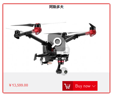
部分效果截图:
HTML代码(index.html):
<!DOCTYPE html>
<html>
<head lang="en">
<meta charset="UTF-8">
<title>jQuery鼠标悬停边框变换动画特效</title>
<script type="text/javascript" src="js/jquery.min.js"></script>
<style>
*{margin:0;padding:0;list-style-type:none;}
a,img{border:0;}
a{color:#000;text-decoration: none;font-weight: 600}
body{font:12px/180% Arial, Helvetica, sans-serif, "新宋体";}

.cn_gobuy {
	float: left;
	width: 360px;
	text-align: center;
	line-height: 2;
	margin-top: 20px;
	margin-left: 20px;
	border:1px solid #E6E2E2;
	border-radius: 2%;
	position: relative;
	height: 300px;
	overflow: hidden;
}
.biankuang{
	width: 3px;
	height: 3px;
	position: absolute;
	z-index: 99;
	border-radius:10px;
	/*background: black;*/
}
.biankuang_1{
	height: 3px;
	top: -6px;
	left:0px;
	border-left: 3px solid #EB5858;
}
.biankuang_2 {
	width: 0px;
	bottom:-3px;
	left: 0px;
	border-top: 3px solid #EB5858;
}
.biankuang_3{
	height: 0px;
	bottom:0px;
	right:0px;
	border-right: 3px solid #EB5858;

}
.biankuang_4{
	width:0px;
	top:-3px;
	right:0px;
	border-bottom: 3px solid #EB5858;
}/*
/!*边框动画*!/
@keyframes changes1 {
	0%{height: 0px; border-left:3px solid transparent;}
	100%{height:305px; border-left: 3px solid red;}
	/!*100%{height:300px;width: 300px}*!/
}
@keyframes changes2 {
	0%{width: 0px;border-bottom: 3px solid transparent;}
	100%{width:300px;border-bottom: 3px solid red;}
	/!*100%{height:300px;width: 300px}*!/
}*/

.tp_gobuy {
	position: absolute;
	z-index:2;
	left: 0;
	top: 0px;
}
.text_gobuy {
	position: absolute;
	z-index:9;
	bottom: -50px;
	width: 360px;
	height: 50px;
	overflow: hidden;
	background:rgba(207, 208, 211, 0);
	cursor: pointer;
	transition:all  300ms;
	-webkit-transition:all  300ms;
	-moz-transition:all  300ms;
	-o-transition:all  300ms;
}
.text_gobuy_show{
	height: 50px;
	position: absolute;
	z-index:9;
	bottom:0px;
	width: 360px;
	overflow: hidden;
	padding: 10px 15px ;
	cursor: pointer;
	background-color: rgba(207, 208, 211,0.3);
}
.cn_gobuy b{position: absolute;bottom:10px;left:20px;line-height: 33px;color: #EB5858}
.cn_gobuy .a_add_divboc{position: absolute;bottom: 0;left:200px}
.top_text{position: absolute;top:0;z-index: 999;text-align: center;width: 100%;left: 0}
.search_y{position: absolute;left: 100px;top:100px;z-index: 999;opacity: 0}
</style>
</head>
<body>

<div class="cn_gobuy">
    <div class="search_y"><a href="#"><img src="images/search_y.png" alt=""/></a></div>
    <div class="biankuang biankuang_1"></div>
    <div class="biankuang biankuang_2"></div>
    <div class="biankuang biankuang_3"></div>
    <div class="biankuang biankuang_4"></div>
    <a class="tp_gobuy" href="#"><img src="images/2-328x300.jpg" alt="Voyager 3" title="Voyager 3"></a>

    <a class="top_text" href="#">阿斯多夫</a>
    <div class="text_gobuy">
        <br/>
        <b>¥13,599.00</b>
        <br/>

        <div class="a_add_divboc">
            <div id="boynow">
                <a href="#">
                    <img src="images/buynow.jpg" width="117" height="33">
                </a>
            </div>
        </div>
    </div>
</div>
<script>
    $(function(){
//        边框效果--移入
        function biankuang(){
            $('.biankuang_1').stop(true).animate({
                height:'305px'
            },300)
            $('.biankuang_2').stop(true).delay(300).animate({
                width:'360px'
            },300)
            $('.biankuang_3').stop(true).animate({
                height:'305px'
            },300)
            $('.biankuang_4').stop(true).delay(300).animate({
                width:'360px'
            },300)
        }
//        边框效果--移出
        function biankuang1(){

            $('.biankuang_1').stop(true).delay(100).animate({
                height:'0px'
            },100)
            $('.biankuang_2').stop(true).animate({
                width:'0px'
            },100)
            $('.biankuang_3').stop(true).delay(100).animate({
                height:'0px'
            },100)
            $('.biankuang_4').stop(true).animate({
                width:'0px'
            },100)
        }
//        触发

            $('.cn_gobuy').hover(
                    function () {
                            $('.text_gobuy').addClass('text_gobuy_show');
                            $('.search_y').animate({left:'150',opacity:1},300);
                        biankuang();
                    },
                    function () {
                        $('.text_gobuy').removeClass('text_gobuy_show');
                        $('.search_y').animate({left:'100',opacity:0},300);
                        biankuang1();
                    }
            );

    })
</script>
</body>
</html>


 分享到QQ
分享到QQ 分享到微博
分享到微博 微信扫一扫
微信扫一扫