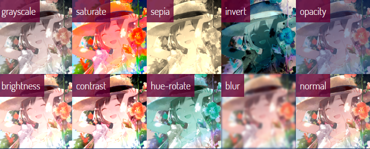
以下是 CSS3 Filter图片滤镜特效代码 的示例演示效果:
部分效果截图:
HTML代码(index.html):
<!DOCTYPE html>
<html >
<head>
<meta charset="UTF-8">
<title>CSS3 Filter图片滤镜特效</title>
<link rel='stylesheet prefetch' href='css/morrqg.css'>
<link rel="stylesheet" href="css/style.css">
</head>

<body>
<h1>CSS <span>Filters</span></h1>
<main>
	<div data-filter="image-grayscale">
		<h2>grayscale</h2>
		<img src="img/a.jpg">
	</div>
	<div data-filter="image-saturate">
		<h2>saturate</h2>
		<img src="img/a.jpg">
	</div>
	<div data-filter="image-sepia">
		<h2>sepia</h2>
		<img src="img/a.jpg">
	</div>
	<div data-filter="image-invert">
		<h2>invert</h2>
		<img src="img/a.jpg">
	</div>
	<div data-filter="image-opacity">
		<h2>opacity</h2>
		<img src="img/a.jpg">
	</div>
	<div data-filter="image-brightness">
		<h2>brightness</h2>
		<img src="img/a.jpg">
	</div>
	<div data-filter="image-contrast">
		<h2>contrast</h2>
		<img src="img/a.jpg">
	</div>
	<div data-filter="image-hue-rotate">
		<h2>hue-rotate</h2>
		<img src="img/a.jpg">
	</div>
	<div data-filter="image-blur">
		<h2>blur</h2>
		<img src="img/a.jpg">
	</div>
	<div data-filter="image-normal">
		<h2>normal</h2>
		<img src="img/a.jpg">
	</div>
</main>
</body>
</html>
CSS代码(morrqg.css):
// Media Queries// 1. Name and define our breakpoints. Name the map something sensical// 2. Write a comma separated list of key:value,pairs that we will use later$breakpoints:( small:34em,large:60em,);// if selector is wider than the screensize we are calling@mixin bp($screen-size){// and if our map that we named $breakpoints includes values (we called them $screen-size)@if map-has-key($breakpoints,$screen-size){// then write out a nested Media Query that will target that value as our min-width@media (min-width:map-get($breakpoints,$screen-size)){// write CSS within this mixin that would apply to only this breakpoint or above@content;}
// if the screen-size we are requesting doesn't exist,then tell me when it is compiled}
@else{// Debugging @warn "'#{$screen-size}
' has not been declared as a breakpoint.";}
}
CSS代码(style.css):
@import url("https://fonts.googleapis.com/css?family=Dosis:300,800");[data-filter*=image-]{flex:0 1 20%;line-height:0;position:relative;z-index:0;}
[data-filter*=image-] img{height:auto;width:100%;}
[data-filter="image-grayscale"] img{filter:grayscale(50%);}
[data-filter="image-saturate"] img{filter:saturate(360%);}
[data-filter="image-sepia"] img{filter:sepia(100%);}
[data-filter="image-invert"] img{filter:invert(100%);}
[data-filter="image-opacity"] img{filter:opacity(50%);}
[data-filter="image-brightness"] img{filter:brightness(120%);}
[data-filter="image-contrast"] img{filter:contrast(160%);}
[data-filter="image-hue-rotate"] img{filter:hue-rotate(160deg);}
[data-filter="image-blur"] img{filter:blur(2px);}
body{background:#163065;color:#fff;font-family:'Dosis',sans-serif;line-height:1;}
main{display:flex;flex-wrap:wrap;}
h1{font-size:2.5rem;font-weight:300;line-height:1;margin:2rem 0 3rem;padding:0;text-align:center;width:100vw;}
h1 span{color:#f8be00;font-size:5rem;font-weight:800;margin:0;}
h2{background:rgba(100,0,50,0.8);color:#fff;display:block;font-size:1.25rem;font-weight:300;left:0;line-height:1.5;margin:0;padding:.5rem;position:absolute;top:0;z-index:1;}
a{color:#fff;display:inline-block;font-size:1rem;}
a:hover{color:#f8be00;}


 分享到QQ
分享到QQ 分享到微博
分享到微博 微信扫一扫
微信扫一扫