以下是 css3背景虚化效果特效代码 的示例演示效果:
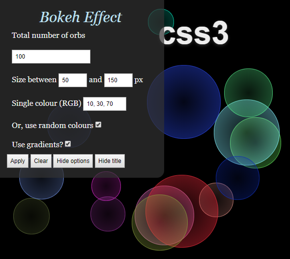
部分效果截图:
HTML代码(index.html):
<!DOCTYPE HTML PUBLIC "-//W3C//DTD HTML 4.01//EN" "http://www.w3.org/TR/html4/strict.dtd">
<html>
<head>
<meta http-equiv="Content-Type" content="text/html;charset=iso-8859-1"/>
<title>css3背景虚化效果 - 站长素材</title>
<link rel="stylesheet" type="text/css" href="css/style.css"/>
<script type="text/javascript" src="js/jquery.min.js"></script>
<script type="text/javascript" src="js/script.js"></script>
</head>
<body>
<div id="configuration">
<h3>Bokeh Effect</h3>
<p>Total number of orbs</p>
<p><input type="text" id="nrOfOrbs" value="100" /></p>
<p>Size between <input type="text" id="orbMin" size="3" value="50" /> and <input type="text" id="orbMax" size="3" value="150" /> px</p>
<p>Single colour (RGB) <input type="text" id="orbColour" size="8" value="10, 30, 70" /></p>
<p>Or, use random colours <input type="checkbox" id="orbRandom" checked="checked" /></p>
<p>Use gradients? <input type="checkbox" id="orbGradient" checked="checked" /></p>
<input type="button" id="changeEffects" value="Apply" />
<input type="button" id="clearBokeh" value="Clear" />
<input type="button" id="hideOptions" value="Hide options" />
<input type="button" id="hideTitle" value="Hide title" />
</div>
<div id="wrapper">
<div id="title">
<h1>css3</h1>
</div>
<div id="bokehs">
<!-- Bokeh will get injected dynamically using jQuery -->
</div>
</div>
</body>
</html>
JS代码(script.js):
/** Author:Marco Kuiper (http://www.marcofolio.net/)*/
$(document).ready(function(){
	// Paint with default settingsrepaint();
	// Paint when button has been clicked$("#changeEffects").click(function(){
	repaint();
}
);
	// Clear when button has been clicked$("#clearBokeh").click(function(){
	// Remove all child elements from the bokeh container$("#bokehs").empty();
}
);
	// Hide the title when button has been clicked$("#hideTitle").click(function(){
	$("#title").remove();
	$(this).remove();
}
);
	// Hide/show options$("#hideOptions").toggle(function(){
	$(this).attr("value","Show options");
	$("#configuration").animate({
	top:'-320px'}
,300);
}
,function(){
	$(this).attr("value","Hide options");
	$("#configuration").animate({
	top:'0px'}
,300);
}
);
}
);
	// Master function that paints all the bokeh effectsfunction repaint(){
	// Retrieve all user submitted datavar numberOfBokehs = $("#nrOfOrbs").val();
	var bokehMinSize = parseInt($("#orbMin").val());
	var bokehMaxSize = parseInt($("#orbMax").val());
	var orbColour = $("#orbColour").val();
	// Check if we need to create random coloursvar useRandomColours = false;
	if ( $("#orbRandom").is(":checked") ){
	useRandomColours = true;
}
// Check if we need to create gradientsvar useGradients = false;
	if ( $("#orbGradient").is(":checked") ){
	useGradients = true;
}
// Generate the bokeh orbsfor(var i = 0;
	i < numberOfBokehs;
	i++){
	// Generate a random bokeh sizevar bokehSize = randomXToY(bokehMinSize,bokehMaxSize);
	if(useRandomColours){
	// Generate the random bokeh colourvar bokehColour = randomColour();
}
else{
	// Use the given RGB codevar bokehColour = orbColour;
}
// Create the bokehvar bokeh = $("<div />").addClass("bokeh").css({
	'left':Math.floor(Math.random()* screen.width ) + 'px','top':Math.floor(Math.random()* screen.height ) + 'px','width':bokehSize + 'px','height':bokehSize + 'px','-moz-border-radius':Math.floor(bokehSize)/2 + 'px','-webkit-border-radius':Math.floor(bokehSize)/2 + 'px','border':'1px solid rgba(' + bokehColour + ',0.7)'}
);
	if(useGradients){
	bokeh.css({
	// Gradients for Firefox'background':'-moz-radial-gradient( contain,rgba('+ bokehColour +',0.1),rgba(' + bokehColour + ',0.4))',// Freaking ugly workaround to make gradients work for Safari too,by applying it to the background-image'background-image':'-webkit-gradient(radial,center center,0,center center,70.5,from(rgba('+ bokehColour +',0.1)),to(rgba(' + bokehColour + ',0.4)))'}
);
}
else{
	bokeh.css({
	'background':'rgba(' + bokehColour + ',0.3)'}
);
}
// Append to containerbokeh.appendTo("#bokehs");
}
}
// Function to get a random value between two values// http://roshanbh.com.np/2008/09/get-random-number-range-two-numbers-javascript.htmlfunction randomXToY(minVal,maxVal,floatVal){
	var randVal = minVal+(Math.random()*(maxVal-minVal));
	return typeof floatVal=='undefined'?Math.round(randVal):randVal.toFixed(floatVal);
}
// Function to generate a random colour in RBA// Modified from:http://develobert.blogspot.com/2008/06/random-color-generation-with-javascript.htmlfunction randomColour(){
	var rint = Math.round(0xffffff * Math.random());
	return (rint >> 16) + ',' + (rint >> 8 & 255) + ',' + (rint & 255);
}
CSS代码(style.css):
/* __ _ _ _ / _| | (_) | | _ __ ___ __ _ _ __ ___ ___ | |_ ___ | |_ ___ _ __ ___| |_| '_ ` _ \ / _` | '__/ __/ _ \| _/ _ \| | |/ _ \ | '_ \ / _ \ __|| | | | | | (_| | | | (_| (_) | || (_) | | | (_) || | | | __/ |_|_| |_| |_|\__,_|_| \___\___/|_| \___/|_|_|\___(_)_| |_|\___|\__|*/
/* BASIC RESET */
ul,ol,li,h1,h2,h3,h4,h5,h6,pre,form,body,html,p,blockquote,fieldset,input{margin:0;padding:0;}
/* HTML ELEMENTS */
body{background-color:#000;color:#eee;overflow:hidden;font-family:Georgia,Times,Serif;}
h1{font:bold 65px/60px Helvetica,Arial,Sans-serif;text-align:center;color:#eee;text-shadow:0px 2px 6px #333;}
h1 small{font-size:20px;text-transform:uppercase;letter-spacing:14px;display:block;color:#ccc;}
h2 a{display:block;text-decoration:none;margin:0 0 30px 0;font:italic 45px Georgia,Times,Serif;text-align:center;color:#bfe1f1;text-shadow:0px 2px 6px #333;}
h2 a:hover{color:#90bcd0;}
/* COMMON CLASSES */
.break{clear:both;}
/* WRAPPER */
#wrapper{width:800px;margin:40px auto;}
/* CONFIGURATION */
#configuration{position:absolute;left:0;top:0;width:300px;background-color:rgba(50,50,50,0.7);padding:20px;-moz-border-radius-bottomright:15px;-webkit-border-bottom-right-radius:15px;}
#configuration input{font-size:12px;padding:5px;}
#configuration p{padding:10px;}
#configuration h3{font:italic 30px Georgia,Times,Serif;text-align:center;color:#bfe1f1;text-shadow:0px 2px 6px #333;}
/* BOKEHS */
#bokehs{}
.bokeh{position:absolute;z-index:-1;}


 分享到QQ
分享到QQ 分享到微博
分享到微博 微信扫一扫
微信扫一扫