以下是 css3条纹边框效果特效代码 的示例演示效果:
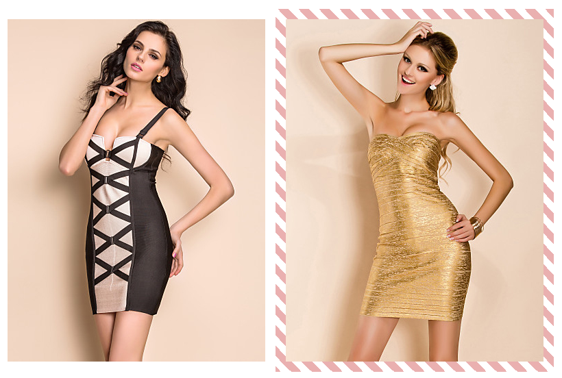
部分效果截图:
HTML代码(index.html):
<!DOCTYPE html PUBLIC "-//W3C//DTD XHTML 1.0 Transitional//EN" "http://www.w3.org/TR/xhtml1/DTD/xhtml1-transitional.dtd">
<html xmlns="http://www.w3.org/1999/xhtml">
<head>
<meta http-equiv="Content-Type" content="text/html; charset=utf-8" />
<title>css3条纹边框效果</title>
<link rel="stylesheet" href="zzsc.css">
</head>
<body>
<div class="main">
<ul>
<li class="product">
  <div class="product-hover"></div>
  <img src="images/1.jpg">
</li>
<li class="product">
  <div class="product-hover"></div>
  <img src="images/2.jpg">
</li>
<li class="product">
  <div class="product-hover"></div>
  <img src="images/3.jpg">
</li>
</ul>
</div>
</body>
</html>
CSS代码(zzsc.css):
body{padding:20px;font-family:"Trebuchet MS",Arial,Helvetica,sans-serif;}
ul,li{list-style:none;}
.product{width:376px;padding:15px;position:relative;float:left;}
.product > img{display:block;position:relative;cursor:pointer;}
.product:hover .product-hover,.product:active .product-hover{opacity:1;}
.product-hover{position:absolute;top:0;left:0;right:0;bottom:0;opacity:0;-webkit-transition:opacity 0.3s ease;-moz-transition:opacity 0.3s ease;transition:opacity 0.3s ease;background-size:30px 30px;background-image:-webkit-linear-gradient(45deg,rgba(234,176,176,1) 25%,transparent 25%,transparent 50%,rgba(234,176,176,1) 50%,rgba(234,176,176,1) 75%,transparent 75%,transparent);background-image:-moz-linear-gradient(45deg,rgba(234,176,176,1) 25%,transparent 25%,transparent 50%,rgba(234,176,176,1) 50%,rgba(234,176,176,1) 75%,transparent 75%,transparent);background-image:linear-gradient(45deg,rgba(234,176,176,1) 25%,transparent 25%,transparent 50%,rgba(234,176,176,1) 50%,rgba(234,176,176,1) 75%,transparent 75%,transparent);-webkit-animation:barberpole 0.5s linear infinite;-moz-animation:barberpole 0.5s linear infinite;animation:barberpole 0.5s linear infinite;}
@-webkit-keyframes barberpole{from{background-position:0 0;}
to{background-position:60px 30px;}
}
@-moz-keyframes barberpole{from{background-position:0 0;}
to{background-position:60px 30px;}
}
@keyframes barberpole{from{background-position:0 0;}
to{background-position:60px 30px;}
}
h1{text-align:center;}
.main{margin:10px auto;text-align:center;overflow:hidden;}
.info{color:#333;text-align:center;font-size:14px;}
.info a{color:#333;text-decoration:none;}
.title{background-color:rgba(0,0,0,0.56);width:100%;position:fixed;top:0;left:0;font-size:12px;font-family:Verdana,Geneva,sans-serif;z-index:99999;}
.title a{color:#FFF;text-decoration:none;line-height:24px;padding:0 10px;letter-spacing:1px;}
.title_r{float:right;}
.title_l{float:left;}
.title a:hover{background:#000;}


 分享到QQ
分享到QQ 分享到微博
分享到微博 微信扫一扫
微信扫一扫