以下是 jquery地图标记提示特效代码 的示例演示效果:
部分效果截图:
HTML代码(index.html):
<!DOCTYPE html>
<html>
<head>
<title>jquery地图标记提示</title>
<script src="js/jquery-1.6.3.min.js"></script>
<script>
$(document).ready(function(){
// set the wrapper width and height to match the img size
$('#wrapper').css({'width':$('#wrapper img').width(),
'height':$('#wrapper img').height()
})
//tooltip direction
var tooltipDirection;
for (i=0; i<$(".pin").length; i++)
{
// set tooltip direction type - up or down
if ($(".pin").eq(i).hasClass('pin-down')) {
tooltipDirection = 'tooltip-down';
} else {
tooltipDirection = 'tooltip-up';
}
// append the tooltip
$("#wrapper").append("<div style='left:"+$(".pin").eq(i).data('xpos')+"px;top:"+$(".pin").eq(i).data('ypos')+"px' class='" + tooltipDirection +"'>\
<div class='tooltip'>" + $(".pin").eq(i).html() + "</div>\
</div>");
}
// show/hide the tooltip
$('.tooltip-up, .tooltip-down').mouseenter(function(){
$(this).children('.tooltip').fadeIn(100);
}).mouseleave(function(){
$(this).children('.tooltip').fadeOut(100);
})
});
</script>
<style>
body {
text-align: center;
font: 13px Arial,Helvetica;
}
/* Relative positioning*/
#wrapper {
position: relative;
margin: 50px auto 20px auto;
border: 1px solid #fafafa;
-moz-box-shadow: 0 3px 3px rgba(0,0,0,.5);
-webkit-box-shadow: 0 3px 3px rgba(0,0,0,.5);
box-shadow: 0 3px 3px rgba(0,0,0,.5);
}
/* Hide the original tooltips contents */
.pin {
display: none;
}
/* Begin styling the tooltips and pins */
.tooltip-up, .tooltip-down {
position: absolute;
background: url(images/arrow-up-down.png);
width: 36px;
height: 52px;
}
.tooltip-down {
background-position: 0 -52px;
}
.tooltip {
display: none;
width: 200px;
cursor: help;
text-shadow: 0 1px 0 #fff;
position: absolute;
top: 10px;
left: 50%;
z-index: 999;
margin-left: -115px;
padding:15px;
color: #222;
-moz-border-radius: 5px;
-webkit-border-radius: 5px;
border-radius: 5px;
-moz-box-shadow: 0 3px 0 rgba(0,0,0,.7);
-webkit-box-shadow: 0 3px 0 rgba(0,0,0,.7);
box-shadow: 0 3px 0 rgba(0,0,0,.7);
background: #fff1d3;
background: -webkit-gradient(linear, left top, left bottom, from(#fff1d3), to(#ffdb90));
background: -webkit-linear-gradient(top, #fff1d3, #ffdb90);
background: -moz-linear-gradient(top, #fff1d3, #ffdb90);
background: -ms-linear-gradient(top, #fff1d3, #ffdb90);
background: -o-linear-gradient(top, #fff1d3, #ffdb90);
background: linear-gradient(top, #fff1d3, #ffdb90);
}
.tooltip::after {
content: '';
position: absolute;
top: -10px;
left: 50%;
margin-left: -10px;
border-bottom: 10px solid #fff1d3;
border-left: 10px solid transparent;
border-right :10px solid transparent;
}
.tooltip-down .tooltip {
bottom: 12px;
top: auto;
}
.tooltip-down .tooltip::after {
bottom: -10px;
top: auto;
border-bottom: 0;
border-top: 10px solid #ffdb90;
}
.tooltip h2 {
font: bold 1.3em 'Trebuchet MS', Tahoma, Arial;
margin: 0 0 10px;
}
.tooltip ul {
margin: 0;
padding: 0;
list-style: none;
}
</style>
</head>
<body>
<div id="wrapper">
<img width="920" height="450" src="images/world-map.jpg" alt="World continents">
<div class="pin pin-down" data-xpos="170" data-ypos="100">
<h2>North America</h2>
<ul>
<li><b>Area (km?):</b> 24,490,000</li>
<li><b>Population:</b> 528,720,588</li>
</ul>
</div>
<div class="pin" data-xpos="270" data-ypos="320">
<h2>South America</h2>
<ul>
<li><b>Area (km?):</b> 17,840,000</li>
<li><b>Population:</b> 382,000,000</li>
</ul>
</div>
<div class="pin pin-down" data-xpos="450" data-ypos="110">
<h2>Europe</h2>
<ul>
<li><b>Area (km?):</b> 10,180,000</li>
<li><b>Population:</b> 731,000,000 </li>
</ul>
</div>
<div class="pin" data-xpos="450" data-ypos="250">
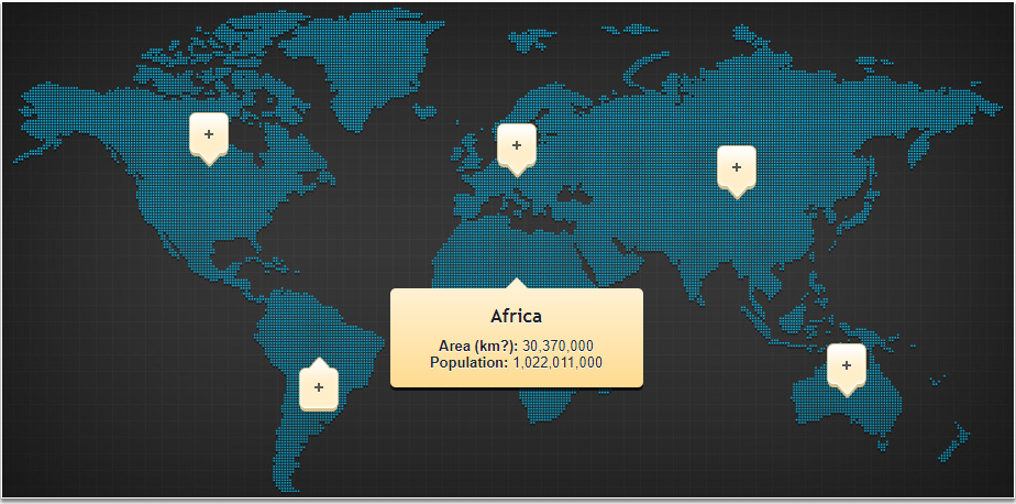
<h2>Africa</h2>
<ul>
<li><b>Area (km?):</b> 30,370,000</li>
<li><b>Population:</b> 1,022,011,000</li>
</ul>
</div>
<div class="pin pin-down" data-xpos="650" data-ypos="130">
<h2>Asia</h2>
<ul>
<li><b>Area (km?):</b> 43,820,000</li>
<li><b>Population:</b> 3,879,000,000</li>
</ul>
</div>
<div class="pin pin-down" data-xpos="750" data-ypos="310">
<h2>Australia</h2>
<ul>
<li><b>Area (km?):</b> 9,008,500</li>
<li><b>Population:</b> 31,260,000</li>
</ul>
</div>
</div>
<div style="text-align:center;clear:both">
</div>
</body>
</html>


 分享到QQ
分享到QQ 分享到微博
分享到微博 微信扫一扫
微信扫一扫