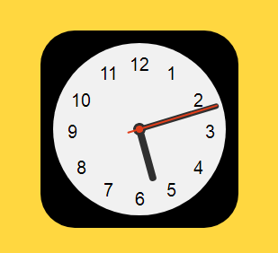
以下是 js+css3扁平化APP图标时钟动画特效代码 的示例演示效果:
部分效果截图:
HTML代码(index.html):
<!DOCTYPE html PUBLIC "-//W3C//DTD XHTML 1.0 Transitional//EN" "http://www.w3.org/TR/xhtml1/DTD/xhtml1-transitional.dtd">
<html xmlns="http://www.w3.org/1999/xhtml">
<head>
<meta http-equiv="Content-Type" content="text/html; charset=gb2312" />
<title>js+css3扁平化APP图标时钟动画</title>
<link href="css/zzsc.css" rel="stylesheet" type="text/css">
</head>
<body>
<!-- 代码 开始 -->
<div class="icon-large icon-clock">
	<div class="clock">
		<ol>
			<li></li>
			<li></li>
			<li></li>
			<li></li>
			<li></li>
			<li></li>
			<li></li>
			<li></li>
			<li></li>
			<li></li>
			<li></li>
			<li></li>
		</ol>
		<div id="hour"></div>
		<div id="min"></div>
		<div id="sec"></div>
	</div>
</div>
<script type="text/javascript" src="js/zzsc.js"></script>
<!-- 代码 结束 -->
</body>
</html>
JS代码(zzsc.js):
//use requestAnimationFrame for smoothness (shimmed with setTimeout fallback)window.requestAnimFrame = (function(){
	return window.requestAnimationFrame || window.webkitRequestAnimationFrame || window.mozRequestAnimationFrame || function( callback ){
	window.setTimeout(callback,1000 / 60);
}
;
}
)();
	//initialize the clock in a self-invoking function(function clock(){
	var hour = document.getElementById("hour"),min = document.getElementById("min"),sec = document.getElementById("sec");
	//set up a loop (function loop(){
	requestAnimFrame(loop);
	draw();
}
)();
	//position the hands function draw(){
	var now = new Date(),//now then = new Date(now.getFullYear(),now.getMonth(),now.getDate(),0,0,0),//midnight diffInMil = (now.getTime() - then.getTime()),// difference in milliseconds h = (diffInMil/(1000*60*60)),//hours m = (h*60),//minutes s = (m*60);
	//seconds //rotate the hands accordingly sec.style.webkitTransform = "rotate(" + (s * 6) + "deg)";
	hour.style.webkitTransform = "rotate(" + (h * 30 + (h / 2)) + "deg)";
	min.style.webkitTransform = "rotate(" + (m * 6) + "deg)";
}
}
)();
CSS代码(zzsc.css):
body{margin:0}
html,body{height:100%;background:#ffd740;position:relative;}
.icon-large{width:220px;height:220px;border-radius:38px;position:absolute;top:50%;left:50%;-webkit-transform:translate(-50%,-50%);-ms-transform:translate(-50%,-50%);transform:translate(-50%,-50%);}
.icon-clock{overflow:hidden;background:#000;}
.clock{width:192px;height:192px;border-radius:50%;background:#f1f1f1;position:absolute;top:50%;left:50%;-webkit-transform:translate(-50%,-50%);-ms-transform:translate(-50%,-50%);transform:translate(-50%,-50%);}
.clock ol{list-style-type:none;width:100%;height:100%;position:relative;margin:0;padding:0;}
.clock ol li{counter-increment:labelCounter;position:absolute;font-size:1.25em;}
.clock ol li:before{font-family:'Helvetica';content:counter(labelCounter) "";}
.clock ol li:nth-child(1){right:55px;top:20px;}
.clock ol li:nth-child(2){right:25px;top:50px;}
.clock ol li:nth-child(3){right:12px;top:85px;}
.clock ol li:nth-child(4){right:25px;top:125px;}
.clock ol li:nth-child(5){right:55px;top:150px;}
.clock ol li:nth-child(6){right:90px;top:160px;}
.clock ol li:nth-child(7){right:125px;top:150px;}
.clock ol li:nth-child(8){right:155px;top:125px;}
.clock ol li:nth-child(9){right:165px;top:85px;}
.clock ol li:nth-child(10){right:150px;top:50px;}
.clock ol li:nth-child(11){right:120px;top:20px;}
.clock ol li:nth-child(12){right:85px;top:10px;}
@-webkit-keyframes spin{100%{-webkit-transform:rotate(360deg);transform:rotate(360deg);}
}
@keyframes spin{100%{-webkit-transform:rotate(360deg);transform:rotate(360deg);}
}
#hour{width:14px;height:14px;border-radius:50%;background:#303030;position:absolute;top:50%;left:50%;margin-top:-7px;margin-left:-7px;}
#hour:before,#hour:after{content:"";display:block;position:absolute;}
#hour:before{width:8px;height:65px;border-radius:4px;background:#303030;position:absolute;bottom:2px;left:50%;-webkit-transform:translate(-50%,0);-ms-transform:translate(-50%,0);transform:translate(-50%,0);}
#min{width:0;height:0;border-radius:50%;background:#303030;position:absolute;top:50%;left:50%;}
#min:before,#min:after{content:"";display:block;position:absolute;}
/* www.datouwang.com */
#min:before{width:6px;height:90px;border-radius:4px;background:#303030;position:absolute;bottom:2px;left:50%;-webkit-transform:translate(-50%,0);-ms-transform:translate(-50%,0);transform:translate(-50%,0);}
#sec{width:4px;height:4px;border-radius:50%;background:#dd3e1c;border:2px solid #e13e1b;position:absolute;top:50%;left:50%;margin-top:-4px;margin-left:-4px;}
#sec:before,#sec:after{content:"";display:block;position:absolute;}
#sec:before{width:2px;height:105px;border-radius:4px;background:#e13e1b;position:absolute;bottom:-12px;left:50%;-webkit-transform:translate(-50%,0);-ms-transform:translate(-50%,0);transform:translate(-50%,0);}


 分享到QQ
分享到QQ 分享到微博
分享到微博 微信扫一扫
微信扫一扫