以下是 jQuery带日期的指针时钟特效代码 的示例演示效果:
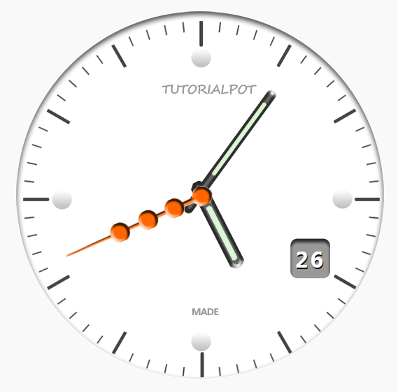
部分效果截图:
HTML代码(index.html):
<!DOCTYPE html>
<html>
<head>
<meta http-equiv="Content-Type" content="text/html; charset=utf-8" />
<title>jQuery带日期的指针时钟</title>
   <link rel="stylesheet" href="css/demo.css" type="text/css" media="screen"/>
</head>
<body>
<script src="js/jquery-1.6.2.min.js"></script>
<script src="js/script.js"></script>
</body>
</html>
JS代码(script.js):
$(document).ready(function(){
	//markup for the clockvar clock = ['<ul id="clock">','<li id="date"></li>','<li id="seconds"></li>','<li id="hours"></li>','<li id="minutes"></li>','</ul>'].join('');
	//fadein the clock and append it to the body $(clock).fadeIn().appendTo('body');
	//an autoexecuting function that updates the clovk view every second//you can also use setInterval (function Clock (){
}
)();
	(function Clock(){
	//get the date and time var date = new Date().getDate(),//get the current date hours = new Date().getHours(),//get the current hour minutes = new Date().getMinutes();
	//get the current minute seconds = new Date().getSeconds(),//get the current second $("#date").html(date);
	//show the current date on the clock var hrotate = hours * 30 + (minutes / 2);
	//i.e 12 hours * 30 = 360 degrees $("#hours").css({
	'transform':'rotate('+ hrotate +'deg)','-moz-transform':'rotate('+ hrotate +'deg)','-webkit-transform':'rotate('+ hrotate +'deg)'}
);
	var mrotate = minutes * 6;
	//degrees to rotate the minute hand $("#minutes").css({
	'transform':'rotate('+ mrotate +'deg)','-moz-transform':'rotate('+ mrotate +'deg)','-webkit-transform':'rotate('+ mrotate +'deg)'}
);
	var srotate = seconds * 6;
	//for the rotation to reach 360 degrees //i.e 60 seconds * 6 = 360 degrees. $("#seconds").css({
	'transform':'rotate('+ srotate +'deg)','-moz-transform':'rotate('+ srotate +'deg)','-webkit-transform':'rotate('+ srotate +'deg)'}
);
	//a call to the clock function after every 1000 miliseconds setTimeout(Clock,1000);
}
)();
}
);
CSS代码(demo.css):
*{margin:0;padding:0;}
body{background:#f9f9f9;color:#000;font:15px Calibri,Arial,sans-serif;text-shadow:1px 2px 1px #FFFFFF;}
a,a:visited{text-decoration:none;outline:none;color:#fff;}
a:hover{text-decoration:underline;color:#ddd;}
/*the footer*/
footer{background:#444 url("../images/bg-footer.png") repeat;position:fixed;width:100%;height:70px;bottom:0;left:0;color:#fff;text-shadow:2px 2px #000;-moz-box-shadow:5px 1px 10px #000;-webkit-box-shadow:5px 1px 10px #000;box-shadow:5px 1px 10px #000;}
footer h1{font:25px/26px Acens;font-weight:normal;left:50%;margin:0px 0 0 150px;padding:25px 0;position:relative;width:400px;}
footer a.orig,a.orig:visited{background:url("../images/demo2.png") no-repeat right top;border:none;text-decoration:none;color:#FCFCFC;font-size:14px;height:70px;left:50%;line-height:50px;margin:12px 0 0 -400px;position:absolute;top:0;width:250px;}
/*styling for the clock*/
#clock{position:relative;width:600px;height:600px;list-style:none;margin:20px auto;background:url('../images/clock.png') no-repeat center;}
#seconds,#minutes,#hours{position:absolute;width:30px;height:580px;left:270px;}
#date{text-shadow:1px 2px 1px #000;position:absolute;top:365px;color:#fff;right:140px;font:30px/36px Acens;font-weight:bold;letter-spacing:3px;}
#hours{background:url('../images/hands.png') no-repeat left;z-index:1000;}
#minutes{background:url('../images/hands.png') no-repeat center;width:25px;z-index:2000;}
#seconds{background:url('../images/hands.png') no-repeat right;z-index:3000;}


 分享到QQ
分享到QQ 分享到微博
分享到微博 微信扫一扫
微信扫一扫