以下是 SVG时钟走时图标特效代码 的示例演示效果:
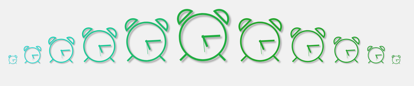
部分效果截图:
HTML代码(index.html):
<!DOCTYPE html PUBLIC "-//W3C//DTD XHTML 1.0 Transitional//EN" "http://www.w3.org/TR/xhtml1/DTD/xhtml1-transitional.dtd">
<html xmlns="http://www.w3.org/1999/xhtml">
<head>
<meta http-equiv="Content-Type" content="text/html; charset=gb2312" />
<title>SVG时钟走时图标特效</title>
<body>
<link rel="stylesheet" type="text/css" href="css/css.css"/>
<svg height="0" width="0" style="position:absolute;margin-left: -100%;">
<g id="clock-icon">
<rect id="minute-hand" transform="rotate(0 16 17)" x="15.386" y="6.464" width="1.227" height="11.439"/>
<rect id="hour-hand" transform="rotate(0 16 17)" x="15.386" y="10.291" width="1.227" height="7.626"/>
<rect id="second-hand" transform="rotate(0 16 17)" x="15.88" y="7.46"  width="0.24" height="9.83"/>

<path d="M15.879,2.531c-8.14,0-14.739,6.599-14.739,14.739c0,8.14,6.599,14.739,14.739,14.739s14.739-6.6,14.739-14.739
  C30.618,9.13,24.02,2.531,15.879,2.531z M15.879,30.852c-7.511,0-13.6-6.089-13.6-13.6c0-7.511,6.089-13.601,13.6-13.601  c7.511,0,13.6,6.089,13.6,13.601C29.479,24.763,23.391,30.852,15.879,30.852z"/>
<rect x="24.794" y="28.95" transform="matrix(0.7071 0.7071 -0.7071 0.7071 28.9921 -10.8671)"  width="5.639" height="1.226"/>
<rect x="1.076" y="28.866" transform="matrix(-0.7071 0.7071 -0.7071 -0.7071 27.6973 47.4864)" width="5.876" height="1.227"/>
<path  d="M9.946,1.291c-1.044-0.812-2.353-1.3-3.778-1.3C2.761-0.009,0,2.752,0,6.158c0,1.425,0.488,2.733,1.3,3.778
  l0.524-0.524l0.002,0.002l7.859-7.859L9.684,1.553L9.946,1.291z M6.167,1.198c0.634,0,1.233,0.132,1.79,0.35L1.558,7.948
  c-0.218-0.557-0.35-1.156-0.35-1.79C1.208,3.418,3.428,1.198,6.167,1.198z"/>
<path  d="M30.7,9.936C31.512,8.892,32,7.583,32,6.158c0-3.406-2.762-6.167-6.168-6.167
  c-1.425,0-2.733,0.488-3.777,1.3l0.524,0.524l-0.002,0.002l7.858,7.859l0.002-0.002L30.7,9.936z M30.793,6.158
  c0,0.634-0.133,1.233-0.352,1.79l-6.398-6.399c0.557-0.218,1.156-0.35,1.789-0.35C28.572,1.198,30.793,3.418,30.793,6.158z"/>

<script type="text/javascript">
    (function(undefined){
      var setTime = function(){
      var date = new Date(),
      MINUTE = 60, HOUR   = 60*MINUTE,
      seconds = date.getSeconds(),
      minutes = (date.getMinutes()*MINUTE) + seconds,
      hours = (date.getHours()*HOUR)+minutes;

        document.getElementById('second-hand').setAttribute('transform', 'rotate('+360*(seconds/MINUTE)+',16,17)');
        document.getElementById('minute-hand').setAttribute('transform', 'rotate('+360*(minutes/HOUR)+',16,17)');
        document.getElementById('hour-hand').setAttribute('transform', 'rotate('+360*(hours/(12*HOUR))+',16,17)');
      }
    setTime();
    var interval = setInterval(setTime,1000);
    })();
</script>
</g>

  <filter id='color-shadow-2' data-iconmelon='filter:d8b3243222f113cd0dd357f0aaed2ee9' color-interpolation-filters="sRGB">
    <feComponentTransfer in="SourceGraphic">
      <feFuncR type="discrete" tableValues=".65"/>
      <feFuncG type="discrete" tableValues=".65"/>
      <feFuncB type="discrete" tableValues=".65"/>
    </feComponentTransfer>
    <feGaussianBlur stdDeviation=".5"/>
    <feOffset dx="1" dy="1" result="shadow"/>
    <feComposite in="SourceGraphic" in2="shadow" operator="over"/>
  </filter>


</svg>

<!--SVG source document ends-->

<div class="svg-time-b">

<svg class="icon" viewBox="0 0 34 34">
  <g filter="url('#color-shadow-2')">
    <use xlink:href="#clock-icon"></use>
  </g>
</svg>

<svg class="icon is-x2 is-delay-1s" viewBox="0 0 34 34">
   <g filter="url('#color-shadow-2')">
    <use xlink:href="#clock-icon"></use>
  </g>
</svg>


<svg class="icon is-x3 is-delay-2s" viewBox="0 0 34 34">
   <g filter="url('#color-shadow-2')">
    <use xlink:href="#clock-icon"></use>
  </g>
</svg>

<svg class="icon is-x4 is-delay-3s" viewBox="0 0 34 34">
   <g filter="url('#color-shadow-2')">
    <use xlink:href="#clock-icon"></use>
  </g>
</svg>


<svg class="icon is-x5 is-delay-4s" viewBox="0 0 34 34">
   <g filter="url('#color-shadow-2')">
    <use xlink:href="#clock-icon"></use>
  </g>
</svg>

<svg class="icon is-x6 is-delay-5s" viewBox="0 0 34 34">
    <g filter="url('#color-shadow-2')">
    <use xlink:href="#clock-icon"></use>
  </g>
</svg>

<svg class="icon is-x5 is-delay-6s" viewBox="0 0 34 34">
  <g filter="url('#color-shadow-2')">
    <use xlink:href="#clock-icon"></use>
  </g>
</svg>

<svg class="icon is-x4 is-delay-7s" viewBox="0 0 34 34">
   <g filter="url('#color-shadow-2')">
    <use xlink:href="#clock-icon"></use>
  </g>
</svg>

<svg class="icon is-x3 is-delay-8s" viewBox="0 0 34 34">
  <g filter="url('#color-shadow-2')">
    <use xlink:href="#clock-icon"></use>
  </g>
</svg>

<svg class="icon is-x2 is-delay-9s" viewBox="0 0 34 34">
  <g filter="url('#color-shadow-2')">
    <use xlink:href="#clock-icon"></use>
  </g>
</svg>

<svg class="icon is-delay-10s" viewBox="0 0 34 34">
  <g filter="url('#color-shadow-2')">
    <use xlink:href="#clock-icon"></use>
  </g>
</svg>
</div>
</body>
</html>
JS代码(js.js):
// JavaScript Document$(document).ready(function(e){
	var ImgBox = $(".img-box"),ImgSpan =ImgBox.find("span"),ImgDiv = $(".img-box div"),BtnNext = $("#btn-next"),BtnPrve = $("#btn-prev"),Btn = $(".btn"),speed = 600,//设置动画的运动时间 Tick = 4000+speed,//设置定时器的间隔时间 n=1,//设置张数计数器 whichCl,//设置判断点击了哪一个按钮 z=0;
	//设置当前动画计数器 ImgSpan.html("第 "+n+" 张/共 "+ImgDiv.length+" 张");
	function Slider(){
	//动画函数 if(whichCl=="nextCl"){
	n++;
	if(n>ImgDiv.length){
	n=1;
}
z--;
	if(z<0){
	z=ImgDiv.length-1;
}
}
if(whichCl=="prevCl"){
	n--;
	if(n<1){
	n=ImgDiv.length;
}
}
ImgSpan.html("第 "+n+" 张/共 "+ImgDiv.length+" 张");
	ImgDiv.eq(z).stop().animate({
	right:-(1.1*ImgDiv.width())}
,speed,function(){
	if(whichCl=="nextCl"){
	ImgSpan.after($(this));
}
if(whichCl=="prevCl"){
	ImgBox.append($(this));
}
$(this).stop().animate({
	right:0}
,speed);
}
) if(whichCl=="prevCl"){
	z++;
	if(z>ImgDiv.length-1){
	z=0;
}
}
ImgBox.stop().animate({
	right:100}
,speed,function(){
	$(this).stop().animate({
	right:0}
,speed)}
) ImgSpan.stop().animate({
	left:395}
,speed,function(){
	$(this).stop().animate({
	left:295}
,speed)}
)}
BtnNext.click(next_cl = function(){
	whichCl="nextCl";
	Slider();
}
);
	//向右点击事件启动动画函数 BtnPrve.click(prev_cl = function(){
	whichCl="prevCl";
	Slider();
}
);
	//向左点击事件启动动画函数 Btn.hover(function(){
	clearTimeout(autoTime)}
,function(){
	autoTime = setInterval(next_cl,Tick);
}
)//当鼠标进入点击按钮时对定时器进行控制 autoTime = setInterval(next_cl,Tick);
	//模拟向右点击事件定时启动动画函数,也可以使用 prev_cl向左启动动画函数}
);
CSS代码(css.css):
body{margin:0;padding:0;background:#f1f1f1;text-align:center;}
.icon{width:32px;height:32px;fill:#22A62B;animation:anima 30s ease-out infinite;}
.icon.is-check{fill:#FE4365;}
.icon.is-x10{width:320px;height:320px;}
.icon.is-x2{width:64px;height:64px;}
.icon.is-x3{width:96px;height:96px;}
.icon.is-x4{width:128px;height:128px;}
.icon.is-x5{width:160px;height:160px;}
.icon.is-x6{width:192px;height:192px;}
@keyframes anima{0%{fill:#22A62B;color:#22A62B;}
10%{fill:#14E3E6;color:#14E3E6;}
20%{fill:#195BEF;color:#195BEF;}
30%{fill:#DF26D9;color:#DF26D9;}
40%{fill:#DF2688;color:#DF2688;}
50%{fill:#FEA903;color:#FEA903;}
60%{fill:#DF26DE;color:#DF26DE;}
70%{fill:#2C4AED;color:#2C4AED;}
80%{fill:#14E3F7;color:#14E3F7;}
90%{fill:#195BEF;color:#195BEF;}
100%{fill:#22A62B;}
}
.icon.is-delay-1s{animation-delay:.5s;}
.icon.is-delay-2s{animation-delay:1s;}
.icon.is-delay-3s{animation-delay:1.5s;}
.icon.is-delay-4s{animation-delay:2s;}
.icon.is-delay-5s{animation-delay:2.5s;}
.icon.is-delay-6s{animation-delay:3s;}
.icon.is-delay-7s{animation-delay:3.5s;}
.icon.is-delay-8s{animation-delay:4s;}
.icon.is-delay-9s{animation-delay:4.5s;}
.icon.is-delay-10s{animation-delay:5s;}
.svg-time-b{margin-top:100px;display:inline-block;min-width:1360px;}
.svg-time-b .icon + .icon{margin-left:16px;}
.svg-time-b > .text-be{font-size:32px;color:white;font-family:monospace;margin-top:32px;display:block;text-decoration:none;animation:anima 30s ease-out infinite;animation-delay:2.5s;color:#22A62B;text-shadow:4px 4px 3px rgba(0,0,0,.25);font-weight:bold;}


 分享到QQ
分享到QQ 分享到微博
分享到微博 微信扫一扫
微信扫一扫