以下是 jquery+css3时钟效果特效代码 的示例演示效果:
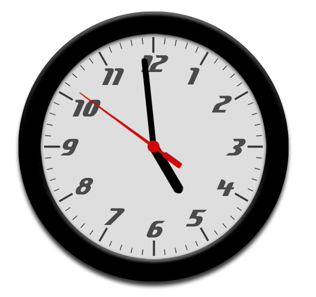
部分效果截图:
HTML代码(index.html):
<!DOCTYPE html PUBLIC "-//W3C//DTD XHTML 1.0 Strict//EN" "http://www.w3.org/TR/xhtml1/DTD/xhtml1-strict.dtd">
<html xmlns="http://www.w3.org/1999/xhtml">
<head>
    <meta http-equiv="Content-Type" content="text/html; charset=utf-8" />
    <title>jquery+css3时钟效果</title>
    <script type="text/javascript" src="js/jquery-1.2.6.min.js"></script>
    <style type="text/css">
        * {
        	margin: 0;
        	padding: 0;
        }

        #clock {
        	position: relative;
        	width: 600px;
        	height: 600px;
        	margin: 20px auto 0 auto;
        	background: url(images/clockface.jpg);
        	list-style: none;
        	}

        #sec, #min, #hour {
        	position: absolute;
        	width: 30px;
        	height: 600px;
        	top: 0px;
        	left: 285px;
        	}

        #sec {
        	background: url(images/sechand.png);
        	z-index: 3;
           	}

        #min {
        	background: url(images/minhand.png);
        	z-index: 2;
           	}

        #hour {
        	background: url(images/hourhand.png);
        	z-index: 1;
           	}

        p {
            text-align: center;
            padding: 10px 0 0 0;
            }
    </style>

    <script type="text/javascript">

        $(document).ready(function() {

              setInterval( function() {
              var seconds = new Date().getSeconds();
              var sdegree = seconds * 6;
              var srotate = "rotate(" + sdegree + "deg)";

              $("#sec").css({"-moz-transform" : srotate, "-webkit-transform" : srotate});

              }, 1000 );


              setInterval( function() {
              var hours = new Date().getHours();
              var mins = new Date().getMinutes();
              var hdegree = hours * 30 + (mins / 2);
              var hrotate = "rotate(" + hdegree + "deg)";

              $("#hour").css({"-moz-transform" : hrotate, "-webkit-transform" : hrotate});

              }, 1000 );


              setInterval( function() {
              var mins = new Date().getMinutes();
              var mdegree = mins * 6;
              var mrotate = "rotate(" + mdegree + "deg)";

              $("#min").css({"-moz-transform" : mrotate, "-webkit-transform" : mrotate});

              }, 1000 );

        });

    </script>

</head>

<body>

    <div id="demo-top-bar">

  <div id="demo-bar-inside">

  </div>

</div>

	<ul id="clock">
	   	<li id="sec"></li>
	   	<li id="hour"></li>
		<li id="min"></li>
	</ul>

	 <style type="text/css" style="display: none !important;">
	* {
		margin: 0;
		padding: 0;
	}
	body {
		overflow-x: hidden;
	}
	.bsa_it_ad {
		padding: 8px 4px 8px 12px !important;
		position: relative;
		border: 0 !important;
		background: #D6D5D5 !important;
		border-top: 0 !important;
		box-shadow: 2px 2px 2px rgba(0, 0, 0, 0.1);
		font: 11px "Lucida Grande", Sans-Serif !important;
	}
	.bsa_it_ad:before, .bsa_it_ad:after {
		content: "";
		position: absolute;
		top: 0;
		left: 6px;
		width: 100%;
		height: 100%;
		background: #989898;
		border-bottom: 6px solid #989898;
		z-index: -1;
		box-shadow: 2px 2px 2px rgba(0, 0, 0, 0.1);
	}
	.bsa_it_ad:before {
		top: 0;
		left: 12px;
		z-index: -2;
		background: #6C6666;
		border-bottom: 12px solid #6C6666;
	}

	.bsa_it_ad a {
	  margin: 0 !important;
		padding: 0 !important;
	}
	.bsa_it_ad a img {
	  border: 0 !important;
		position: static !important;
	}
	.bsa_it_ad a:hover img {
		margin: 0 !important;
	}
	.bsa_it_ad a:hover {
	  background: none !important;
	}
	.bsa_it_i {
		margin: 0 15px 0 0 !important;
	}
	.bsa_it_t {
		font-size: 14px !important;
		margin: 12px 0 0 0 !important;
	}
	.bsa_it_d {
		padding-right: 10px;
	}
	.bsa_it_p{
		display: none !important;
	}
	#demo-bar-ad {
		width: 416px;
		position: absolute;
		right: 0;
		top: -20px;
		font: 11px "Lucida Grande", Sans-Serif !important;
	}
	#bsap_aplink {
		position: absolute;
		color: #999;
		text-decoration: none;
		bottom: 8px !important;
		right: 8px !important;
		padding: 0 !important;
	}
	.bsa_it_p a:hover {
		background:none !important;
	}
	#demo-top-bar {
		text-align: left;
		background: #e18728;
		position: relative;
		zoom: 1;
		width: 100% !important;
		z-index: 6000;
		box-shadow: 0 0 10px black;
		padding: 20px 0 15px;
	}
	#demo-bar-inside {
		width: 960px;
		margin: 0 auto;
		position: relative;
	}
	#demo-top-bar:before, #demo-top-bar:after {
		content: "";
		position: absolute;
		top: 0;
		left: 6px;
		width: 100%;
		height: 100%;
		background: #e18728;
		border-bottom: 6px solid #8F5314;
		z-index: -1;
		box-shadow: 2px 2px 2px rgba(0, 0, 0, 0.1);
	}
	#demo-top-bar:before {
		top: 0;
		left: 12px;
		background: #6C6666;
		border-bottom: 12px solid #62390E;
	}

	#demo-bar-buttons {
		display: inline-block;
		width: 236px;
		text-align: center;
		vertical-align: top;
		font-size: 0;
	}
	#demo-bar-buttons a {
		font-size: 12px;
		color: white;
		display: block;
		margin: 2px 0;
		text-decoration: none;
		font: 14px "Lucida Grande", Sans-Serif !important;
	}
	#demo-bar-buttons a:hover,
	#demo-bar-buttons a:focus {
		color: #333;
	}

	#demo-bar-badge {
		display: inline-block;
		width: 302px;
		padding: 0 !important;
		margin: 0 !important;
		background-color: transparent !important;
	}
	#demo-bar-badge a {
		display: block;
		width: 100%;
		height: 38px;
		border-radius: 0;
		bottom: auto;
		margin: 0;
		background: url(/images/examples-logo.png) no-repeat;
		background-size: 100%;
		overflow: hidden;
		text-indent: -9999px;
	}
	#demo-bar-badge:before, #demo-bar-badge:after {
		display: none !important;
	}
</style>
</body>
</html>


 分享到QQ
分享到QQ 分享到微博
分享到微博 微信扫一扫
微信扫一扫