以下是 随浏览器大小切换jquery流布局js代码 的示例演示效果:
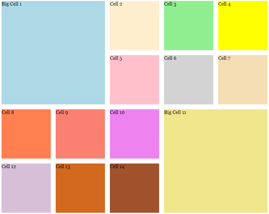
部分效果截图:
HTML代码(index.html):
<!DOCTYPE html PUBLIC "-//W3C//DTD XHTML 1.0 Transitional//EN" "http://www.w3.org/TR/xhtml1/DTD/xhtml1-transitional.dtd ">
<html xmlns="http://www.w3.org/1999/xhtml" xml:lang="en" lang="en" encoding="utf-8">
<head>
<script src="js/jquery.min.js" type="text/javascript"></script>
<script src="js/slidegrid.js" type="text/javascript"></script>
<link rel="stylesheet" type="text/css" href="css/slidegrid.css" ></link>
<title>Sliding Resizable Grid</title>
    </head>

    <body>
        <div class="slidegrid">
            <div class="cell bigcell" style="background: lightblue;">Big Cell 1</div>
            <div class="cell" style="background: #FEEECD;">Cell 2</div>
            <div class="cell" style="background: lightgreen;">Cell 3</div>
            <div class="cell" style="background: yellow;">Cell 4</div>

            <div class="cell" style="background: pink;">Cell 5</div>
            <div class="cell" style="background: lightgray;">Cell 6</div>
            <div class="cell" style="background: wheat;">Cell 7</div>
            <div class="cell" style="background: coral;">Cell 8</div>

            <div class="cell" style="background: salmon;">Cell 9</div>
            <div class="cell" style="background: violet;">Cell 10</div>
            <div class="cell bigcell" style="background: khaki;">Big Cell 11
            </div>
            <div class="cell" style="background: thistle;">Cell 12</div>

            <div class="cell" style="background: chocolate;">Cell 13</div>
            <div class="cell" style="background: sienna;">Cell 14</div>
            <div class="cell" style="background: goldenrod;">Cell 15</div>
            <div class="cell bigcell" style="background: lavender;">Big Cell 16
                <p>
                    Big cells like this one make it easy to use the grid for different types of content.
                </p>
            </div>

            <div class="cell" style="background: bisque;">Cell 17</div>
            <div class="cell" style="background: darkseagreen;">Cell 18</div>
            <div class="cell" style="background: mistyrose;">Cell 19</div>
            <div class="cell" style="background: plum;">Cell 20</div>

            <div class="cell" style="background: yellowgreen;">Cell 21</div>
            <div class="cell" style="background: peru;">Cell 22</div>
            <div class="cell" style="background: orange;">Cell 23</div>
            <div class="cell" style="background: lemonchiffon;">Cell 24</div>

            <div class="cell" style="background: deepskyblue;">Cell 25</div>
            <div class="cell" style="background: purple;">Cell 26</div>
            <div class="cell" style="background: greenyellow;">Cell 27</div>
            <div class="cell" style="background: goldenrod;">Cell 28</div>

            <div class="cell" style="background: sienna;">Cell 29</div>
            <div class="cell" style="background: skyblue;">Cell 30</div>

        </div>
    </body>
</html>
JS代码(slidegrid.js):
/*File:slidegrid.jsDescription:for more information see http://www.zackgrossbart.com/hackito/slidegrid/******************************************************************************* * * Licensed under the Apache License,Version 2.0 (the "License");
	* you may not use this file except in compliance with the License. * You may obtain a copy of the License at * * http://www.apache.org/licenses/LICENSE-2.0 * * Unless required by applicable law or agreed to in writing,software * distributed under the License is distributed on an "AS IS" BASIS,* WITHOUT WARRANTIES OR CONDITIONS OF ANY KIND,either express or implied. * See the License for the specific language governing permissions and * limitations under the License. * ******************************************************************************/
/** * Adds a specific cell to the set of used cells. Used cells are skipped * when laying cells out in the future. * * @param usedCells the array of used cells * @param col the column of the used cell * @param row the row of the used cell */
function setUsed(/*array*/
 usedCells,/*int*/
col,/*int*/
row){
	var index = usedCells.length;
	usedCells[index] ={
	left:col,top:row}
;
}
/** * Lets you know if a specific column and row index has already been used. * * @param usedCells the array of used cells * @param col the column of the cell to check * @param row the row of the cell to check */
function isUsed(/*array*/
 usedCells,/*int*/
 col,/*int*/
 row){
	for (var i = 0;
	i < usedCells.length;
	i++){
	if (usedCells[i].left === col && usedCells[i].top === row){
	return true;
}
}
return false;
}
/** * Applies the styling to a specific cell. * * @param cell The JQuery object representing the cell to style * @param x the left position of the cell in EMs * @param y the top position of the cell in EMs * @param cellWidth the width of the cell in EMs * @param cellHeight the height of the cell in EMs * @param animate true if this style should be animated and false otherwise */
function styleCell(cell,x,y,cellWidth,cellHeight,/*boolean*/
animate){
	if (animate){
	cell.animate({
	left:x + "em",top:y + "em"}
,500,"swing" );
}
else{
	cell.css({
	width:cellWidth + "em",height:cellHeight + "em",position:"absolute",left:x + "em",top:y + "em"}
);
}
}
/** * This is a kind of hacky function to figure out the pixel size of a single * EM in the current container. I wish there was a better way to handle this,* but I haven't found it yet. * * @param el the parent element of the grid */
function getComputedEm(el){
	el.append("<div id=\"emtestdiv\"></div>");
	var testel = $("#emtestdiv");
	testel.css({
	height:"1em",position:"absolute",backgroundColor:"#f00"}
);
	var emValue = testel.height();
	testel.remove();
	return emValue;
}
var hasDrawn = false;
	/** * Aligns a set of elements in a resizable grid. * * @param cellWidth the width of each cell in EMs * @param cellHeight the height of each cell in EMs * @param padding the paddin between each cell in EMs */
function alignGrid(/*int*/
 cellWidth,/*int*/
 cellHeight,/*int*/
 padding){
	var x = 0;
	var y = 0;
	var count = 1;
	/* * When we add a "bigcell" to the grid it takes up four cells instead of one. * That makes we need to not add any other cells to those areas or the cells * will overlap. These three variables are used to remember the cells used * by big cells. */
 var curCol = 0;
	var curRow = 0;
	var usedCells = [];
	$(".slidegrid").each(function(){
	var cols = Math.floor($(window).width() / ((cellWidth + padding) * getComputedEm($(this))));
	$(this).css("position","relative");
	var children = $(this).children("div");
	for (var i = 0;
	i < children.length;
	i++){
	if (isUsed(usedCells,curCol,curRow)){
	/* * If the current cell is used we * just want to try the next column. * However,we also want to bump to * the next row if needed so we are * calling the column logic and then * backing up the counter. */
 i--;
}
else{
	if (children.eq(i).hasClass("bigcell")){
	styleCell(children.eq(i),x,y,(cellWidth * 2) + padding,(cellHeight * 2) + padding,hasDrawn);
	/* * Big cells are twice as large as normal cells. That means they * use up the cell to the right,the cell below,and the cell to * the right and below. */
 setUsed(usedCells,curCol,curRow);
	setUsed(usedCells,curCol + 1,curRow);
	setUsed(usedCells,curCol,curRow + 1);
	setUsed(usedCells,curCol + 1,curRow + 1);
}
else{
	styleCell(children.eq(i),x,y,cellWidth,cellHeight,hasDrawn);
}
}
if ((count % cols) === 0){
	/* * This means it is time to bump down to the next row */
 curCol = 0;
	curRow++;
	x = 0;
	y += cellHeight + padding;
}
else{
	x += cellWidth + padding;
	curCol++;
}
count++;
}
/* * Now we reset the variables for the next grid. */
 x = 0;
	y = 0;
	count = 1;
}
);
	hasDrawn = true;
}
var windowWidth = 0;
	$(document).ready(function(){
	alignGrid(10,10,1);
	/* * When the user resizes the window we need to redraw the grid. * This works well in Firefox and Chrome,but IE and Safari fire * the resize events a little more often than they need to. We * remember the last window width so we can only repaint the grid * when we need to. */
 function resizeWindow(e){
	if (windowWidth != $(window).width()){
	alignGrid(10,10,1);
	windowWidth = $(window).width();
}
}
$(window).bind("resize",resizeWindow);
}
);
CSS代码(slidegrid.css):
body{font-family:Georgia,"Times New Roman","Bitstream Charter",Times,serif;}
p{padding:2em}


 分享到QQ
分享到QQ 分享到微博
分享到微博 微信扫一扫
微信扫一扫