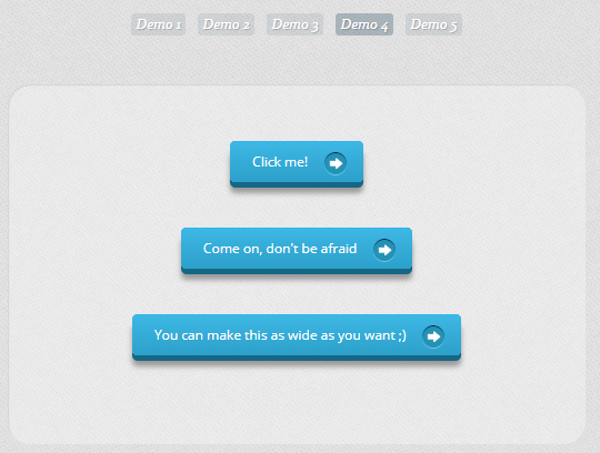
以下是 CSS3实现伪对象立体按钮特效代码 的示例演示效果:
部分效果截图:
HTML代码(index.html):
<!DOCTYPE html>
<!--[if lt IE 7 ]> <html class="ie ie6 no-js" lang="en"> <![endif]-->
<!--[if IE 7 ]> <html class="ie ie7 no-js" lang="en"> <![endif]-->
<!--[if IE 8 ]> <html class="ie ie8 no-js" lang="en"> <![endif]-->
<!--[if IE 9 ]> <html class="ie ie9 no-js" lang="en"> <![endif]-->
<!--[if gt IE 9]><!--><html class="no-js" lang="en"><!--<![endif]-->
<head>
<meta charset="UTF-8" />
<meta http-equiv="X-UA-Compatible" content="IE=edge,chrome=1">
<title>CSS buttons with pseudo-elements</title>
<meta name="viewport" content="width=device-width, initial-scale=1.0">
<meta name="description" content="CSS buttons with pseudo-elements" />
<meta name="keywords" content="css, css3, pseudo, buttons, anchor, before, after, web design" />
<meta name="author" content="Sergio Camalich for Codrops" />
<link rel="shortcut icon" href="../favicon.ico">
<link rel="stylesheet" type="text/css" href="css/demo.css" />
<link rel="stylesheet" type="text/css" href="css/style1.css" />
<link href='http://fonts.googleapis.com/css?family=Open+Sans' rel='stylesheet' type='text/css'>
</head>
<body>
<div class="container">
<!-- Codrops top bar -->
<div class="codrops-top">
<a href="http://tympanus.net/Tutorials/AnimatedWebBanners/">
<strong>« Previous Demo: </strong>Animated Web Banners With CSS3
</a>
<span class="right">
<a href="http://tympanus.net/codrops/2012/01/11/css-buttons-using-pseudo-elements/">
<strong>Back to the Codrops Article</strong>
</a>
</span>
<div class="clr"></div>
</div><!--/ Codrops top bar -->
<header>
<h1>CSS <span>buttons</span></h1>
<h2>using pseudo-elements</h2>
<nav class="codrops-demos">
<a class="current" href="index.html">Demo 1</a>
<a href="index2.html">Demo 2</a>
<a href="index3.html">Demo 3</a>
<a href="index4.html">Demo 4</a>
<a href="index5.html">Demo 5</a>
<nav>
</header>
<section>
<div id="container_buttons">
<p>
<a href="#" class="a_demo_one">
Click me!
</a>
</p>
<p>
<a href="#" class="a_demo_one">
Come on, don't be afraid
</a>
</p>
<p>
<a href="#" class="a_demo_one">
You can make this as wide as you want ;)
</a>
</p>
</div>
</section>
</div>
</body>
</html>
HTML代码(index2.html):
<!DOCTYPE html>
<!--[if lt IE 7 ]> <html class="ie ie6 no-js" lang="en"> <![endif]-->
<!--[if IE 7 ]> <html class="ie ie7 no-js" lang="en"> <![endif]-->
<!--[if IE 8 ]> <html class="ie ie8 no-js" lang="en"> <![endif]-->
<!--[if IE 9 ]> <html class="ie ie9 no-js" lang="en"> <![endif]-->
<!--[if gt IE 9]><!--><html class="no-js" lang="en"><!--<![endif]-->
<head>
<meta charset="UTF-8" />
<meta http-equiv="X-UA-Compatible" content="IE=edge,chrome=1">
<title>CSS buttons with pseudo-elements</title>
<meta name="viewport" content="width=device-width, initial-scale=1.0">
<meta name="description" content="CSS buttons with pseudo-elements" />
<meta name="keywords" content="css, css3, pseudo, buttons, anchor, before, after, web design" />
<meta name="author" content="Sergio Camalich for Codrops" />
<link rel="shortcut icon" href="../favicon.ico">
<link rel="stylesheet" type="text/css" href="css/demo.css" />
<link rel="stylesheet" type="text/css" href="css/style2.css" />
<link href='http://fonts.googleapis.com/css?family=Open+Sans' rel='stylesheet' type='text/css'>
</head>
<body>
<div class="container">
<!-- Codrops top bar -->
<div class="codrops-top">
<a href="http://tympanus.net/Tutorials/AnimatedWebBanners/">
<strong>« Previous Demo: </strong>Animated Web Banners With CSS3
</a>
<span class="right">
<a href="http://tympanus.net/codrops/2012/01/11/css-buttons-with-pseudo-elements/">
<strong>Back to the Codrops Article</strong>
</a>
</span>
<div class="clr"></div>
</div><!--/ Codrops top bar -->
<header>
<h1>CSS <span>buttons</span></h1>
<h2>with pseudo-elements</h2>
<nav class="codrops-demos">
<a href="index.html">Demo 1</a>
<a class="current" href="index2.html">Demo 2</a>
<a href="index3.html">Demo 3</a>
<a href="index4.html">Demo 4</a>
<a href="index5.html">Demo 5</a>
<nav>
</header>
<section>
<div id="container_buttons">
<p>
<a href="#" class="a_demo_two">
Click me!
</a>
</p>
<p>
<a href="#" class="a_demo_two">
Come on, don't be afraid
</a>
</p>
<p>
<a href="#" class="a_demo_two">
You can make this as wide as you want ;)
</a>
</p>
</div>
</section>
</div>
</body>
</html>
CSS代码(style1.css):
@charset "UTF-8";/* CSS Document */
/*DEMO 1*/
.a_demo_one{background-color:#3bb3e0;padding:10px;position:relative;font-family:'Open Sans',sans-serif;font-size:12px;text-decoration:none;color:#fff;border:solid 1px #186f8f;background-image:linear-gradient(bottom,rgb(44,160,202) 0%,rgb(62,184,229) 100%);background-image:-o-linear-gradient(bottom,rgb(44,160,202) 0%,rgb(62,184,229) 100%);background-image:-moz-linear-gradient(bottom,rgb(44,160,202) 0%,rgb(62,184,229) 100%);background-image:-webkit-linear-gradient(bottom,rgb(44,160,202) 0%,rgb(62,184,229) 100%);background-image:-ms-linear-gradient(bottom,rgb(44,160,202) 0%,rgb(62,184,229) 100%);background-image:-webkit-gradient(linear,left bottom,left top,color-stop(0,rgb(44,160,202)),color-stop(1,rgb(62,184,229)));-webkit-box-shadow:inset 0px 1px 0px #7fd2f1,0px 1px 0px #fff;-moz-box-shadow:inset 0px 1px 0px #7fd2f1,0px 1px 0px #fff;box-shadow:inset 0px 1px 0px #7fd2f1,0px 1px 0px #fff;-webkit-border-radius:5px;-moz-border-radius:5px;-o-border-radius:5px;border-radius:5px;}
.a_demo_one::before{background-color:#ccd0d5;content:"";display:block;position:absolute;width:100%;height:100%;padding:8px;left:-8px;top:-8px;z-index:-1;-webkit-border-radius:5px;-moz-border-radius:5px;-o-border-radius:5px;border-radius:5px;-webkit-box-shadow:inset 0px 1px 1px #909193,0px 1px 0px #fff;-moz-box-shadow:inset 0px 1px 1px #909193,0px 1px 0px #fff;-o-box-shadow:inset 0px 1px 1px #909193,0px 1px 0px #fff;box-shadow:inset 0px 1px 1px #909193,0px 1px 0px #fff;}
.a_demo_one:active{padding-bottom:9px;padding-left:10px;padding-right:10px;padding-top:11px;top:1px;background-image:linear-gradient(bottom,rgb(62,184,229) 0%,rgb(44,160,202) 100%);background-image:-o-linear-gradient(bottom,rgb(62,184,229) 0%,rgb(44,160,202) 100%);background-image:-moz-linear-gradient(bottom,rgb(62,184,229) 0%,rgb(44,160,202) 100%);background-image:-webkit-linear-gradient(bottom,rgb(62,184,229) 0%,rgb(44,160,202) 100%);background-image:-ms-linear-gradient(bottom,rgb(62,184,229) 0%,rgb(44,160,202) 100%);background-image:-webkit-gradient(linear,left bottom,left top,color-stop(0,rgb(62,184,229)),color-stop(1,rgb(44,160,202)));}
CSS代码(style2.css):
@charset "UTF-8";/* CSS Document */
/*DEMO 2*/
.a_demo_two{background-color:#3bb3e0;padding:10px;position:relative;font-family:'Open Sans',sans-serif;font-size:12px;text-decoration:none;color:#fff;background-image:linear-gradient(bottom,rgb(44,160,202) 0%,rgb(62,184,229) 100%);background-image:-o-linear-gradient(bottom,rgb(44,160,202) 0%,rgb(62,184,229) 100%);background-image:-moz-linear-gradient(bottom,rgb(44,160,202) 0%,rgb(62,184,229) 100%);background-image:-webkit-linear-gradient(bottom,rgb(44,160,202) 0%,rgb(62,184,229) 100%);background-image:-ms-linear-gradient(bottom,rgb(44,160,202) 0%,rgb(62,184,229) 100%);background-image:-webkit-gradient(linear,left bottom,left top,color-stop(0,rgb(44,160,202)),color-stop(1,rgb(62,184,229)));-webkit-box-shadow:inset 0px 1px 0px #7fd2f1,0px 6px 0px #156785;-moz-box-shadow:inset 0px 1px 0px #7fd2f1,0px 6px 0px #156785;-o-box-shadow:inset 0px 1px 0px #7fd2f1,0px 6px 0px #156785;box-shadow:inset 0px 1px 0px #7fd2f1,0px 6px 0px #156785;-webkit-border-radius:5px;-moz-border-radius:5px;-o-border-radius:5px;border-radius:5px;}
.a_demo_two::before{background-color:#072239;content:"";display:block;position:absolute;width:100%;height:100%;padding-left:2px;padding-right:2px;padding-bottom:4px;left:-2px;top:5px;z-index:-1;-webkit-border-radius:6px;-moz-border-radius:6px;-o-border-radius:6px;border-radius:6px;-webkit-box-shadow:0px 1px 0px #fff;-moz-box-shadow:0px 1px 0px #fff;-o-box-shadow:0px 1px 0px #fff;box-shadow:0px 1px 0px #fff;}
.a_demo_two:active{color:#156785;text-shadow:0px 1px 1px rgba(255,255,255,0.3);background:rgb(44,160,202);-webkit-box-shadow:inset 0px 1px 0px #7fd2f1,inset 0px -1px 0px #156785;-moz-box-shadow:inset 0px 1px 0px #7fd2f1,inset 0px -1px 0px #156785;-o-box-shadow:inset 0px 1px 0px #7fd2f1,inset 0px -1px 0px #156785;box-shadow:inset 0px 1px 0px #7fd2f1,inset 0px -1px 0px #156785;top:7px;}
.a_demo_two:active::before{top:-2px;}


 分享到QQ
分享到QQ 分享到微博
分享到微博 微信扫一扫
微信扫一扫