以下是 CSS3图片全屏显示特效代码 的示例演示效果:
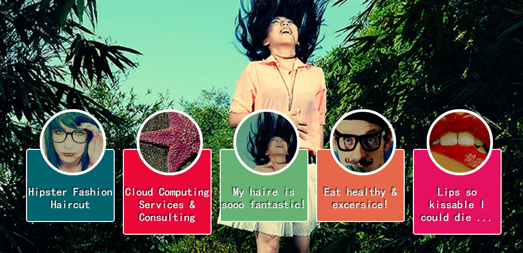
部分效果截图:
HTML代码(index.html):
<!DOCTYPE HTML>
<html lang="en-US">
<head>
<meta http-equiv="Content-Type" content="text/html; charset=UTF-8">
<title>CSS3图片全屏显示</title>
<link rel="stylesheet" type="text/css" href="base.css" media="all" />
<!--<link href='http://fonts.googleapis.com/css?family=Yesteryear' rel='stylesheet' type='text/css'>-->
<style type="text/css">
html,body {
height: 100%;
}
img.bg {
/* Set rules to fill background */
min-height: 100%;
min-width: 1024px;
/* Set up proportionate scaling */
width: 100%;
height: auto !important;
height: 100%;
/* Set up positioning */
position: fixed;
top: 40px;
left: 0;
z-index:1;
}
@media screen and (max-width: 1024px) { /* Specific to this particular image */
img.bg {
left: 50%;
margin-left: -512px; /* 50% */
}
}
.slider {
position: absolute;
width: 100%;
text-align: center;
z-index: 9999;
bottom: 100px;
}
.slider li {
display: inline-block;
width: 170px;
height: 130px;
margin-right: 15px;
}
.slider a {
display: inline-block;
width: 170px;
padding-top: 70px;
padding-bottom: 20px;
position: relative;
cursor: pointer;
border: 2px solid #fff;
border-radius: 5px;
vertical-align: top;
color: #fff;
text-decoration: none;
font-size: 22px;
font-family: 'Yesteryear', cursive;
text-shadow: -1px -1px 1px rgba(0, 0, 0, 0.8),-2px -2px 1px rgba(0, 0, 0, 0.3),-3px -3px 1px rgba(0, 0, 0, 0.3);
}
.slider li:nth-of-type(1) a {
background-color: #02646e;
}
.slider li:nth-of-type(2) a {
background-color: #eb0837;
}
.slider li:nth-of-type(3) a {
background-color: #67b374;
}
.slider li:nth-of-type(4) a {
background-color: #e6674a;
}
.slider li:nth-of-type(5) a {
background-color: #e61061;
}
.slider a::after {
content:"";
display: block;
height: 120px;
width: 120px;
border: 5px solid #fff;
border-radius: 50%;
position: absolute;
left: 50%;
margin-left: -60px;
z-index: 9999;
top: -80px;
}
.slider li:nth-of-type(1) a::after {
background: url(sbg1.jpg) no-repeat center;
}
.slider li:nth-of-type(2) a::after {
background: url(sbg2.jpg) no-repeat center;
}
.slider li:nth-of-type(3) a::after {
background: url(sbg3.jpg) no-repeat center;
}
.slider li:nth-of-type(4) a::after {
background: url(sbg4.jpg) no-repeat center;
}
.slider li:nth-of-type(5) a::after {
background: url(sbg5.jpg) no-repeat center;
}
.slider a::before {
content:"";
display: block;
height: 120px;
width: 120px;
border: 5px solid #fff;
border-radius: 50%;
position: absolute;
left: 50%;
margin-left: -60px;
z-index: 99999;
top: -80px;
background: rgba(0,0,0,0.3);
}
.slider a:hover::before {
opacity:0;
}
/* Slide Left */
@-webkit-keyframes 'slideLeft' {
0% { left: -500px; }
100% { left: 0; }
}
@-moz-keyframes 'slideLeft' {
0% { left: -500px; }
100% { left: 0; }
}
@-o-keyframes 'slideLeft' {
0% { left: -500px; }
100% { left: 0; }
}
@-ms-keyframes 'slideLeft' {
0% { left: -500px; }
100% { left: 0; }
}
@keyframes 'slideLeft' {
0% { left: -500px; }
100% { left: 0; }
}
.slideLeft:target {
z-index: 100;
-webkit-animation-name: slideLeft;
-webkit-animation-duration: 1s;
-webkit-animation-iteration-count: 1;
-moz-animation-name: slideLeft;
-moz-animation-duration: 1s;
-moz-animation-iteration-count: 1;
-ms-animation-name: slideLeft;
-ms-animation-duration: 1s;
-ms-animation-iteration-count: 1;
-o-animation-name: slideLeft;
-o-animation-duration: 1s;
-o-animation-iteration-count: 1;
animation-name: slideLeft;
animation-duration: 1s;
animation-iteration-count: 1;
}
/* Slide Bottom */
@-webkit-keyframes 'slideBottom' {
0% { top: 350px; }
100% { top: 0; }
}
@-moz-keyframes 'slideBottom' {
0% { top: 350px; }
100% { top: 0; }
}
@-ms-keyframes 'slideBottom' {
0% { top: 350px; }
100% { top: 0; }
}
@-o-keyframes 'slideBottom' {
0% { top: 350px; }
100% { top: 0; }
}
@keyframes 'slideBottom' {
0% { top: 350px; }
100% { top: 0; }
}
.slideBottom:target {
z-index: 100;
-webkit-animation-name: slideBottom;
-webkit-animation-duration: 1s;
-webkit-animation-iteration-count: 1;
-moz-animation-name: slideBottom;
-moz-animation-duration: 1s;
-moz-animation-iteration-count: 1;
-ms-animation-name: slideBottom;
-ms-animation-duration: 1s;
-ms-animation-iteration-count: 1;
-o-animation-name: slideBottom;
-o-animation-duration: 1s;
-o-animation-iteration-count: 1;
animation-name: slideBottom;
animation-duration: 1s;
animation-iteration-count: 1;
}
/* Zoom In */
@-webkit-keyframes 'zoomIn' {
0% { -webkit-transform: scale(0.1); }
100% { -webkit-transform: none; }
}
@-moz-keyframes 'zoomIn' {
0% { -moz-transform: scale(0.1); }
100% { -moz-transform: none; }
}
@-ms-keyframes 'zoomIn' {
0% { -ms-transform: scale(0.1); }
100% { -ms-transform: none; }
}
@-o-keyframes 'zoomIn' {
0% { -o-transform: scale(0.1); }
100% { -o-transform: none; }
}
@keyframes 'zoomIn' {
0% { transform: scale(0.1); }
100% { transform: none; }
}
.zoomIn:target {
z-index: 100;
-webkit-animation-name: zoomIn;
-webkit-animation-duration: 1s;
-webkit-animation-iteration-count: 1;
-moz-animation-name: zoomIn;
-moz-animation-duration: 1s;
-moz-animation-iteration-count: 1;
-ms-animation-name: zoomIn;
-ms-animation-duration: 1s;
-ms-animation-iteration-count: 1;
-o-animation-name: zoomIn;
-o-animation-duration: 1s;
-o-animation-iteration-count: 1;
animation-name: zoomIn;
animation-duration: 1s;
animation-iteration-count: 1;
}
/* Zoom Out */
@-webkit-keyframes 'zoomOut' {
0% { -webkit-transform: scale(2); }
100% { -webkit-transform: none; }
}
@-moz-keyframes 'zoomOut' {
0% { -moz-transform: scale(2); }
100% { -moz-transform: none; }
}
@-ms-keyframes 'zoomOut' {
0% { -ms-transform: scale(2); }
100% { -ms-transform: none; }
}
@-o-keyframes 'zoomOut' {
0% { -o-transform: scale(2); }
100% { -o-transform: none; }
}
@keyframes 'zoomOut' {
0% { transform: scale(2); }
100% { transform: none; }
}
.zoomOut:target {
z-index: 100;
-webkit-animation-name: zoomOut;
-webkit-animation-duration: 1s;
-webkit-animation-iteration-count: 1;
-moz-animation-name: zoomOut;
-moz-animation-duration: 1s;
-moz-animation-iteration-count: 1;
-ms-animation-name: zoomOut;
-ms-animation-duration: 1s;
-ms-animation-iteration-count: 1;
-o-animation-name: zoomOut;
-o-animation-duration: 1s;
-o-animation-iteration-count: 1;
animation-name: zoomOut;
animation-duration: 1s;
animation-iteration-count: 1;
}
/* Rotate */
@-webkit-keyframes 'rotate' {
0% { -webkit-transform: rotate(-360deg) scale(0.1); }
100% { -webkit-transform: none; }
}
@-moz-keyframes 'rotate' {
0% { -moz-transform: rotate(-360deg) scale(0.1); }
100% { -moz-transform: none; }
}
@-ms-keyframes 'rotate' {
0% { -ms-transform: rotate(-360deg) scale(0.1); }
100% { -ms-transform: none; }
}
@-o-keyframes 'rotate' {
0% { -o-transform: rotate(-360deg) scale(0.1); }
100% { -o-transform: none; }
}
@keyframes 'rotate' {
0% { transform: rotate(-360deg) scale(0.1); }
100% { transform: none; }
}
.rotate:target {
z-index: 100;
-webkit-animation-name: rotate;
-webkit-animation-duration: 1s;
-webkit-animation-iteration-count: 1;
-moz-animation-name: rotate;
-moz-animation-duration: 1s;
-moz-animation-iteration-count: 1;
-ms-animation-name: rotate;
-ms-animation-duration: 1s;
-ms-animation-iteration-count: 1;
-o-animation-name: rotate;
-o-animation-duration: 1s;
-o-animation-iteration-count: 1;
animation-name: rotate;
animation-duration: 1s;
animation-iteration-count: 1;
}
/* Not Target */
@-webkit-keyframes 'notTarget' {
0% { z-index: 75; }
100% { z-index: 75; }
}
@-moz-keyframes 'notTarget' {
0% { z-index: 75; }
100% { z-index: 75; }
}
@-ms-keyframes 'notTarget' {
0% { z-index: 75; }
100% { z-index: 75; }
}
@-o-keyframes 'notTarget' {
0% { z-index: 75; }
100% { z-index: 75; }
}
@keyframes 'notTarget' {
0% { z-index: 75; }
100% { z-index: 75; }
}
.bg:not(:target) {
-webkit-animation-name: notTarget;
-webkit-animation-duration: 1s;
-webkit-animation-iteration-count: 1;
-moz-animation-name: notTarget;
-moz-animation-duration: 1s;
-moz-animation-iteration-count: 1;
-ms-animation-name: notTarget;
-ms-animation-duration: 1s;
-ms-animation-iteration-count: 1;
-o-animation-name: notTarget;
-o-animation-duration: 1s;
-o-animation-iteration-count: 1;
animation-name: notTarget;
animation-duration: 1s;
animation-iteration-count: 1;
}
</style>
</head>
<body>
<div class="page">
<header id="header">
<hgroup class="white blank" style="position:relative;z-index:9999;color:orange;font-size:30px;text-shadow:0 1px 1px #000;">
<h1></h1>
<h2></h2>
</hgroup>
</header>
<section class="demo">
<div class="slider">
<ul class="clearfix">
<li><a href="#bg1">Hipster Fashion Haircut </a></li>
<li><a href="#bg2">Cloud Computing Services & Consulting</a></li>
<li><a href="#bg3">My haire is sooo fantastic!</a></li>
<li><a href="#bg4">Eat healthy & excersice!</a></li>
<li><a href="#bg5">Lips so kissable I could die ...</a></li>
</ul>
</div>
<img src="bg1.jpg" alt="" class="bg slideLeft" id="bg1" />
<img src="bg2.jpg" alt="" class="bg slideBottom" id="bg2" />
<img src="bg3.jpg" alt="" class="bg zoomIn" id="bg3" />
<img src="bg4.jpg" alt="" class="bg zoomOut" id="bg4" />
<img src="bg5.jpg" alt="" class="bg rotate" id="bg5" />
</section>
</div>
</body>
</html>
CSS代码(base.css):
@charset "utf-8";@import url("http://www.w3cplus.com/download/reset.css");/* ------------------------------------------------- * common * -------------------------------------------------*/
.page{text-align:left;padding-top:40px;}
.wrap_top_nav{background-color:#333;box-shadow:0 1px 3px rgba(0,0,0,0.25),0 -1px 0 rgba(0,0,0,0.1) inset;height:40px;}
#top_nav{width:1000px;margin:0 auto;position:relative;}
#top_nav a{font-size:16px;line-height:40px;float:left;margin-right:20px;color:#999;text-decoration:none;}
#top_nav a:hover{color:#fff;}
#top_nav li:nth-child(1) a{background-image:url(http://www.w3cplus.com/sites/all/themes/marvin/logo.png);background-position:0 -12px;background-repeat:no-repeat;background-size:68px 60px;padding-left:74px;color:#fff;width:74px;overflow:hidden;}
#read{position:absolute;right:0;top:0;font-family:'����';}
#header{text-align:center;}
#header .white{color:#fff;}
#header .blank{color:#444;}
#header h1{font-size:24px;}
#header h2{font-weight:normal;}
#ad_w3cplus{width:750px;margin:100px auto;text-align:center;}
#ad_w3cplus .grid-ad{float:left;}


 分享到QQ
分享到QQ 分享到微博
分享到微博 微信扫一扫
微信扫一扫