以下是 jQuery&CSS3旋转幻灯片轮播滚动切换特效代码 的示例演示效果:
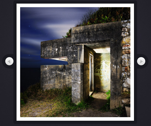
部分效果截图:
HTML代码(index.html):
<!DOCTYPE html PUBLIC "-//W3C//DTD XHTML 1.0 Transitional//EN" "http://www.w3.org/TR/xhtml1/DTD/xhtml1-transitional.dtd">
<html xmlns="http://www.w3.org/1999/xhtml">
<head>
<meta http-equiv="Content-Type" content="text/html; charset=gb2312" />
<meta name="keywords" content="JS代码,焦点图,JS广告代码,JS特效代码" />
<meta name="description" content="此代码内容为jQuery&CSS3旋转幻灯片代码" />
<title>jQuery&CSS3旋转幻灯片代码</title>
<link rel="stylesheet" type="text/css" href="css/styles.css" />
</head>
<body>
<!-- 代码 开始 -->
<div id="slideShowContainer">
<div id="slideShow">
<ul>
<li><img src="img/photos/1.jpg" width="100%" alt="Fish" /></li>
<li><img src="img/photos/2.jpg" width="100%" alt="Ancient" /></li>
<li><img src="img/photos/3.jpg" width="100%" alt="Industry" /></li>
<li><img src="img/photos/4.jpg" width="100%" alt="Rain" /></li>
</ul>
</div>
<a id="previousLink" href="#">»</a>
<a id="nextLink" href="#">«</a>
</div>
<script src="js/jquery-1.7.2.min.js"></script>
<script src="js/jquery.rotate.js"></script>
<script src="js/script.js"></script>
</body>
</html>JS代码(script.js):
$(document).ready(function(){
	var slideShow = $('#slideShow'),ul = slideShow.find('ul'),li = ul.find('li'),cnt = li.length;
	// As the images are positioned absolutely,the last image will be shown on top.// This is why we force them in the correct order by assigning z-indexes:updateZindex();
	if($.support.transform){
	// Modern browsers with support for css3 transformationsli.find('img').css('rotate',function(i){
	// Rotating the images counterclockwisereturn (-90*i) + 'deg';
}
);
	// Binding a custom event. the direction and degrees parameters// are passed when the event is triggered later on in the code.slideShow.bind('rotateContainer',function(e,direction,degrees){
	// Enlarging the slideshow and photo:slideShow.animate({
	width:510,height:510,marginTop:0,marginLeft:0}
,'fast',function(){
	if(direction == 'next'){
	// Moving the topmost image containing Li at// the bottom after a fadeOut animation$('li:first').fadeOut('slow',function(){
	$(this).remove().appendTo(ul).show();
	updateZindex();
}
);
}
else{
	// Showing the bottomost Li element on top// with a fade in animation. Notice that we are// updating the z-indexes.var liLast = $('li:last').hide().remove().prependTo(ul);
	updateZindex();
	liLast.fadeIn('slow');
}
// Rotating the slideShow. css('rotate') gives us the// current rotation in radians. We are converting it to// degress so we can add 90 or -90 to rotate it to its new value.slideShow.animate({
	rotate:Math.round($.rotate.radToDeg(slideShow.css('rotate'))+degrees) + 'deg'}
,'slow').animate({
	width:490,height:490,marginTop:10,marginLeft:10}
,'fast');
}
);
}
);
	// By triggering the custom events below,we can// show the previous / next images in the slideshow.slideShow.bind('showNext',function(){
	slideShow.trigger('rotateContainer',['next',90]);
}
);
	slideShow.bind('showPrevious',function(){
	slideShow.trigger('rotateContainer',['previous',-90]);
}
);
}
else{
	// Fallback for Internet Explorer and older browsersslideShow.bind('showNext',function(){
	$('li:first').fadeOut('slow',function(){
	$(this).remove().appendTo(ul).show();
	updateZindex();
}
);
}
);
	slideShow.bind('showPrevious',function(){
	var liLast = $('li:last').hide().remove().prependTo(ul);
	updateZindex();
	liLast.fadeIn('slow');
}
);
}
// Listening for clicks on the arrows,and// triggering the appropriate event.$('#previousLink').click(function(){
	if(slideShow.is(':animated')){
	return false;
}
slideShow.trigger('showPrevious');
	return false;
}
);
	$('#nextLink').click(function(){
	if(slideShow.is(':animated')){
	return false;
}
slideShow.trigger('showNext');
	return false;
}
);
	// This function updates the z-index properties.function updateZindex(){
	// The CSS method can take a function as its second argument.// i is the zero-based index of the element.ul.find('li').css('z-index',function(i){
	return cnt-i;
}
);
}
}
);
CSS代码(styles.css):
*{margin:0;padding:0;}
html{background:url('../img/page_bg_tile.jpg') #202027;}
body{color:#999;background-image:url('../img/contour.png'),url('../img/page_bg.jpg');background-repeat:no-repeat,no-repeat;background-position:center 117px,center -200px;font:15px Calibri,Arial,sans-serif;border:1px solid transparent;}
/* Styling the slideshow */
#slideShowContainer{width:510px;height:510px;position:relative;margin:120px auto 50px;}
#slideShow{position:absolute;height:490px;width:490px;background-color:#fff;margin:10px 0 0 10px;z-index:100;-moz-box-shadow:0 0 10px #111;-webkit-box-shadow:0 0 10px #111;box-shadow:0 0 10px #111;}
#slideShow ul{position:absolute;top:15px;right:15px;bottom:15px;left:15px;list-style:none;overflow:hidden;}
#slideShow li{position:absolute;top:0;left:0;width:100%;height:100%;}
#slideShowContainer > a{border:none;text-decoration:none;text-indent:-99999px;overflow:hidden;width:36px;height:37px;background:url('../img/arrows.png') no-repeat;position:absolute;top:50%;margin-top:-21px;}
#previousLink{left:-38px;}
#previousLink:hover{background-position:bottom left;}
a#nextLink{right:-38px;background-position:top right;}
#nextLink:hover{background-position:bottom right;}
/* General styles */
.note{margin-bottom:40px;text-align:center;}
.credit{font-size:12px;}
.credit a{color:#bbb !important;}
a,a:visited{text-decoration:underline;outline:none;color:#97CAE6;}
a:hover{text-decoration:none;}


 分享到QQ
分享到QQ 分享到微博
分享到微博 微信扫一扫
微信扫一扫