以下是 jquery 4屏自动滚动焦点图轮播滚动切换特效代码 的示例演示效果:
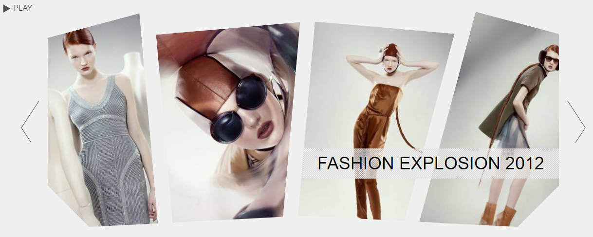
部分效果截图:
HTML代码(index.html):
<!DOCTYPE html>
<html lang="en">
    <head>
        <title>Rotating Image Slider with jQuery & CSS3</title>
		<meta charset="UTF-8" />
        <meta name="description" content="Rotating Image Slider with jQuery & CSS3" />
        <meta name="keywords" content="jquery, rotation, slider, images, slideshow, autoplay, play, pause, css3"/>
		<meta name="author" content="Codrops" />
        <link rel="stylesheet" type="text/css" href="css/style.css" />
    </head>
    <body>
		<div class="content">
			<h1>Rotating Image Slider</h1>
			<div class="rm_wrapper">
				<div id="rm_container" class="rm_container">
					<ul>
						<li data-images="rm_container_1" data-rotation="-15"><img src="images/1.jpg"/></li>
						<li data-images="rm_container_2" data-rotation="-5"><img src="images/2.jpg"/></li>
						<li data-images="rm_container_3" data-rotation="5"><img src="images/3.jpg"/></li>
						<li data-images="rm_container_4" data-rotation="15"><img src="images/4.jpg"/></li>
					</ul>
					<div id="rm_mask_left" class="rm_mask_left"></div>
					<div id="rm_mask_right" class="rm_mask_right"></div>
					<div id="rm_corner_left" class="rm_corner_left"></div>
					<div id="rm_corner_right" class="rm_corner_right"></div>
					<h2>Fashion Explosion 2012</h2>
					<div style="display:none;">
						<div id="rm_container_1">
							<img src="images/1.jpg"/>
							<img src="images/5.jpg"/>
							<img src="images/6.jpg"/>
							<img src="images/7.jpg"/>
						</div>
						<div id="rm_container_2">
							<img src="images/2.jpg"/>
							<img src="images/8.jpg"/>
							<img src="images/9.jpg"/>
							<img src="images/10.jpg"/>
						</div>
						<div id="rm_container_3">
							<img src="images/3.jpg"/>
							<img src="images/11.jpg"/>
							<img src="images/12.jpg"/>
							<img src="images/13.jpg"/>
						</div>
						<div id="rm_container_4">
							<img src="images/4.jpg"/>
							<img src="images/14.jpg"/>
							<img src="images/15.jpg"/>
							<img src="images/16.jpg"/>
						</div>
					</div>
				</div>
				<div class="rm_nav">
					<a id="rm_next" href="#" class="rm_next"></a>
					<a id="rm_prev" href="#" class="rm_prev"></a>
				</div>
				<div class="rm_controls">
					<a id="rm_play" href="#" class="rm_play">Play</a>
					<a id="rm_pause" href="#" class="rm_pause">Pause</a>
				</div>
			</div>
		</div>
<p align="center"></p>
<p align="center"></p>
		<script type="text/javascript" src="js/jquery-1.7.2.min.js"></script>
		<script type="text/javascript" src="js/jquery.transform-0.9.3.min_.js"></script>
		<script type="text/javascript" src="js/jquery.mousewheel.js"></script>
		<script type="text/javascript" src="js/jquery.RotateImageMenu.js"></script>
    </body>
</html>
JS代码(jquery.RotateImageMenu.js):
$(function(){
	//our 4 itemsvar $listItems= $('#rm_container > ul > li'),totalItems= $listItems.length,//the controls$rm_next= $('#rm_next'),$rm_prev= $('#rm_prev'),$rm_play= $('#rm_play'),$rm_pause= $('#rm_pause'),//the masks and corners of the slider$rm_mask_left= $('#rm_mask_left'),$rm_mask_right= $('#rm_mask_right'),$rm_corner_left= $('#rm_corner_left'),$rm_corner_right= $('#rm_corner_right'),//check if the browser is <= IE8ieLte8= ($.browser.msie && parseInt($.browser.version) <= 8),RotateImageMenu= (function(){
	//difference of animation time between the itemsvartimeDiff= 300,//time between each image animation (slideshow)slideshowTime= 3000,slideshowInterval,//checks if the images are rotatingisRotating= false,//how many images completed each slideshow iterationcompleted= 0,/*all our images have 310 of width and 465 of height.this could / should be dynamically calculatedif we would have different image sizes.we will set the rotation origin atx = width/2 and y = height*2*/
origin= ['155px','930px'],init= function(){
	configure();
	initEventsHandler();
}
,//initialize some eventsinitEventsHandler= function(){
	/*next and previous arrows:we will stop the slideshow if active,and rotate each items images.1rotate right-1rotate left*/
$rm_next.bind('click',function(e){
	stopSlideshow();
	rotateImages(1);
	return false;
}
);
	$rm_prev.bind('click',function(e){
	stopSlideshow();
	rotateImages(-1);
	return false;
}
);
	/*start and stop the slideshow*/
$rm_play.bind('click',function(e){
	startSlideshow();
	return false;
}
);
	$rm_pause.bind('click',function(e){
	stopSlideshow();
	return false;
}
);
	/*adds events to the mouse and left / right keys*/
$(document).bind('mousewheel',function(e,delta){
	if(delta > 0){
	stopSlideshow();
	rotateImages(0);
}
else{
	stopSlideshow();
	rotateImages(1);
}
return false;
}
).keydown(function(e){
	switch(e.which){
	case 37:stopSlideshow();
	rotateImages(0);
	break;
	case 39:stopSlideshow();
	rotateImages(1);
	break;
}
}
);
}
,/*rotates each items images.we set a delay between each item animation*/
rotateImages= function(dir){
	//if the animation is in progress returnif(isRotating) return false;
	isRotating = true;
	$listItems.each(function(i){
	var $item= $(this),/*the delay calculation.if rotation is to the right,then the first item to rotate is the first one,otherwise the last one*/
interval= (dir === 1) ? i * timeDiff:(totalItems - 1 - i) * timeDiff;
	setTimeout(function(){
	//the images associated to this itemvar$otherImages= $('#' + $item.data('images')).children('img'),totalOtherImages= $otherImages.length;
	//the current one$img= $item.children('img:last'),//keep track of each items current imagecurrent= $item.data('current');
	//out of boundsif(current > totalOtherImages - 1)current = 0;
	else if(current < 0)current = totalOtherImages - 1;
	//the next image to show and its initial rotation (depends on dir)var otherRotation= (dir === 1) ? '-30deg':'30deg',$other= $otherImages.eq(current).clone();
	//for IE <= 8 we will not rotate,but fade out / fade in ...//better than nothing:)if(!ieLte8)$other.css({
	rotate:otherRotation,origin:origin}
);
	(dir === 1) ? ++current:--current;
	//prepend the next image to the <li>$item.data('current',current).prepend($other);
	//the final rotation for the current imagevar rotateTo= (dir === 1) ? '80deg':'-80deg';
	if(!ieLte8){
	$img.animate({
	rotate:rotateTo}
,1200,function(){
	$(this).remove();
	++completed;
	if(completed === 4){
	completed = 0;
	isRotating = false;
}
}
);
	$other.animate({
	rotate:'0deg'}
,600);
}
else{
	$img.fadeOut(1200,function(){
	$(this).remove();
	++completed;
	if(completed === 4){
	completed = 0;
	isRotating = false;
}
}
);
}
}
,interval );
}
);
}
,//set initial rotationsconfigure= function(){
	if($.browser.msie && !ieLte8)rotateMaskCorners();
	else if(ieLte8)hideMaskCorners();
	$listItems.each(function(i){
	//the initial current is 1//since we already showing the first imagevar $item = $(this).data('current',1);
	if(!ieLte8)$item.transform({
	rotate:$item.data('rotation') + 'deg'}
) .find('img') .transform({
	origin:origin}
);
}
);
}
,//rotates the masks and cornersrotateMaskCorners= function(){
	$rm_mask_left.transform({
	rotate:'-3deg'}
);
	$rm_mask_right.transform({
	rotate:'3deg'}
);
	$rm_corner_left.transform({
	rotate:'45deg'}
);
	$rm_corner_right.transform({
	rotate:'-45deg'}
);
}
,//hides the masks and cornershideMaskCorners= function(){
	$rm_mask_left.hide();
	$rm_mask_right.hide();
	$rm_corner_left.hide();
	$rm_corner_right.hide();
}
,startSlideshow= function(){
	clearInterval(slideshowInterval);
	rotateImages(1);
	slideshowInterval= setInterval(function(){
	rotateImages(1);
}
,slideshowTime);
	//show the pause button and hide the play button$rm_play.hide();
	$rm_pause.show();
}
,stopSlideshow= function(){
	clearInterval(slideshowInterval);
	//show the play button and hide the pause button$rm_pause.hide();
	$rm_play.show();
}
;
	return{
	init:init}
;
}
)();
	RotateImageMenu.init();
}
);
CSS代码(style.css):
@import url('reset.css');body{background:#f0f0f0;color:#000;font-family:'PT Sans Narrow',Arial,sans-serif;font-size:16px;}
a{color:#000;text-decoration:none;}
h1{padding:10px;margin:20px;font-size:40px;text-transform:uppercase;text-shadow:0px 0px 1px #fff;color:#333;background:transparent url(../images/line.png) repeat-x bottom left;}
.rm_wrapper{width:1160px;margin:0 auto;position:relative;}
.rm_container{width:1050px;overflow:hidden;position:relative;height:530px;margin:0 auto;}
.rm_container h2{background:transparent url(../images/lines.png) repeat top left;padding:10px 30px;position:absolute;bottom:170px;right:0px;color:#000;font-size:36px;text-transform:uppercase;text-shadow:1px 0px 1px #fff;}
.rm_container ul{width:1170px;}
.rm_container ul li{float:left;margin-left:-80px;position:relative;overflow:hidden;width:310px;height:465px;border:30px solid #f0f0f0;border-width:50px 30px 0px 30px;background-color:#f0f0f0;}
.rm_container ul li img{position:absolute;top:0px;left:0px;}
.rm_mask_right,.rm_mask_left{position:absolute;height:110px;background:#f0f0f0;width:530px;bottom:-30px;left:0px;-moz-transform:rotate(-3deg);-webkit-transform:rotate(-3deg);transform:rotate(-3deg);}
.rm_mask_right{left:auto;right:0px;-moz-transform:rotate(3deg);-webkit-transform:rotate(3deg);transform:rotate(3deg);}
.rm_corner_right,.rm_corner_left{background:#f0f0f0;position:absolute;width:200px;height:100px;bottom:0px;left:-65px;-moz-transform:rotate(45deg);-webkit-transform:rotate(45deg);transform:rotate(45deg);}
.rm_corner_right{left:auto;right:-65px;-moz-transform:rotate(-45deg);-webkit-transform:rotate(-45deg);transform:rotate(-45deg);}
.rm_nav a{position:absolute;top:200px;width:38px;height:87px;cursor:pointer;opacity:0.7;}
.rm_nav a:hover{opacity:1.0;}
.rm_nav a.rm_next{background:transparent url(../images/next.png) no-repeat top left;right:0px;}
.rm_nav a.rm_prev{background:transparent url(../images/prev.png) no-repeat top left;left:0px;}
.rm_controls{position:absolute;top:0px;left:-40px;height:20px;}
.rm_controls a{cursor:pointer;opacity:0.7;padding-left:24px;font-size:16px;text-transform:uppercase;height:20px;float:left;line-height:20px;}
.rm_controls a:hover{opacity:1.0;}
.rm_controls a.rm_play{display:none;background:transparent url(../images/play.png) no-repeat center left;}
.rm_controls a.rm_pause{background:transparent url(../images/pause.png) no-repeat center left;}
/* Footer Style */
.footer{position:fixed;bottom:0px;left:0px;width:100%;font-size:13px;background:#000;opacity:0.9;height:20px;padding-bottom:5px;text-transform:uppercase;z-index:4;}
.footer a{padding:5px 10px;letter-spacing:1px;text-shadow:1px 1px 1px #000;color:#ddd;float:right;}
.footer a:hover{color:#fff;}
.footer a span{font-weight:bold;}
.footer a.left{float:left;}


 分享到QQ
分享到QQ 分享到微博
分享到微博 微信扫一扫
微信扫一扫