以下是 jQ多种相册切换效果特效代码 的示例演示效果:
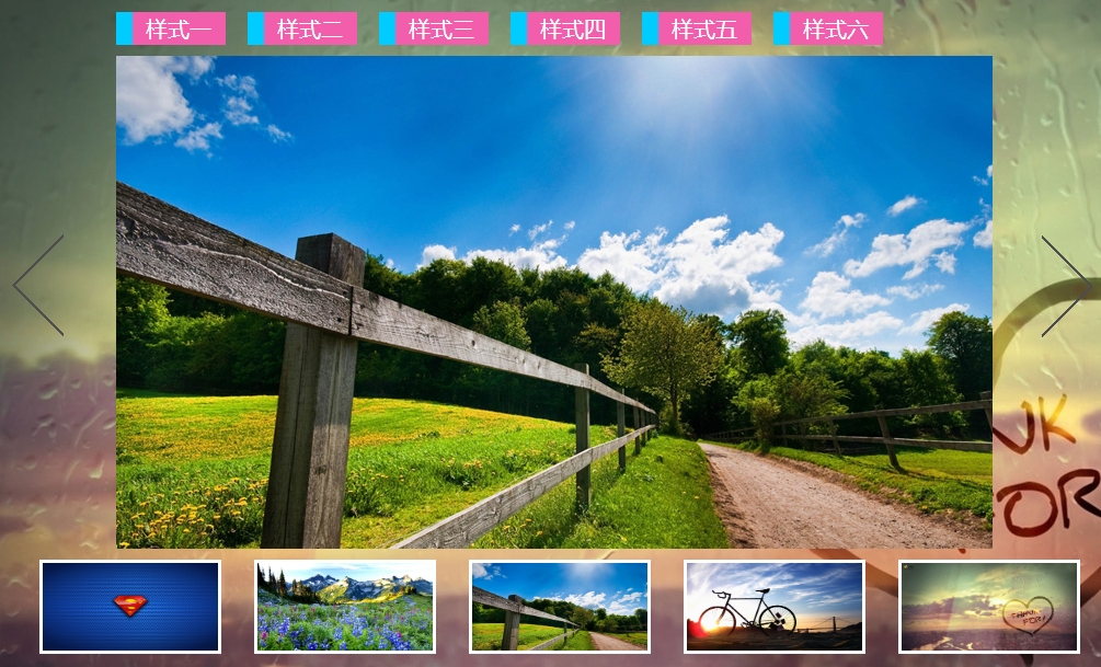
部分效果截图:
HTML代码(index.html):
<!DOCTYPE html PUBLIC "-//W3C//DTD XHTML 1.0 Transitional//EN" "http://www.w3.org/TR/xhtml1/DTD/xhtml1-transitional.dtd">
<html xmlns="http://www.w3.org/1999/xhtml">
<head>
<meta http-equiv="Content-Type" content="text/html; charset=utf-8" />
<title>jQ多种相册切换效果</title>
<script id="jquery_183" type="text/javascript" class="library" src="js/jquery-1.8.3.min.js"></script>
<script id="jquery_183" type="text/javascript" class="library" src="js/jquery.mousewheel.min.js"></script>
</head>
<body>
<div id="main">
<div id="nav">
<li value="0" class="navli" id="li1"><span>样式一</span></li>
<li value="1" class="navli" id="li2"><span>样式二</span></li>
<li value="2" class="navli" id="li3"><span>样式三</span></li>
<li value="3" class="navli" id="li4"><span>样式四</span></li>
<li value="4" class="navli" id="li5"><span>样式五</span></li>
<li value="5" class="navli" id="li5"><span>样式六</span></li>
</div>
<div class="content">
<div class="pics" id="pc1"></div>
<div class="pics" id="pc2"></div>
<div class="pics" id="pc3"></div>
<div class="pics" id="pc4"></div>
<div class="pics" id="pc8"></div>
<div class="pics" id="pc7"></div>
<div class="pics" id="pc6"></div>
<div class="pics" id="pc5"></div>
<div class="pics" id="pc9"></div>
<div class="pics" id="pc10"></div>
<div class="pics" id="pc11"></div>
<div class="pics" id="pc12"></div>
</div>
<div class="but" id="pre"></div>
<div class="but" id="next"></div>
<div id="totle"> <img class="littlepics" id="lipic1" alt="0" src="#" /> <img class="littlepics" id="lipic2" alt="1" src="#" /> <img class="littlepics" id="lipic3" alt="2" src="#" /> <img class="littlepics" id="lipic4" alt="3" src="#" /> <img class="littlepics" id="lipic5" alt="4" src="#" /> </div>
</div>
<style>
@charset "utf-8";
* {
padding: 0;
margin: 0;
border: none;
text-decoration: none;
list-style: none;
overflow: hidden;
}
input, button, select, textarea {
outline: none;
}
textarea {
font-size: 13px;
resize: none;
}
body {
background: url(images/1.JPEG);
}
#main {
width: 1000px;
height: 600px;
position: relative;
left: 50%;
margin-left: -500px;
margin-top: 50px;
}
.content {
width: 800px;
height: 450px;
position: relative;
top: 40px;
left: 100px;
}
.pics {
width: 200px;
height: 150px;
position: absolute;
display: none;
}
#pc1 {
top: 0px;
left: 0px;
background-position: 0px 0px;
}
#pc2 {
top: 0px;
left: 200px;
background-position: -200px 0px;
}
#pc3 {
top: 0px;
left: 400px;
background-position: -400px 0px;
}
#pc4 {
top: 0px;
left: 600px;
background-position: -600px 0px;
}
#pc8 {
top: 150px;
left: 0px;
background-position: 0px -150px;
}
#pc7 {
top: 150px;
left: 200px;
background-position: -200px -150px;
}
#pc6 {
top: 150px;
left: 400px;
background-position: -400px -150px;
}
#pc5 {
top: 150px;
left: 600px;
background-position: -600px -150px;
}
#pc9 {
top: 300px;
left: 0px;
background-position: 0px -300px;
}
#pc10 {
top: 300px;
left: 200px;
background-position: -200px -300px;
}
#pc11 {
top: 300px;
left: 400px;
background-position: -400px -300px;
}
#pc12 {
top: 300px;
left: 600px;
background-position: -600px -300px;
}
.but {
width: 50px;
height: 100px;
background: url(images/button.png);
position: absolute;
cursor: pointer;
}
#pre {
top: 200px;
left: 5px;
background-position: 0px -95px;
}
#next {
top: 200px;
right: 5px;
background-position: 0px -192px;
}
#totle {
width: 1000px;
height: 100px;
position: absolute;
bottom: 10px;
left: 0px;
}
.littlepics {
width: 160px;
height: 80px;
display: block;
border: #fff 3px solid;
float: left;
margin-left: 30px;
margin-top: 10px;
cursor: pointer;
}
#nav {
width: 800px;
height: 30px;
list-style: none;
position: absolute;
left: 100px;
}
.navli {
float: left;
line-height: 30px;
margin-right: 20px;
width: 100px;
background: #0cf;
cursor: pointer;
}
.navli span {
background: #F25EAB;
width: 85px;
height: 30px;
display: block;
float: right;
text-align: center;
color: #fff;
line-height: 30px;
font-size: 20px;
}
.style4 {
display: block;
-webkit-animation: animations linear 0.3s;
-moz-animation: animations linear 0.3s;
-o-animation: animations linear 0.3s;
-ms-animation: animations linear 0.3s;
animation: animations linear 0.3s;
}
@-webkit-keyframes animations {
0% {
-webkit-transform: rotate(0deg);
}
100% {
-webkit-transform: rotate(360deg);
}
}
@-moz-keyframes animations {
0% {
-moz-transform: rotate(0deg);
}
100% {
-moz-transform: rotate(360deg);
}
}
@-o-keyframes animations {
0% {
-o-transform: rotate(0deg);
}
100% {
-o-transform: rotate(360deg);
}
}
@-ms-keyframes animations {
0% {
-ms-transform: rotate(0deg);
}
100% {
-ms-transform: rotate(360deg);
}
}
@keyframes animations {
0% {
transform: rotate(0deg);
}
100% {
transform: rotate(360deg);
}
}
.style5 {
display: block;
-webkit-animation: flys linear 0.3s;
-moz-animation: flys linear 0.3s;
-o-animation: flys linear 0.3s;
-ms-animation: flys linear 0.3s;
animation: flys linear 0.3s;
}
@-webkit-keyframes flys {
0% {
-webkit-transform: scale(0,0);
}
100% {
-webkit-transform: scale(1,1);
}
}
@-moz-keyframes flys {
0% {
-moz-transform: scale(0,0);
}
100% {
-moz-transform: scale(1,1);
}
}
@-o-keyframes flys {
0% {
-o-transform: scale(0,0);
}
100% {
-o-transform: scale(1,1);
}
}
@-ms-keyframes flys {
0% {
-ms-transform: scale(0,0);
}
100% {
-ms-transform: scale(1,1);
}
}
@keyframes flys {
0% {
transform: scale(0,0);
}
100% {
transform: scale(1,1);
}
}
.style6 {
display: block;
-webkit-animation: stl linear 0.3s;
-moz-animation: stl linear 0.3s;
-o-animation: stl linear 0.3s;
-ms-animation: stl linear 0.3s;
animation: stl linear 0.3s;
}
@-webkit-keyframes stl {
0% {
-webkit-transform: rotate3d(0,1,0,-180deg);
}
100% {
-webkit-transform: rotate3d(0,1,0,0deg);
}
}
@-moz-keyframes stl {
0% {
-moz-transform: rotate3d(0,1,0,-180deg);
}
100% {
-moz-transform: rotate3d(0,1,0,0deg);
}
}
@-o-keyframes stl {
0% {
-o-transform: rotate3d(0,1,0,-180deg);
}
100% {
-o-transform: rotate3d(0,1,0,0deg);
}
}
@-ms-keyframes stl {
0% {
-ms-transform: rotate3d(0,1,0,-180deg);
}
100% {
-ms-transform: rotate3d(0,1,0,0deg);
}
}
@keyframes stl {
0% {
transform: rotate3d(0,1,0,-180deg);
}
100% {
transform: rotate3d(0,1,0,0deg);
}
}
</style>
<script>
var picnum = 0;
var style = 0;
$(document).ready(function () {
for (var j = 0; j < 5; j++) {
var imgurl = mypics.pics[j].url;
$("#lipic" + (j + 1)).attr("src", imgurl);
}
changeimg();
goin();
$("#main").bind("mousewheel", function (event, delta) {
delta < 0 ? picnum++ : picnum--;
changeimg();
goin();
});
$(".navli").click(function () {
style = $(this).val();
$(this).css("background", "#000").siblings().css("background", "#0cf");
});
$(".littlepics").click(function () {
var altnum = $(this).attr("alt");
picnum = altnum;
changeimg();
goin();
});
$("#pre").click(function () {
picnum--;
changeimg();
goin();
});
$("#next").click(function () {
picnum++;
changeimg();
goin();
});
});
function goin() {
$(".pics").hide();
var i = 0;
switch (style) {
case 0:
var timer = setInterval(function autodo() {
i++;
$("#pc" + i).fadeIn(500);
if (i == 12) {
clearTimeout(timer);
}
}, 100);
break;
case 1:
var timer = setInterval(function autodo() {
i++;
$("#pc" + i).show(500);
if (i == 12) {
clearTimeout(timer);
}
}, 100);
break;
case 2:
var timer = setInterval(function autodo() {
i++;
$("#pc" + i).slideDown(500);
if (i == 12) {
clearTimeout(timer);
}
}, 100);
break;
case 3:
var timer = setInterval(function autodo() {
i++;
$("#pc" + i).show().addClass("style4");
if (i == 14) {
clearTimeout(timer);
$(".pics").removeClass("style4");
}
}, 100);
break;
case 4:
var timer = setInterval(function autodo() {
i++;
$("#pc" + i).show().addClass("style5");
if (i == 14) {
clearTimeout(timer);
$(".pics").removeClass("style5");
}
}, 100);
break;
case 5:
var timer = setInterval(function autodo() {
i++;
$("#pc" + i).show().addClass("style6");
if (i == 14) {
clearTimeout(timer);
$(".pics").removeClass("style6");
}
}, 100);
break;
}
}
function changeimg() {
if (picnum < 0) {
picnum = 0;
}
else if (picnum > 4) {
picnum = 4;
}
var imgurl = mypics.pics[picnum].url;
$(".pics").css("background-image", "url(" + imgurl + ")");
}
var mypics = {
"pics": [
{ "url": "images/4CD747C612005CD508E.jpg" },
{ "url": "images/42A41E817EDB0B70949.jpg" },
{ "url": "images/82EC0A563613956A9E8.jpg" },
{ "url": "images/81463F7890FF1BDABA7.jpg" },
{ "url": "images/08E6FDA15296B871201.jpg" }
/*{"url": "images/82EC0A563613956A9E8B4811BB60F9F603052586F2C23_800_450.JPEG"},
{"url": "images/4CD747C612005CD508E02FE5D1B56C84620DC2F17A58B_800_450.JPEG"},
{"url": "images/81463F7890FF1BDABA708996FCD0401CFE58993C881F8_800_450.JPEG"},
{"url": "images/42A41E817EDB0B709492012F69396C96998BF91306E9B_800_450.JPEG"},
{"url": "images/08E6FDA15296B8712013BC81F85262BEAF2ECF5492FA2_800_450.JPEG"}
*/
]
};</script>
</body>
</html>JS代码(jquery.mousewheel.min.js):
/*! Copyright (c) 2011 Brandon Aaron (http://brandonaaron.net) * Licensed under the MIT License (LICENSE.txt). * * Thanks to:http://adomas.org/javascript-mouse-wheel/ for some pointers. * Thanks to:Mathias Bank(http://www.mathias-bank.de) for a scope bug fix. * Thanks to:Seamus Leahy for adding deltaX and deltaY * * Version:3.0.6 * * Requires:1.2.2+ */
(function(a){
	function d(b){
	var c=b||window.event,d=[].slice.call(arguments,1),e=0,f=!0,g=0,h=0;
	return b=a.event.fix(c),b.type="mousewheel",c.wheelDelta&&(e=c.wheelDelta/120),c.detail&&(e=-c.detail/3),h=e,c.axis!==undefined&&c.axis===c.HORIZONTAL_AXIS&&(h=0,g=-1*e),c.wheelDeltaY!==undefined&&(h=c.wheelDeltaY/120),c.wheelDeltaX!==undefined&&(g=-1*c.wheelDeltaX/120),d.unshift(b,e,g,h),(a.event.dispatch||a.event.handle).apply(this,d)}
var b=["DOMMouseScroll","mousewheel"];
	if(a.event.fixHooks)for(var c=b.length;
	c;
	)a.event.fixHooks[b[--c]]=a.event.mouseHooks;
	a.event.special.mousewheel={
	setup:function(){
	if(this.addEventListener)for(var a=b.length;
	a;
	)this.addEventListener(b[--a],d,!1);
	else this.onmousewheel=d}
,teardown:function(){
	if(this.removeEventListener)for(var a=b.length;
	a;
	)this.removeEventListener(b[--a],d,!1);
	else this.onmousewheel=null}
}
,a.fn.extend({
	mousewheel:function(a){
	return a?this.bind("mousewheel",a):this.trigger("mousewheel")}
,unmousewheel:function(a){
	return this.unbind("mousewheel",a)}
}
)}
)(jQuery)


 分享到QQ
分享到QQ 分享到微博
分享到微博 微信扫一扫
微信扫一扫