以下是 CSS3手势变换动画滑动滚动特效代码 的示例演示效果:
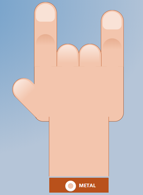
部分效果截图:
HTML代码(index.html):
<!DOCTYPE html>
<html>
<head>
  <meta charset="UTF-8">
  <title>CSS3手势变换动画特效</title>
    <style>
.hand {
  position: relative;
  top: 40%;
  left: 50%;
  transform: translate(-50%, -50%);
  background-color: #f3c5ad;
  width: 300px;
  height: 230.76923077px;
  border-radius: 30px;
  border: 1px solid #8c3e15;
}
.hand .finger {
  position: absolute;
  bottom: 80%;
  right: 0;
  width: 75px;
  height: 75px;
  border-top-left-radius: 75px;
  border-top-right-radius: 75px;
  background-color: #f3c5ad;
  border-left: 1px solid #b9511b;
  border-right: 1px solid #b9511b;
  border-top: 1px solid #b9511b;
  transition: .3s;
}
.hand .finger:nth-of-type( 5) {
  right: 299px;
}
.hand .finger:nth-of-type( 4) {
  right: 224px;
}
.hand .finger:nth-of-type( 3) {
  right: 149px;
}
.hand .finger:nth-of-type( 2) {
  right: 74px;
}
.hand .finger:nth-of-type( 1) {
  right: -1px;
}
.hand .finger.thumb {
  transform-origin: left bottom;
  transform: rotate(-45deg);
  bottom: 10px;
  right: 217.39130435px;
  z-index: -1;
  height: 150px;
  border-right: 0;
  border-top: 1px solid #b9511b;
}
.hand .finger.thumb:before {
  top: 2%;
}
.hand .finger:before,
.hand .finger:after {
  content: "";
  position: absolute;
  top: 5%;
  left: 7%;
  width: 85%;
  height: 60px;
  border-top-left-radius: 75px;
  border-top-right-radius: 75px;
  background: linear-gradient(to bottom, rgba(255, 255, 255, 0.6) 0%, rgba(255, 255, 255, 0) 100%);
  transition: .2s;
}
.hand .finger:after {
  top: 50%;
  height: 37.5px;
  background: linear-gradient(to bottom, rgba(185, 81, 27, 0.2) 0%, rgba(185, 81, 27, 0) 100%);
  display: none;
}
.hand .arm {
  position: absolute;
  bottom: -80%;
  left: 50%;
  transform: translate(-50%, 0);
  width: 200px;
  height: 200px;
  background-color: #f3c5ad;
  border-left: 1px solid #b9511b;
  border-right: 1px solid #b9511b;
}
label {
  width: 100px;
  height: 30px;
  display: inline-block;
  border-radius: 14px;
  line-height: 23.07692308px;
  font-style: normal;
  color: #fff;
  text-shadow: 0 1px 1px rgba(0, 0, 0, 0.1);
  font-weight: bold;
  transition: .5s;
  cursor: pointer;
  position: absolute;
  bottom: 1%;
  left: 50%;
  transform: translate(-50%, -50%);
  z-index: 9;
}
label:after {
  content: "";
  position: absolute;
  bottom: -20%;
  left: 50%;
  transform: translateX(-50%);
  width: 200px;
  height: 50px;
  background-color: #b9511b;
  z-index: -1;
}
label i {
  position: absolute;
  top: -4px;
  right: 60px;
  width: 36px;
  height: 36px;
  display: block;
  border-radius: 36px;
  background: white;
  box-shadow: inset 0 -3px 3px 0 rgba(0, 0, 0, 0.1), inset 0 -1px 1px 0 rgba(255, 255, 255, 0.4), 0 2px 0 0 rgba(0, 0, 0, 0.2);
  transition: .2s;
}
label i:before {
  content: "";
  display: block;
  position: absolute;
  top: 50%;
  left: 50%;
  width: 18px;
  height: 18px;
  margin: -9px 0 0 -9px;
  border-radius: 18px;
  background-color: #f3c5ad;
  box-shadow: inset 0 1px 0 0 rgba(0, 0, 0, 0.2);
}
label:before {
  content: "metal";
  margin-left: 50px;
  text-transform: uppercase;
  transition: .2s;
}
input[type=checkbox]:checked ~ label:before {
  content: "punk";
  text-transform: uppercase;
  margin-right: 30px;
  margin-left: 0;
}
input[type=checkbox]:checked ~ label {
  background: radial-gradient(center, ellipse cover, #8dad33 0%, #92b237 24%, #9dbb40 55%, #a6c24e 100%);
}
input[type=checkbox]:checked ~ label i {
  right: -6px;
}
input {
  opacity: 0;
}
input[type=checkbox] ~ .hand .finger {
  height: 75px;
}
input[type=checkbox] ~ .hand .finger:after {
  display: none;
}
input[type=checkbox] ~ .hand .finger:before {
  background: linear-gradient(to bottom, rgba(255, 255, 255, 0.6) 0%, rgba(255, 255, 255, 0) 100%);
}
input[type=checkbox] ~ .hand .finger:nth-of-type(1),
input[type=checkbox] ~ .hand .finger:nth-of-type(4) {
  height: 214.28571429px;
}
input[type=checkbox] ~ .hand .finger:nth-of-type(1):before,
input[type=checkbox] ~ .hand .finger:nth-of-type(4):before {
  top: 2%;
  background: rgba(255, 255, 255, 0.5);
  border-bottom-left-radius: 37.5px;
  border-bottom-right-radius: 37.5px;
}
input[type=checkbox] ~ .hand .finger:nth-of-type(1):after,
input[type=checkbox] ~ .hand .finger:nth-of-type(4):after {
  display: block;
}
input[type=checkbox] ~ .hand .finger:nth-of-type(1) {
  height: 187.5px;
}
input[type=checkbox] ~ .hand .finger.thumb {
  height: 136.36363636px;
}
input[type=checkbox]:checked ~ .hand .finger {
  height: 75px;
}
input[type=checkbox]:checked ~ .hand .finger:after {
  display: none;
}
input[type=checkbox]:checked ~ .hand .finger:before {
  background: linear-gradient(to bottom, rgba(255, 255, 255, 0.6) 0%, rgba(255, 255, 255, 0) 100%);
}
input[type=checkbox]:checked ~ .hand .finger:nth-of-type(3) {
  height: 250px;
}
input[type=checkbox]:checked ~ .hand .finger:nth-of-type(3):before {
  top: 2%;
  background: rgba(255, 255, 255, 0.5);
  border-bottom-left-radius: 37.5px;
  border-bottom-right-radius: 37.5px;
}
input[type=checkbox]:checked ~ .hand .finger:nth-of-type(3):after {
  display: block;
}
input[type=checkbox]:checked ~ .hand .finger.thumb {
  height: 136.36363636px;
}
/*}*/
html,
body {
  height: 100%;
  overflow: hidden;
}
body {
  background: radial-gradient(ellipse at top left, #699bc8 0%, #b5c5d8 57%);
}

</style>

    <script src="js/prefixfree.min.js"></script>

</head>

<body>
<input type="checkbox" id="switch"/>
<label for="switch"><i></i></label>
<div class="hand">
  <div class="finger"></div>
  <div class="finger"></div>
  <div class="finger"></div>
  <div class="finger"></div>
  <div class="finger thumb"></div>
  <div class="arm"></div>
</div>
</body>
</html>
JS代码(prefixfree.min.js):
/** * StyleFix 1.0.3 & PrefixFree 1.0.7 * @author Lea Verou * MIT license */
(function(){
	function t(e,t){
	return[].slice.call((t||document).querySelectorAll(e))}
if(!window.addEventListener)return;
	var e=window.StyleFix={
	link:function(t){
	try{
	if(t.rel!=="stylesheet"||t.hasAttribute("data-noprefix"))return}
catch(n){
	return}
var r=t.href||t.getAttribute("data-href"),i=r.replace(/[^\/]+$/,""),s=(/^[a-z]{
	3,10}
:/.exec(i)||[""])[0],o=(/^[a-z]{
	3,10}
:\/\/[^\/]+/.exec(i)||[""])[0],u=/^([^?]*)\??/.exec(r)[1],a=t.parentNode,f=new XMLHttpRequest,l;
	f.onreadystatechange=function(){
	f.readyState===4&&l()}
,l=function(){
	var n=f.responseText;
	if(n&&t.parentNode&&(!f.status||f.status<400||f.status>600)){
	n=e.fix(n,!0,t);
	if(i){
	n=n.replace(/url\(\s*?((?:"|')?)(.+?)\1\s*?\)/gi,function(e,t,n){
	return/^([a-z]{
	3,10}
:|#)/i.test(n)?e:/^\/\//.test(n)?'url("'+s+n+'")':/^\//.test(n)?'url("'+o+n+'")':/^\?/.test(n)?'url("'+u+n+'")':'url("'+i+n+'")'}
);
	var r=i.replace(/([\\\^\$*+[\]?{
}
.=!:(|)])/g,"\\$1");
	n=n.replace(RegExp("\\b(behavior:\\s*?url\\('?\"?)"+r,"gi"),"$1")}
var l=document.createElement("style");
	l.textContent=n,l.media=t.media,l.disabled=t.disabled,l.setAttribute("data-href",t.getAttribute("href")),a.insertBefore(l,t),a.removeChild(t),l.media=t.media}
}
;
	try{
	f.open("GET",r),f.send(null)}
catch(n){
	typeof XDomainRequest!="undefined"&&(f=new XDomainRequest,f.onerror=f.onprogress=function(){
}
,f.onload=l,f.open("GET",r),f.send(null))}
t.setAttribute("data-inprogress","")}
,styleElement:function(t){
	if(t.hasAttribute("data-noprefix"))return;
	var n=t.disabled;
	t.textContent=e.fix(t.textContent,!0,t),t.disabled=n}
,styleAttribute:function(t){
	var n=t.getAttribute("style");
	n=e.fix(n,!1,t),t.setAttribute("style",n)}
,process:function(){
	t("style").forEach(StyleFix.styleElement),t("[style]").forEach(StyleFix.styleAttribute)}
,register:function(t,n){
	(e.fixers=e.fixers||[]).splice(n===undefined?e.fixers.length:n,0,t)}
,fix:function(t,n,r){
	for(var i=0;
	i<e.fixers.length;
	i++)t=e.fixers[i](t,n,r)||t;
	return t}
,camelCase:function(e){
	return e.replace(/-([a-z])/g,function(e,t){
	return t.toUpperCase()}
).replace("-","")}
,deCamelCase:function(e){
	return e.replace(/[A-Z]/g,function(e){
	return"-"+e.toLowerCase()}
)}
}
;
	(function(){
	setTimeout(function(){
}
,10),document.addEventListener("DOMContentLoaded",StyleFix.process,!1)}
)()}
)(),function(e){
	function t(e,t,r,i,s){
	e=n[e];
	if(e.length){
	var o=RegExp(t+"("+e.join("|")+")"+r,"gi");
	s=s.replace(o,i)}
return s}
if(!window.StyleFix||!window.getComputedStyle)return;
	var n=window.PrefixFree={
	prefixCSS:function(e,r,i){
	var s=n.prefix;
	n.functions.indexOf("linear-gradient")>-1&&(e=e.replace(/(\s|:|,)(repeating-)?linear-gradient\(\s*(-?\d*\.?\d*)deg/ig,function(e,t,n,r){
	return t+(n||"")+"linear-gradient("+(90-r)+"deg"}
)),e=t("functions","(\\s|:|,)","\\s*\\(","$1"+s+"$2(",e),e=t("keywords","(\\s|:)","(\\s|;
	|\\}
|$)","$1"+s+"$2$3",e),e=t("properties","(^|\\{
	|\\s|;
	)","\\s*:","$1"+s+"$2:",e);
	if(n.properties.length){
	var o=RegExp("\\b("+n.properties.join("|")+")(?!:)","gi");
	e=t("valueProperties","\\b",":(.+?);
	",function(e){
	return e.replace(o,s+"$1")}
,e)}
return r&&(e=t("selectors","","\\b",n.prefixSelector,e),e=t("atrules","@","\\b","@"+s+"$1",e)),e=e.replace(RegExp("-"+s,"g"),"-"),e=e.replace(/-\*-(?=[a-z]+)/gi,n.prefix),e}
,property:function(e){
	return(n.properties.indexOf(e)?n.prefix:"")+e}
,value:function(e,r){
	return e=t("functions","(^|\\s|,)","\\s*\\(","$1"+n.prefix+"$2(",e),e=t("keywords","(^|\\s)","(\\s|$)","$1"+n.prefix+"$2$3",e),e}
,prefixSelector:function(e){
	return e.replace(/^:{
	1,2}
/,function(e){
	return e+n.prefix}
)}
,prefixProperty:function(e,t){
	var r=n.prefix+e;
	return t?StyleFix.camelCase(r):r}
}
;
	(function(){
	var e={
}
,t=[],r={
}
,i=getComputedStyle(document.documentElement,null),s=document.createElement("div").style,o=function(n){
	if(n.charAt(0)==="-"){
	t.push(n);
	var r=n.split("-"),i=r[1];
	e[i]=++e[i]||1;
	while(r.length>3){
	r.pop();
	var s=r.join("-");
	u(s)&&t.indexOf(s)===-1&&t.push(s)}
}
}
,u=function(e){
	return StyleFix.camelCase(e)in s}
;
	if(i.length>0)for(var a=0;
	a<i.length;
	a++)o(i[a]);
	else for(var f in i)o(StyleFix.deCamelCase(f));
	var l={
	uses:0}
;
	for(var c in e){
	var h=e[c];
	l.uses<h&&(l={
	prefix:c,uses:h}
)}
n.prefix="-"+l.prefix+"-",n.Prefix=StyleFix.camelCase(n.prefix),n.properties=[];
	for(var a=0;
	a<t.length;
	a++){
	var f=t[a];
	if(f.indexOf(n.prefix)===0){
	var p=f.slice(n.prefix.length);
	u(p)||n.properties.push(p)}
}
n.Prefix=="Ms"&&!("transform"in s)&&!("MsTransform"in s)&&"msTransform"in s&&n.properties.push("transform","transform-origin"),n.properties.sort()}
)(),function(){
	function i(e,t){
	return r[t]="",r[t]=e,!!r[t]}
var e={
	"linear-gradient":{
	property:"backgroundImage",params:"red,teal"}
,calc:{
	property:"width",params:"1px + 5%"}
,element:{
	property:"backgroundImage",params:"#foo"}
,"cross-fade":{
	property:"backgroundImage",params:"url(a.png),url(b.png),50%"}
}
;
	e["repeating-linear-gradient"]=e["repeating-radial-gradient"]=e["radial-gradient"]=e["linear-gradient"];
	var t={
	initial:"color","zoom-in":"cursor","zoom-out":"cursor",box:"display",flexbox:"display","inline-flexbox":"display",flex:"display","inline-flex":"display",grid:"display","inline-grid":"display","min-content":"width"}
;
	n.functions=[],n.keywords=[];
	var r=document.createElement("div").style;
	for(var s in e){
	var o=e[s],u=o.property,a=s+"("+o.params+")";
	!i(a,u)&&i(n.prefix+a,u)&&n.functions.push(s)}
for(var f in t){
	var u=t[f];
	!i(f,u)&&i(n.prefix+f,u)&&n.keywords.push(f)}
}
(),function(){
	function s(e){
	return i.textContent=e+"{
}
",!!i.sheet.cssRules.length}
var t={
	":read-only":null,":read-write":null,":any-link":null,"::selection":null}
,r={
	keyframes:"name",viewport:null,document:'regexp(".")'}
;
	n.selectors=[],n.atrules=[];
	var i=e.appendChild(document.createElement("style"));
	for(var o in t){
	var u=o+(t[o]?"("+t[o]+")":"");
	!s(u)&&s(n.prefixSelector(u))&&n.selectors.push(o)}
for(var a in r){
	var u=a+" "+(r[a]||"");
	!s("@"+u)&&s("@"+n.prefix+u)&&n.atrules.push(a)}
e.removeChild(i)}
(),n.valueProperties=["transition","transition-property"],e.className+=" "+n.prefix,StyleFix.register(n.prefixCSS)}
(document.documentElement);
CSS代码(normalize.css):
html{font-family:sans-serif;-ms-text-size-adjust:100%;-webkit-text-size-adjust:100%}
body{margin:0}
article,aside,details,figcaption,figure,footer,header,hgroup,main,nav,section,summary{display:block}
audio,canvas,progress,video{display:inline-block;vertical-align:baseline}
audio:not([controls]){display:none;height:0}
[hidden],template{display:none}
a{background:transparent}
a:active,a:hover{outline:0}
abbr[title]{border-bottom:1px dotted}
b,strong{font-weight:bold}
dfn{font-style:italic}
h1{font-size:2em;margin:0.67em 0}
mark{background:#ff0;color:#000}
small{font-size:80%}
sub,sup{font-size:75%;line-height:0;position:relative;vertical-align:baseline}
sup{top:-0.5em}
sub{bottom:-0.25em}
img{border:0}
svg:not(:root){overflow:hidden}
figure{margin:1em 40px}
hr{-moz-box-sizing:content-box;box-sizing:content-box;height:0}
pre{overflow:auto}
code,kbd,pre,samp{font-family:monospace,monospace;font-size:1em}
button,input,optgroup,select,textarea{color:inherit;font:inherit;margin:0}
button{overflow:visible}
button,select{text-transform:none}
button,html input[type="button"],input[type="reset"],input[type="submit"]{-webkit-appearance:button;cursor:pointer}
button[disabled],html input[disabled]{cursor:default}
button::-moz-focus-inner,input::-moz-focus-inner{border:0;padding:0}
input{line-height:normal}
input[type="checkbox"],input[type="radio"]{-moz-box-sizing:border-box;box-sizing:border-box;padding:0}
input[type="number"]::-webkit-inner-spin-button,input[type="number"]::-webkit-outer-spin-button{height:auto}
input[type="search"]{-webkit-appearance:textfield;-moz-box-sizing:content-box;box-sizing:content-box}
input[type="search"]::-webkit-search-cancel-button,input[type="search"]::-webkit-search-decoration{-webkit-appearance:none}
fieldset{border:1px solid #c0c0c0;margin:0 2px;padding:0.35em 0.625em 0.75em}
legend{border:0;padding:0}
textarea{overflow:auto}
optgroup{font-weight:bold}
table{border-collapse:collapse;border-spacing:0}
td,th{padding:0}


 分享到QQ
分享到QQ 分享到微博
分享到微博 微信扫一扫
微信扫一扫