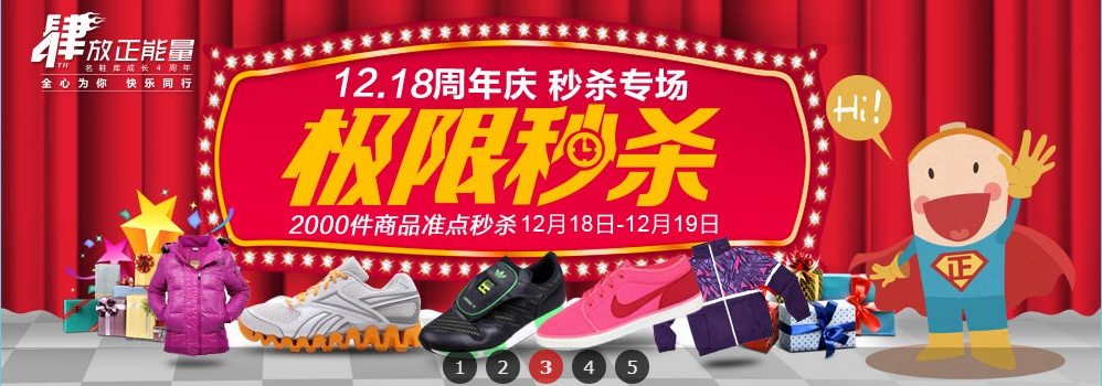
以下是 基于MooTools全屏焦点图轮播滚动切换特效代码 的示例演示效果:
部分效果截图:
HTML代码(index.html):
<!DOCTYPE html PUBLIC "-//W3C//DTD XHTML 1.0 Transitional//EN" "http://www.w3.org/TR/xhtml1/DTD/xhtml1-transitional.dtd">
<html xmlns="http://www.w3.org/1999/xhtml">
<head>
<meta http-equiv="Content-Type" content="text/html; charset=UTF-8" />
<meta http-equiv="X-UA-Compatible" content="IE=8" />
<title>基于MooTools全屏焦点图</title>
<script type="text/javascript" src="js/tools.js"></script>
<script type="text/javascript" src="js/zzsc.js"></script>
<script type="text/javascript">
document.addEvent('domready',function(){
	  var myTabs = new Tabs($$('#a_focuspic_tabs4304 li'),$$('#a_focuspic_con4304 div.con'),{});
			 myTabs.startAuto();
});
</script>
<link href="css/zzsc.css" rel="stylesheet" type="text/css" />
</head>
<body>
<div style="width:100%;overflow:hidden;margin:0 auto">
<div class="warp">
<div class="a_focus_pic">
 <ul class="ctr_btn" id="a_focuspic_tabs4304">
    <li class="on">1</li>
    <li class="">2</li>
    <li class="">3</li>
    <li class="">4</li>
    <li class="">5</li>
 </ul>

<div class="ctrlbg"></div>
<div id="a_focuspic_con4304">
<div class="con" style="display: none; visibility: visible; zoom: 1; opacity: 1;">
<div class="sub_con">
<a style="width:980px;height:350px;top:0px;left:310px;" href="#"><p style="_width:970px;_height:340px;_background:none">内容</p></a>
<div class="pic"><img src="images/nike1129.jpg"/></div>
</div>
</div>

<div class="con" style="display: none; visibility: visible; zoom: 1; opacity: 1;">
<div class="sub_con">
<a style="width:980px;height:350px;top:0px;left:310px;" href="#"><p style="_width:970px;_height:340px;_background:none">内容</p></a>
<div class="pic"><img src="images/lantivy-010.jpg"/></div>
</div>
</div>

<div class="con" style="display: none; visibility: visible; zoom: 1; opacity: 1;">
<div class="sub_con">
<a style="width:980px;height:350px;top:0px;left:310px;" href="#"><p style="_width:970px;_height:340px;_background:none">内容</p></a>
<div class="pic"><img src="images/miaosha1218.jpg"/></div>
</div>
</div>

<div class="con" style="display: none; visibility: visible; zoom: 1; opacity: 1;">
<div class="sub_con">
<a style="width:980px;height:350px;top:0px;left:310px;" href="#"><p style="_width:970px;_height:340px;_background:none">内容</p></a>
<div class="pic"><img src="images/yrf11.jpg"/></div>
</div>
</div>

<div class="con" style="display: block; visibility: visible; zoom: 1; opacity: 1;">
<div class="sub_con">
<a style="width:980px;height:350px;top:0px;left:310px;" href="#"><p style="_width:970px;_height:340px;_background:none">内容</p></a>
<div class="pic"><img src="images/converse1.jpg"/></div>
</div>
</div>

</div>
</div>
</div>
</div>
</body>
</html>
JS代码(zzsc.js):
var Tabs = new Class({
	Implements:[Options,Events],options:{
	selectedTabCss:'on',selectedSectionCss:'on',mvSH:1,firstShow:0,autoInterval:4,mouseEvent:'mouseover'}
,initialize:function(tabs,sections,options){
	this.setOptions(options);
	this.current = this.options.firstShow;
	this.tabs = $$(tabs);
	this.sections = $$(sections);
	this.sectionsLength = $$(sections).length;
	this.attach();
	this.render();
}
,render:function(){
	this.sections.each(function(section,index){
	if( index !== this.current ){
	section.hide();
}
else{
	this.showSection(index);
}
;
}
,this);
}
,attach:function(){
	this.tabs.each(function(tab,index){
	tab.addEvent(this.options.mouseEvent,this.tabEvent.bindWithEvent(this,tab));
}
,this);
}
,tabEvent:function(e,tab){
	e.preventDefault();
	var index = this.tabs.indexOf(tab);
	this.toggleSection(index);
}
,toggleSection:function(index){
	if(this.current === index) return;
	this.hideSection(this.current);
	this.current = index;
	this.showSection(this.current);
}
,showSection:function(index){
	var tab = this.tabs[index];
	var section = this.sections[index];
	tab.addClass(this.options.selectedTabCss);
	section.addClass(this.options.selectedSectionCss).show();
	this.fireEvent('onShow',[index,tab,section]);
}
,hideSection:function(index){
	if (index===false) return;
	var tab = this.tabs[index];
	var section = this.sections[index];
	tab.removeClass(this.options.selectedTabCss);
	section.removeClass(this.options.selectedSectionCss).hide();
	this.fireEvent('onHide',[index,tab,section]);
}
}
);
	/** * implement effects */
Tabs.implement({
	showSection:function(index){
	var tab = this.tabs[index];
	var section = this.sections[index];
	switch (this.options.mvSH){
	case 1:section.setStyles({
	display:'block',opacity:0}
).fade(1);
	tab.addClass(this.options.selectedTabCss);
	break;
	default:tab.addClass(this.options.selectedTabCss);
	section.addClass(this.options.selectedSectionCss).show();
	//section.setStyles({
	display:'block',opacity:0}
).fade(1);
}
this.fireEvent('onShow',[index,tab,section]);
}
,hideSection:function(index){
	if (index===false) return;
	var tab = this.tabs[index];
	var section = this.sections[index];
	switch (this.options.mvSH){
	case 1:section.hide();
	tab.removeClass(this.options.selectedTabCss);
	break;
	default:tab.removeClass(this.options.selectedTabCss);
	section.removeClass(this.options.selectedSectionCss).hide();
}
this.fireEvent('onHide',[index,tab,section]);
}
}
);
	/** * implement auto change Tab method to Tabs class */
Tabs.implement({
	startAuto:function(){
	this.attachAuto();
	this.start();
}
,attachAuto:function(){
	this.bindOver = this.stop.bind(this);
	this.bindOut = this.start.bind(this);
	this.tabs.getParent().addEvents({
	'mouseenter':this.bindOver,'mouseleave':this.bindOut}
);
	this.sections.getParent().addEvents({
	'mouseenter':this.bindOver,'mouseleave':this.bindOut}
);
}
,start:function(){
	this.autoId = this.autoToggle.periodical(this.options.autoInterval*1000,this);
}
,stop:function(){
	$clear(this.autoId);
}
,autoToggle:function(){
	this.numNext = this.current + 1;
	this.numNext = this.numNext >= this.sectionsLength ? 0:this.numNext;
	this.toggleSection(this.numNext);
}
}
);
CSS代码(zzsc.css):
*{margin:0;list-style:none;padding:0;border:0;}
.warp{margin:0 auto;width:980px}
/*焦点图样式*/
.a_focus_pic{position:relative;width:980px;height:350px;z-index:1001;}
.a_focus_pic .con{position:absolute;top:0;left:-310px;height:350px;width:1600px;z-index:2;}
.a_focus_pic .ctrlbg{height:35px;background:#000;filter:alpha(opacity=20);-moz-opacity:0.2;opacity:0.2;width:1600px;position:absolute;bottom:0;left:-310px;z-index:10;}
.a_focus_pic .ctr_btn{height:31px;position:absolute;left:40%;bottom:2px;z-index:11;}
.a_focus_pic .ctr_btn li{height:31px;width:31px;line-height:31px;text-align:center;float:left;margin-right:8px;background:#000;filter:alpha(opacity=70);-moz-opacity:0.7;opacity:0.7;color:#FFF;font-family:verdana;font-size:16px;cursor:pointer;border-radius:25px;_width:22px;_height:22px;_line-height:22px;_margin-top:4px}
.a_focus_pic .ctr_btn li.on{font-weight:700;background:#c00;_width:22px;_height:22px;_line-height:22px;}
.a_focus_pic .con .sub_con{position:relative;width:1600px;height:350px;}
.a_focus_pic .con .sub_con a{position:absolute;display:block;z-index:2;background:url('../images/transparent.gif') no-repeat;background-position:-9999px -9999px;overflow:hidden;text-indent:-999px}
.a_focus_pic .con .sub_con a p{cursor:pointer;display:block;height:100%;margin:0;padding:0;position:absolute;left:0;top:0;width:100%;background:#000;filter:alpha(opacity=20);-moz-opacity:0.2;-khtml-opacity:0.2;opacity:0.2;visibility:hidden;line-height:100em;z-index:999999;zoom:1;}
.a_focus_pic .con .sub_con a:hover{zoom:1;}
.a_focus_pic .con .sub_con a:hover p{visibility:visible;_border:5px solid #c00;overflow:hidden}
.a_focus_pic .con .sub_con .pic{position:absolute;z-index:1;}


 分享到QQ
分享到QQ 分享到微博
分享到微博 微信扫一扫
微信扫一扫