以下是 HTML5仿Chrome样式控制滑杆动画滑动滚动特效代码 的示例演示效果:
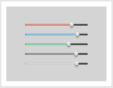
部分效果截图:
HTML代码(index.html):
<!DOCTYPE html>
<html>
<head>
<meta charset="UTF-8">
<title>HTML5仿Chrome样式控制滑杆动画</title>
<link href="css/style.css" rel="stylesheet" type="text/css">
<script src="js/jquery.min.js"></script>
<script src="js/jquery-ui.min.js"></script>
</head>
<body>
<article class="mainfeature">
<div class="sliderset">
<div class="slider red"></div>
<div class="slider blue"></div>
<div class="slider green"></div>
<div class="slider black"></div>
<div class="slider white"></div>
</div>
</article>
<script src="js/index.js"></script>
</body>
</html>
JS代码(index.js):
$( document ).ready(function(){
	function createHoverState (myobject){
	myobject.hover(function(){
	$(this).prev().toggleClass('hilite');
}
);
	myobject.mousedown(function(){
	$(this).prev().addClass('dragging');
	$("*").mouseup(function(){
	$(myobject).prev().removeClass('dragging');
}
);
}
);
}
$(".slider").slider({
	orientation:"horizontal",range:"min",max:100,value:0,animate:1300}
);
	$("#blue").slider( "value",100 );
	$('.slider').each(function(index){
	$(this).slider( "value",75-index*(50/($('.slider').length-1)));
}
);
	createHoverState($(".slider a.ui-slider-handle"));
}
);
CSS代码(style.css):
html,body{background-color:#e6e6e6;}
article.mainfeature{width:400px;height:300px;border:20px solid white;margin:30px auto;background-color:#d4d4d4;-moz-border-radius:2px;-webkit-border-radius:2px;border-radius:2px;box-shadow:0 1px 2px rgba(0,0,0,0.08);}
.sliderset{margin-top:70px;}
.slider{position:relative;margin:32px auto;width:250px;display:block;background:#565656;height:7px;box-shadow:0 1px 0px rgba(255,255,255,0.25),inset 0 0 4px rgba(0,0,0,0.9);-moz-border-radius:7px;-webkit-border-radius:7px;border-radius:7px;}
.slider div.ui-slider-range{display:block;height:7px;-moz-border-radius:7px;-webkit-border-radius:7px;border-radius:7px;-moz-transition-property:background-color;-o-transition-property:background-color;-webkit-transition-property:background-color;transition-property:background-color;-moz-transition-duration:100ms;-o-transition-duration:100ms;-webkit-transition-duration:100ms;transition-duration:100ms;}
.slider.red div.ui-slider-range{background-color:#e69e9b;box-shadow:inset 0 0 4px rgba(163,18,0,0.7),inset 0 0 2px rgba(0,0,0,0.5);}
.slider.red div.ui-slider-range.hilite,.slider.red div.ui-slider-range.dragging{background-color:#ffa09b;}
.slider.blue div.ui-slider-range{background-color:#9FD0E9;box-shadow:inset 0 0 4px rgba(0,85,151,0.8),inset 0 0 2px rgba(0,0,0,0.5);}
.slider.blue div.ui-slider-range.hilite,.slider.blue div.ui-slider-range.dragging{background-color:#9fd5ff;}
.slider.green div.ui-slider-range{background-color:#9edbbc;box-shadow:inset 0 0 4px rgba(19,121,72,0.8),inset 0 0 2px rgba(0,0,0,0.5);}
.slider.green div.ui-slider-range.hilite,.slider.green div.ui-slider-range.dragging{background-color:#9ee7c2;}
.slider.black div.ui-slider-range{background-color:#aaaaaa;box-shadow:inset 0 0 4px rgba(24,24,24,0.8),inset 0 0 2px rgba(0,0,0,0.5);}
.slider.black div.ui-slider-range.hilite,.slider.black div.ui-slider-range.dragging{background-color:#bbbbbb;}
.slider.white div.ui-slider-range{background-color:#e3e3e3;box-shadow:inset 0 0 4px rgba(88,88,88,0.5),inset 0 0 2px rgba(0,0,0,0.3);}
.slider.white div.ui-slider-range.hilite,.slider.white div.ui-slider-range.dragging{background-color:#f0f0f0;}
.slider a.ui-slider-handle{position:absolute;top:-5px;margin-left:-9px;z-index:2;height:16px;width:16px;-moz-border-radius:20px;-webkit-border-radius:20px;border-radius:20px;background-color:#d4d4d4;background-image:url(https://s3.amazonaws.com/codepen/chrome_radial.jpg);-moz-background-size:100% 100%;-o-background-size:100% 100%;-webkit-background-size:100% 100%;background-size:100% 100%;border:0px solid rgba(0,0,0,0.1);box-shadow:0 0px 2px rgba(0,0,0,0.4),inset 0 0px 1px rgba(0,0,0,0.3),0 1px 2px rgba(0,0,0,0.6),0 4px 2px rgba(0,0,0,0.2),0 9px 4px rgba(0,0,0,0.1),inset 0 2px 1px white;outline:none;}
.slider a.ui-slider-handle:after{content:"";position:absolute;width:15px;height:15px;left:-1px;top:-4px;background-color:none;-moz-border-radius:12px;-webkit-border-radius:12px;border-radius:12px;background-image:-moz-radial-gradient(#ffffff,rgba(255,255,255,0.05),rgba(255,255,255,0));background-image:-webkit-radial-gradient(#ffffff,rgba(255,255,255,0.05),rgba(255,255,255,0));background-image:radial-gradient(#ffffff,rgba(255,255,255,0.05),rgba(255,255,255,0));}


 分享到QQ
分享到QQ 分享到微博
分享到微博 微信扫一扫
微信扫一扫