以下是 纯CSS3跳动焦点广告特效代码 的示例演示效果:
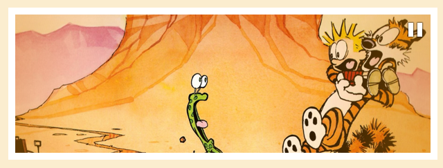
部分效果截图:
HTML代码(index.html):
<!DOCTYPE html PUBLIC "-//W3C//DTD XHTML 1.0 Transitional//EN" "http://www.w3.org/TR/xhtml1/DTD/xhtml1-transitional.dtd">
<html xmlns="http://www.w3.org/1999/xhtml">
<head>
<meta http-equiv="Content-Type" content="text/html; charset=UTF-8" />
<link href="css/reset.css" rel="stylesheet" type="text/css" /> <!-- This CSS creates a ninja that kicks the butt of any browser that rebels against conformity *cough*IE*cough* -->
<link href="css/slider.css" rel="stylesheet" type="text/css" /> <!-- This CSS creates the magic for the slider -->
<link href="css/main.css" rel="stylesheet" type="text/css" /> <!-- This CSS is just boring -->
<title>纯CSS3制作的焦点广告</title>
</head>
<body>
<div class="container">
	<div id="slider">
		<div id="mask"><!-- This masks an unordered list (<ul>) while it's sliding from right to left. Here's an illustration of what's going on (The ='s are the slides and the [ ] is the mask):

						Slide 1:    [=]===
						Slide 2:   =[=]==
						Slide 3:  ==[=]=
						Slide 4: ===[=]

						In summary, as the unordered list moves from right to left, the mask ([ ]) will only show the content (portion of the unordered list) that is currently inside of it. If it weren't for this mask, you'd see all of the slides going across your window.
						-->
			<ul><!-- Sets up the previously mentioned unordered list. This will structure the slides and lay them out horizontally/inline with eachother (by default, an unordered list would display list items (<li>) vertically. However, with some CSS magic (display:inline;), the list items will line up horizontally -->
				<li><!-- Sets up a list item that will contain one of our slides -->
					<a href="#" title="View my first image link"><img src="images/1.png" /></a><!-- This image is wrapped in an achor tag (<a>) to open up another page (or in this case, the image) when clicked on. If you don't want a slide to link to another page, simply remove the <a> tags -->
				</li>
				<li>
					<a href="#" title="View my second image link"><img src="images/2.png" /></a>
					<span><!-- The text wrapped in this span tag will become this slide's caption. If you do not want a caption, simply remove the span tag and all content/tags inside of it -->
						<h2>Image Caption</h2>
						<p>Lorem ipsum dolor...</p>
					</span>
				</li>
				<li>
					<iframe src="http://en.wikipedia.org/wiki/Calvin_and_Hobbes" width="600" height="200" frameborder="0" scrolling="no"></iframe><!-- This slide is pulling an entire web page from another website using the <iframe> tag. This goes to show that you can insert anything into the slides - even a video! This is why it's important for the slider to pause on mouseover. The pause will allow people to interact with whatever your slide contains - without it slapping them in the face and sliding away (that would suck)  -->
					<span>
						<h2>Iframe Caption</h2>
					</span>
				</li>
				<li>
					<a href="#" title="View my third image link"><img src="images/3.png" /></a>
				</li>
			</ul><!-- Ends the unordered list that contains our slides -->
		</div><!-- Ends the slider mask. Everything outside of this tag will no longer be masked -->
		<div id="progress"><!-- Sets up our progress bar to show the remaining time of the current slide. This will be animated to go from 1px wide to the full width of the slide (600px) -->
		</div>
		<div id="overlay"><!-- Used to add a dope gradient ontop of the slider. Simply remove this <div> if you don't want any type of overlay -->
		</div>
		<div id="pause"><!-- This contains the pause icon that appears when hovering over the slider. Again, if you don't want the icon to appear, simply remove this <div> -->
		</div>
	</div>
</div>
</body>
</html>
CSS代码(main.css):
body{background-color:#fbedcf;min-width:960px;font-family:Tahoma,Geneva,sans-serif;color:#fff;font-size:16px;line-height:22px;text-shadow:1px 1px 1px #362c30;}
.container{width:960px;margin:0 auto;overflow:visible;}
CSS代码(reset.css):
@charset "UTF-8";html,body,div,span,applet,object,iframe,h1,h2,h3,h4,h5,h6,p,blockquote,pre,a,abbr,acronym,address,big,cite,code,del,dfn,em,img,ins,kbd,q,s,samp,small,strike,strong,sub,sup,tt,var,b,u,i,center,dl,dt,dd,ol,ul,li,fieldset,form,label,legend,table,caption,tbody,tfoot,thead,tr,th,td,article,aside,canvas,details,embed,figure,figcaption,footer,header,hgroup,menu,nav,output,ruby,section,summary,time,mark,audio,video{margin:0;padding:0;border:0;font-size:100%;vertical-align:baseline;}
/* HTML5 display-role reset for older browsers */
article,aside,details,figcaption,figure,footer,header,hgroup,menu,nav,section{display:block;}
body{line-height:1;}
ol,ul{list-style:none;}
blockquote,q{quotes:none;}
blockquote:before,blockquote:after,q:before,q:after{content:'';content:none;}
table{border-collapse:collapse;border-spacing:0;}
CSS代码(slider.css):
#slider{/* Styles the <div> that contains everything slider related */
width:600px;height:200px;position:relative;margin:40px auto 0;background-color:#362c30;border:10px solid #362c30;transform:rotate(0deg);/* Default rotation that the #slider <div> will come back to after the "shakey bounce" effect. For more information on transforms,check out:http://www.w3schools.com/css3/css3_2dtransforms.asp */
-ms-transform:rotate(0deg);-moz-transform:rotate(0deg);-webkit-transform:rotate(0deg);-o-transform:rotate(0deg);-moz-transition:all 150ms ease-in;/* Allows all property values to animate on hover. For information on transitions,check out:http://w3schools.com/css3/css3_transitions.asp */
-webkit-transition:all 150ms ease-in;-o-transition:all 150ms ease-in;}
#slider:hover{/* Since we added the transistion property to #slider <div>,the previous properties will now animate to these new properties on hover */
background-color:#fff;border:10px solid #fff;-webkit-animation:rotatey 400ms ease-out;/* Once we hover on #slider <div>,the "shakey bounce" animation will play (animating #slider <div>). For more information on animations,check out:http://www.w3schools.com/css3/css3_animations.asp */
-moz-animation:rotatey 400ms ease-out;}
#slider:hover #pause{/* When we hover over #slider <div>,our #pause <div> will become visible - which will display the pause icon */
opacity:1;}
#slider:hover #progress{/* When we hover over #slider <div>,the background color of our #progress <div> will become transparent. This will give the effect of the progress bar fading away on hover */
background-color:rgba(255,255,255,0.0);}
#slider:hover ul,#slider:hover #progress,#slider:hover #overlay{/* When we hover over the unordered list <ul> inside of #slider <div> (the slides),all of our slide related animations will pause */
-moz-animation-play-state:paused;-webkit-animation-play-state:paused;}
#mask{/* Creates the mask */
overflow:hidden;}
#pause{/* Styling our pause icon that appears when hovering over #slider <div> */
width:600px;height:200px;position:absolute;top:0;opacity:0;background-image:url(../images/paused.png);background-position:566px 10px;background-repeat:no-repeat;pointer-events:none;/* This not-so-well-known property is very nifty. Since the #pause <div> (along with other <div>'s - which also use this property) are laying ontop of the slides,we need to be able to "click through" them to the slides/content below. Without this property,there would be a massive sumo sitting on top of all your content - blocking it from the user's mouse. However,it currently seems that pointer-events will only work in FireFox,Safari,and Chrome (as of 11/4/11). For more information:https://developer.mozilla.org/en/CSS/pointer-events */
-moz-transition:all 150ms ease-in;/* This transition allows the #pause <div> to fade in when #slider <div> is hovered over */
-webkit-transition:all 150ms ease-in;-o-transition:all 150ms ease-in;}
#progress{/* The progress bar that will animate to the full width of the slide to show the duration of the slide */
width:1px;height:1px;position:relative;top:-1px;background-color:#ffd000;-moz-transition:all 150ms linear;/* Transition allows #progress <div> to fade when #slider <div> is hovered over */
-webkit-transition:all 150ms linear;-o-transition:all 150ms linear;-moz-animation:progress 18s infinite;/* The progress animation will increase #progress's <div> width from 1px to the full width of the slide (600px) */
-webkit-animation:progress 18s infinite;}
#overlay{/* Creates the cool gradient effect ontop of the slider */
width:600px;height:200px;position:absolute;top:0;background-image:url(../images/overlay.png);background-position:center;background-repeat:no-repeat;pointer-events:none;opacity:0.5;-moz-animation:overlay-fade 18s infinite;/* The animation will fade #overlay <div> when the slider is finished */
-webkit-animation:overlay-fade 18s infinite;}
#slider ul{/* Styling the unordered list <ul> that contains our slides <li>'s */
width:2400px;/* The calculated width of all the slides (4 slides x 600px in width) */
position:relative;left:0px;margin:0;padding:0;list-style:none;-moz-animation:slide-animation 18s infinite;/* You can change the speed of the slide by changing the 18s. Make sure to update the speed of #overlay and #progress too. Keep in mind that this will also effect the speed of the transitions */
-webkit-animation:slide-animation 18s infinite;}
#slider li{/* Styling the list elements <li>'s that contain each slide */
width:600px;height:200px;position:relative;display:inline;/* This aligns the <li>'s horizontally so that the <ul> can scroll horizontally. By default,<li>'s align vertically */
float:left;/* Gets rid of mysterious spacing on the sides of the <li>'s */
margin:0;padding:0;background-image:url(../images/loader.gif);/* Adds a loader GIF to each slide to show that content is loading */
background-position:50% 50%;background-repeat:no-repeat;}
#slider li span{/* Styling of the slider caption */
display:block;width:560px;position:absolute;bottom:0;left:0;padding:15px 20px;pointer-events:none;/* Allows people to "click through" the captions to the content below. If you'd like people to be able to interact with the content in the caption (highlight text,click special links,etc),then remove this property */
background-color:rgba(54,44,48,0.6);border-top:1px solid #362c30;text-shadow:1px 1px 1px #362c30;}
#slider ul li span h2{/* Styling of the slider caption */
font-size:20px;line-height:30px;font-weight:normal;color:#fff;text-shadow:1px 1px 1px #362c30;}
#slider ul li span p{/* Styling of the slider's paragraphs */
font-size:14px;line-height:20px;font-weight:normal;color:#fff;text-shadow:1px 1px 1px #362c30;}
@-webkit-keyframes slide-animation{/* Creates our animation that cycles through the slides for WebKit browsers. This is set up to cycle through 4 slides. If you plan on changing that number,you will have to divide 100 by the amount of slides and figure out the formula from there (while also changing the formulas for the progress and overlay-fade animations). Right now it's set up for each slide to take roughly 25% of the animation time. As you can see,this is where it can get a bit sticky changing the amount of slides. I'd suggest playing around with some basic animations first to get a handle on how they work. For an in depth explanation of animations,check out:http://www.w3schools.com/css3/css3_animations.asp */
0%{opacity:0;}
2%{opacity:1;}
20%{left:0px;opacity:1;}
22.5%{opacity:0.6;}
25%{left:-600px;opacity:1;}
45%{left:-600px;opacity:1;}
47.5%{opacity:0.6;}
50%{left:-1200px;opacity:1;}
70%{left:-1200px;opacity:1;}
72.5%{opacity:0.6;}
75%{left:-1800px;opacity:1;}
95%{opacity:1;}
98%{left:-1800px;opacity:0;}
/* The slider fades all the way out before resetting. If it didn't fade out,you'd see all of the slides shoot through real quick on there way back to the beginning. */
100%{left:0px;opacity:0;}
}
@-moz-keyframes slide-animation{/* Creates the slide animation for FireFox */
0%{opacity:0;}
2%{opacity:1;}
20%{left:0px;opacity:1;}
22.5%{opacity:0.6;}
25%{left:-600px;opacity:1;}
45%{left:-600px;opacity:1;}
47.5%{opacity:0.6;}
50%{left:-1200px;opacity:1;}
70%{left:-1200px;opacity:1;}
72.5%{opacity:0.6;}
75%{left:-1800px;opacity:1;}
95%{opacity:1;}
98%{left:-1800px;opacity:0;}
100%{left:0px;opacity:0;}
}
@-webkit-keyframes progress{/* Animation for the progress bar in WebKit browsers */
0%{width:0px;opacity:0;}
2%{width:0px;opacity:1;}
20%{width:600px;opacity:1;}
22.5%{width:600px;opacity:0;}
22.59%{width:0px;}
25%{width:0px;opacity:1;}
45%{width:600px;opacity:1;}
47.5%{width:600px;opacity:0;}
47.59%{width:0px;}
50%{width:0px;opacity:1;}
70%{width:600px;opacity:1;}
72.5%{width:600px;opacity:0;}
72.59%{width:0px;}
75%{width:0px;opacity:1;}
95%{width:600px;opacity:1;}
98%{width:600px;opacity:0;}
100%{width:0px;opacity:0;}
}
@-moz-keyframes progress{/* Animation for the progress bar in FireFox */
0%{width:0px;opacity:0;}
2%{width:0px;opacity:1;}
20%{width:600px;opacity:1;}
22.5%{width:600px;opacity:0;}
22.59%{width:0px;}
25%{width:0px;opacity:1;}
45%{width:600px;opacity:1;}
47.5%{width:600px;opacity:0;}
47.59%{width:0px;}
50%{width:0px;opacity:1;}
70%{width:600px;opacity:1;}
72.5%{width:600px;opacity:0;}
72.59%{width:0px;}
75%{width:0px;opacity:1;}
95%{width:600px;opacity:1;}
98%{width:600px;opacity:0;}
100%{width:0px;opacity:0;}
}
@-webkit-keyframes overlay-fade{/* This animation fades #overlay <div> (the gradient on top of the slider) when the slide comes to an end on WebKit browsers */
0%{opacity:0;}
2%{opacity:0.5;}
95%{opacity:0.5;}
98%{opacity:0;}
100%{opacity:0;}
}
@-moz-keyframes overlay-fade{/* Fades #overlay for FireFox */
0%{opacity:0;}
2%{opacity:0.5;}
95%{opacity:0.5;}
98%{opacity:0;}
100%{opacity:0;}
}
@-webkit-keyframes rotatey{/* Animation for the "shakey bounce" effect when you hover over #slider <div> for WebKit browsers */
0%{transform:rotate(0deg);-ms-transform:rotate(0deg);-moz-transform:rotate(0deg);-webkit-transform:rotate(0deg);-o-transform:rotate(0deg);}
25%{transform:rotate(1deg);-ms-transform:rotate(1deg);-moz-transform:rotate(1deg);-webkit-transform:rotate(1deg);-o-transform:rotate(1deg);}
50%{transform:rotate(-1deg);-ms-transform:rotate(-1deg);-moz-transform:rotate(-1deg);-webkit-transform:rotate(-1deg);-o-transform:rotate(-1deg);}
100%{transform:rotate(0deg);-ms-transform:rotate(0deg);-moz-transform:rotate(0deg);-webkit-transform:rotate(0deg);-o-transform:rotate(0deg);}
}
@-moz-keyframes rotatey{/* The "shakey bounce" animation for FireFox */
0%{transform:rotate(0deg);-ms-transform:rotate(0deg);-moz-transform:rotate(0deg);-webkit-transform:rotate(0deg);-o-transform:rotate(0deg);}
25%{transform:rotate(1deg);-ms-transform:rotate(1deg);-moz-transform:rotate(1deg);-webkit-transform:rotate(1deg);-o-transform:rotate(1deg);}
50%{transform:rotate(-1deg);-ms-transform:rotate(-1deg);-moz-transform:rotate(-1deg);-webkit-transform:rotate(-1deg);-o-transform:rotate(-1deg);}
100%{transform:rotate(0deg);-ms-transform:rotate(0deg);-moz-transform:rotate(0deg);-webkit-transform:rotate(0deg);-o-transform:rotate(0deg);}
}


 分享到QQ
分享到QQ 分享到微博
分享到微博 微信扫一扫
微信扫一扫